Controversial new Yelp logo icon draws strong reaction online
Modern masterpiece or retro disaster?

Social media has been rallying against the march of flat design for a while now, with smooth, minimalist app icons increasingly drawing ire for their homogenous aesthetic. One brand that clearly isn't following the crowd is Yelp, which has just revealed a positively 3D new look. But it seems, surprise, surprise, there's just no pleasing the internet.
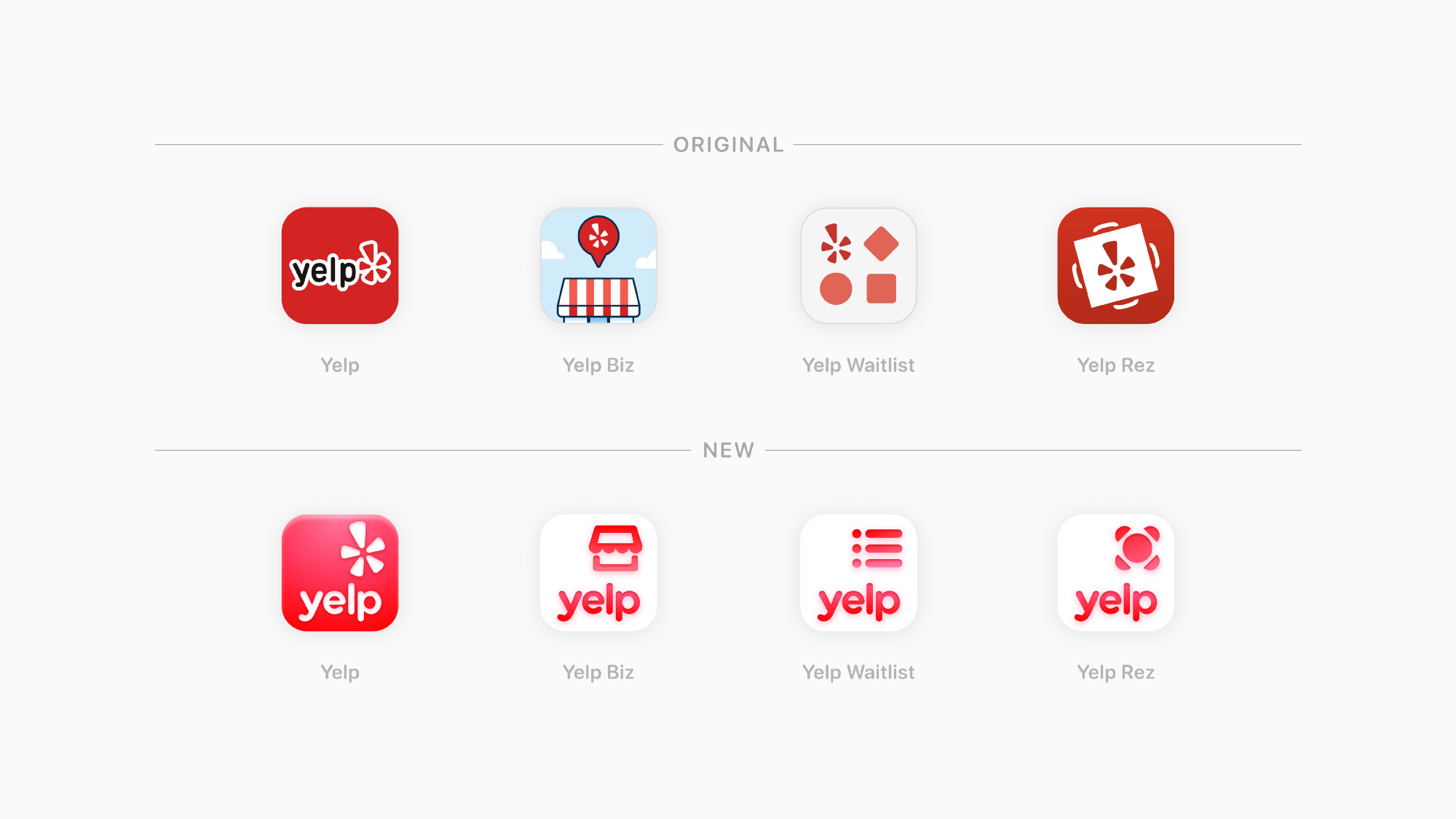
The restaurant review platform has unveiled a new logo and icon set, designed to look "simple, modern, and cohesive". But while that's certainly true of the logo, which has done away with its superfluous 'bubble' outline, the new app icons look rather retro.

Yelp says the new logo and icons "add the finishing touches to the modernisation of the Yelp platform," and we can certainly see how that simplified logo fits that brief. But the icons? Has Yelp been paying any attention to app design trends over the last decade? Guys, skeumorphism is just so 2010. But hey, that's not necessarily a bad thing – it all depends where you sit on the great flat design debate.

With lighting, embossing and shadows, the app icons (above) hark back to late noughties (and early teenies) app design. And if the response on Twitter is anything to go by, that's either a very good thing, or a very, very bad thing.
New Yelp logo is giving me iOS 2, glossy-faux-3D-core, 2010 App Store. Completely on board for the regression pic.twitter.com/BnnbRUqv4LAugust 3, 2021
Have you seen the new Yelp icon? This is the ugliest app I’ve ever seen🤢Feels like 2010 pic.twitter.com/LSOvDW7gSXAugust 3, 2021
Yep, it seems there's no middle ground with this one. People are either loving the retro look, or considering it an insult to their homescreen. And, to be honest, there seem to be a few more of the latter than the former.
That said, we can't help but admire Yelp for going against the design grain. There's certainly something nostalgic and, dare we say, fun, about the new look – in a world of utilitarian straight lines, it's nice to see some shadow (and hey, even Apple is embracing 3D again). We just hope it was deliberate – all that talk from Yelp about the rebrand looking "simple", "modern" and "contemporary" suggests Yelp might be a little confused.

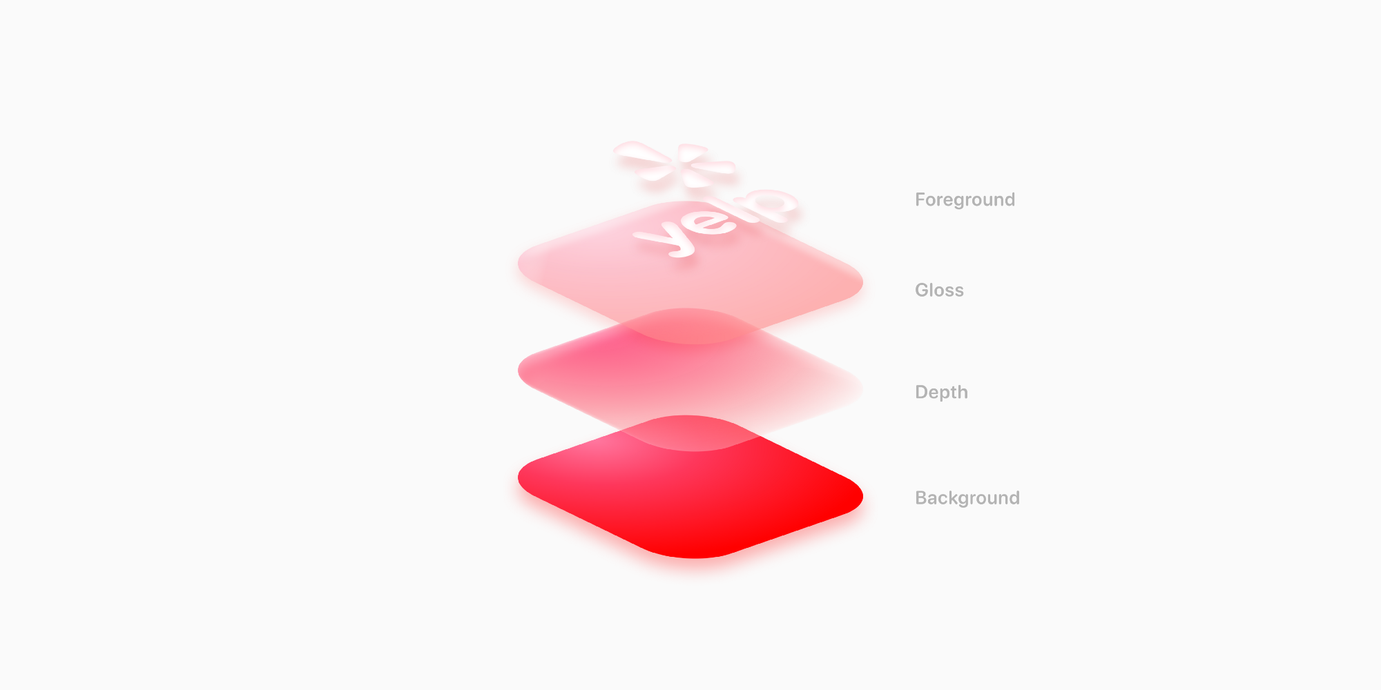
But Yelp's deeper dive into the rebrand on Medium is a little more illuminating. "While flat UI is the industry standard, our team saw an opportunity to create a visually distinct and unique 3D style — specifically for Yelp. This glossy, embossed and rich visual language is a new style we’re excited to introduce where the texture of our app icons feel tactile and vibrantly fresh. This style is unconventional and a bold splash for a digital landscape filled with flat design." In short, Yelp knew what it was doing.
Get the Creative Bloq Newsletter
Daily design news, reviews, how-tos and more, as picked by the editors.
Of course, that doesn't mean users have to love it – and there are clearly plenty who, at first glance, don't. But with retro throwbacks like that iOS 4 comeback doing the rounds, it's clear that nostalgia is the order of the day right now – maybe Yelp is simply ahead of the curve here. But let's not forget, there's still plenty of scope for creativity in flat design – just look at Burger King's sizzling rebrand from this year.
Read more:

Thank you for reading 5 articles this month* Join now for unlimited access
Enjoy your first month for just £1 / $1 / €1
*Read 5 free articles per month without a subscription

Join now for unlimited access
Try first month for just £1 / $1 / €1

Daniel John is Design Editor at Creative Bloq. He reports on the worlds of design, branding and lifestyle tech, and has covered several industry events including Milan Design Week, OFFF Barcelona and Adobe Max in Los Angeles.
