Yahoo makes an unexpected comeback with new logo
Long-forgotten browser is also adding new features and products.

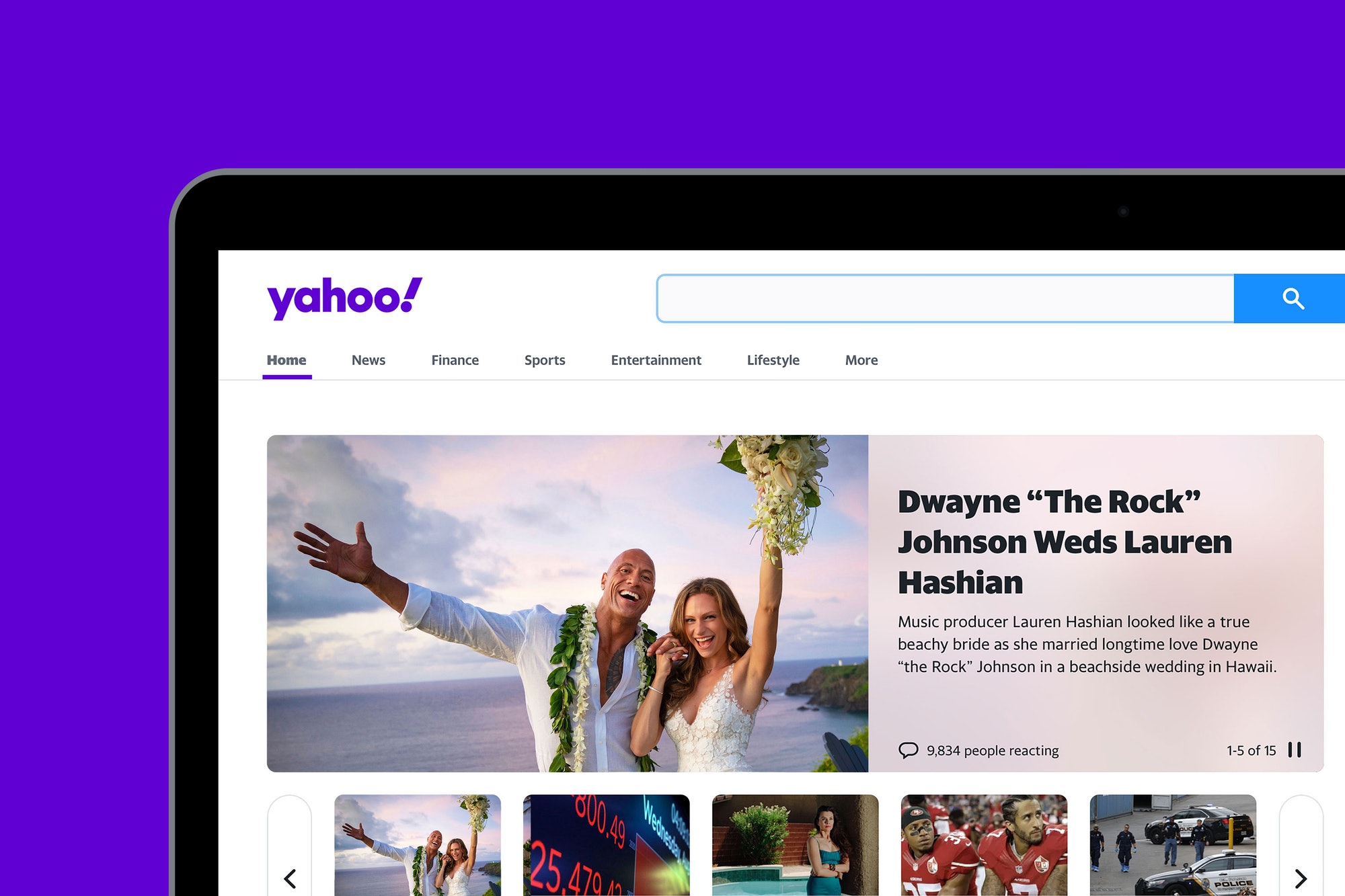
Remember Yahoo? Once upon a time it was the most popular starting point for web users, but those days are long gone. This doesn't mean Yahoo is dead and buried though. In fact yesterday it rolled out a new look and logo redesign (above) created in partnership with Pentagram.
Announcing a new logo design is an important part of any brand launch. And it looks like Yahoo's new logo reveal is suitably timely, with the web services provider promising to roll out new products and features soon.
The latest logo is Yahoo's third since launching more than 24 years ago, and the first significant change to the brand since 2013's '30 days of Change' design campaign. This new logo reflects Yahoo's updated brand strategy, which design consultancy Pentagram says focuses on "helping users find a more personalised, customised experience online".

So what's new with the logo? Well, the colour purple is still the cornerstone of Yahoo's design. Considering that it's been Yahoo's signature colour since 2003, it makes sense that it's still there. However the palette has been refined to include a primary purple dubbed 'grape jelly', and secondary purples called 'hulk pants' and 'malbec'.
Meanwhile the wordmark is set in Centra No.2 Extrabold. The letters have also been changed to be more geometric and compact. Topping off the logo design is an italicised exclamation mark, which just like the 'y' is set at an angle of 22.5 degrees. According to Pentagram this forward tilt suggests "a sense of momentum and excitement."
The online landscape has changed a lot since 2013, so the new Yahoo logo has been optimised to keep up. This includes the ability to work across various platforms and scales, and the introduction of a simple 'y!' monogram which is perfectly suited to favicons and social media. This monogram will also be used to connect sub-brands such as Yahoo Finance, Yahoo Sports, and Yahoo Weather.

As for those new products and features, they've already started rolling out. On its refreshed news site, Yahoo said that its new Yahoo Mail app will help users to organise their life. It also promised there is much more to come "in our quest to make things simpler, give you control, and put the things you love at your fingertips."
Get the Creative Bloq Newsletter
Daily design news, reviews, how-tos and more, as picked by the editors.
"In the decades since Yahoo first launched, the internet has grown to be so big and ubiquitous, it’s easy to become overwhelmed with information," Pentagram adds. "With its new products, Yahoo will empower users to better sift out irrelevant parts of the digital world, giving them more control of what they see and when they see it."
Related articles:

Thank you for reading 5 articles this month* Join now for unlimited access
Enjoy your first month for just £1 / $1 / €1
*Read 5 free articles per month without a subscription

Join now for unlimited access
Try first month for just £1 / $1 / €1

Dom Carter is a freelance writer who specialises in art and design. Formerly a staff writer for Creative Bloq, his work has also appeared on Creative Boom and in the pages of ImagineFX, Computer Arts, 3D World, and .net. He has been a D&AD New Blood judge, and has a particular interest in picture books.
