Xbox Series X UI revealed (and there's more to it than meets the eye)
What you see isn't all you get.

Design-wise, Microsoft has had a bit of a bumpy ride with the upcoming Xbox Series X, with the shape of the console itself being compared with a large fridge. So now it's unveiled the new console's user interface, has that made things any better?
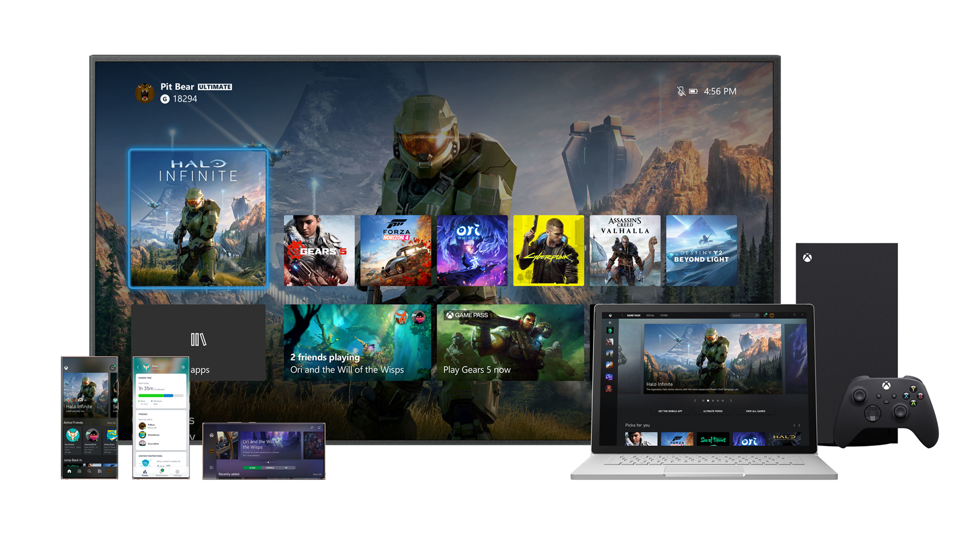
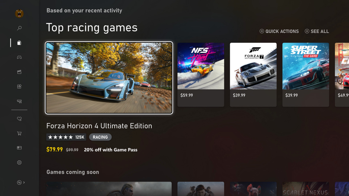
On first glance, it all seems very... familiar. Instead of reinventing the wheel, Microsoft has opted for a very similar interface to the current Xbox One, complete with large tiles and images. So it's certainly not going to excite anyone involved in UI design (for an alternative source of inspiration, check out our website mockup guide). But Microsoft promises there are big changes under the hood; you just can't see them yet.
Firstly, it will be faster. A lot faster. According to a blog post on its website, Microsoft has ensured that the new UI "will set a new bar for speed", by harnessing its Xbox Velocity Architecture and Quick Resume technology to make games quicker to launch and discover.
To be more precise, the Home screen will load more than 50 percent faster when you boot up the console, and be almost 30 percent faster to load when you’re returning from a game. For anyone who values every second of playing time, and gets impatient waiting for games to start, that's going to be a really big deal.

Secondly, according to Microsoft, the UI of the new console isn't exactly the same. In terms of the visual aesthetic, it says text is more readable, elements on screen are easier to understand at a glance, including tile shape, fonts, and there's been an updated illustration style The company calls it "familiar, just faster and more focused" – which basically means it's slightly tweaked rather than changed completely.
Same shit to meAugust 20, 2020
Personally, we feel it's a shame Microsoft didn't grasp the nettle to bring us something new, fresh and exciting with this UI. But the company says it was going for "welcoming", and we suppose familiar is welcoming. And the speed increase will no doubt be good news for gamers who want to spend less time looking at the UI itself, and more time actually gaming.
Microsoft says it will "continue to listen" to fan feedback, so we've no doubt the UI will continue to develop over the coming months and years. Thankfully, Microsoft has form when it comes to taking fans' opinions on board – it recently altered the Xbox Series X box art after a huge backlash.
Get the Creative Bloq Newsletter
Daily design news, reviews, how-tos and more, as picked by the editors.
Read more:

Thank you for reading 5 articles this month* Join now for unlimited access
Enjoy your first month for just £1 / $1 / €1
*Read 5 free articles per month without a subscription

Join now for unlimited access
Try first month for just £1 / $1 / €1

Daniel John is Design Editor at Creative Bloq. He reports on the worlds of design, branding and lifestyle tech, and has covered several industry events including Milan Design Week, OFFF Barcelona and Adobe Max in Los Angeles.
