Microsoft moves Xbox Series X logo after huge backlash
Fans weren't happy with the design.

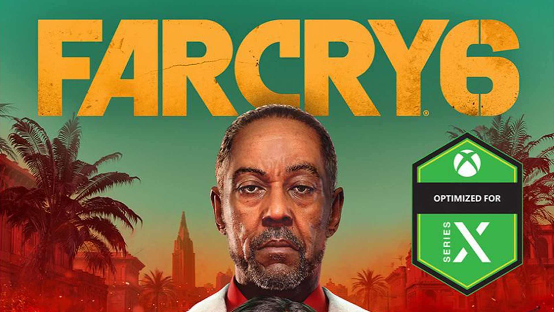
From a design perspective, the next generation of gaming hasn't left us hugely impressed so far. The PS5 console itself has been widely mocked for resembling a WiFi router, and the Xbox Series X hasn't fared much better, with many comparing it to a fridge. But one graphic design element left fans particularly unhappy: Microsoft's 'Optimised for Xbox Series X' logo.
The mark, designed to denote Xbox One games that will look better on the upcoming Series X console, ironically made the games' box art look much, much worse. Slapped across several game covers, the massive, bright green logo has been hugely unpopular online (needless to say, it won't be hitting our best logos list). Thankfully, it seems Microsoft has taken note, deciding to, er, optimise the logo's placement.
Microsoft listened to feedback pic.twitter.com/2rFqMuMZSPAugust 3, 2020
According to games analyst Daniel Ahmad (above), the monstrosity has now been relegated to the back of game boxes, offering a "more subtle mention of it being optimised for Xbox Series X".
When the first batch of box art was revealed last month, many fans were quick to share their displeasure, and to compare the 'Optimised for Xbox Series X' box designs with the more minimal PS5 offerings. In fact, Twitter was almost as crowded as Microsoft's box art itself:
Omg wtf is with the next gen box arts PS5 is clean but the white banner sucks, and isn't seamless with the spine.Xbox Series X box art green banner is seamless and clean, but it's so crowded due to all the symbols and icons 🤦♂️🤦♂️🤦♂️ https://t.co/ou8Ld80eazJuly 13, 2020
Hoo boy Xbox Series X box art is ugly and can be improved greatly by just moving the "Optimised" label and omitting the excess branding (you don't need your logo twice on the front like that). If you want folks to know it's optimised, don't bury your logo in the bottom corner. pic.twitter.com/FTUgiZAGsWJuly 15, 2020
The amount of buzzwords on the Xbox game case is ridiculous lol. Put all that bullshit on the back of the case and keep the case clean. The Xbox case still looks identical to the X1. Like I said before, the Series X is just extension of the X1, It doesn't have its own identity. pic.twitter.com/aWY3YUZaDkJuly 13, 2020
MAKE IT BIGGER pic.twitter.com/hq8FMYkjGzJuly 14, 2020
From those PS5 wireless router memes to the reaction to Microsoft's logo, fans are able to make their feelings known pretty quickly thanks to social media – and in some cases even influence or completely reverse design decisions. Thankfully for Microsoft, in this case it seems to simply mean moving a logo from the front to the back of a box. Some designers have faced a much more gargantuan task as a result of fan pressure – who can forget last year's infamous Sonic the Hedgehog redesign?
Read more:
- Iconic logo mashups you'll never be able to unsee
- The best digital art software for creatives in 2020
- Apple has some bad news about the iPhone 12
Get the Creative Bloq Newsletter
Daily design news, reviews, how-tos and more, as picked by the editors.

Thank you for reading 5 articles this month* Join now for unlimited access
Enjoy your first month for just £1 / $1 / €1
*Read 5 free articles per month without a subscription

Join now for unlimited access
Try first month for just £1 / $1 / €1

Daniel John is Design Editor at Creative Bloq. He reports on the worlds of design, branding and lifestyle tech, and has covered several industry events including Milan Design Week, OFFF Barcelona and Adobe Max in Los Angeles. He has interviewed leaders and designers at brands including Apple, Microsoft and Adobe. Daniel's debut book of short stories and poems was published in 2018, and his comedy newsletter is a Substack Bestseller.
