Design can be a hugely rewarding profession. You get to create enduring work that people remember, and that just perhaps in some small way makes the world a better place... or maybe your work just gets ridiculed forever. As we reach the end of another year, any designers out there with regrets about personal design blunders or oversights over the past 12 months can take solace in recalling some of the unbelievably bad logos that once saw the light of day, and how one designer set out to fix them.
Bad logo designs crop up all the time (Meta, Volvo and Calendly were the protagonists of some of the biggest controversies of 2021, and this year even saw some brands jump on a TikTok trend by posting intentionally bad logo designs). Many bad logos are simply forgotten about and consigned to history, but some real clangers retain their place the design hall of shame forever. It's these that designer Emanuele Abrate sought to fix in his 'Worst Logos Ever Redesigned' project, which is still gaining praise today.
It's been more than a year since he set out to "clean up" some of the world's worst – and smuttiest – logos, and he's still getting comments about the mammoth undertaking on his Behance profile. He chose nine of the most famously bad logos ever, a couple of which make it to our list of the all-time worst design fails, and set about exploring how to rectify them. The results were a whole lot more wholesome, as you'll see below (for examples of logos done right, from the start see our selection of the best logos of all time).
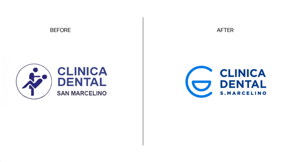
Many of the worst logo designs that Abrate set about fixing were unintentionally pornographic, so much so that we actually have hesitations about whether we can get away with publishing them. Incorporating human figures into a logo is a minefield, as the logo for the dentist's surgery above demonstrates. Abrate's makeover retains only the general shape of the existing logo and plays it much safer using the letters C and D from Clinical Dental to form a smiling face. As he points out, "the clean, rounded lines and blue colour convey a sense of confidence and cleanliness" – it's certainly a lot cleaner than the original.
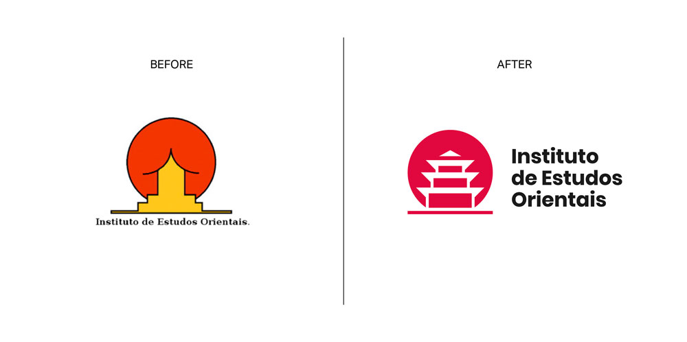
Another famously hilarious example of an ambiguous logo design was that of a Brazilian university's Instituto de Estudos Orientais. Despite being quickly dropped by the university almost a decade ago, it's gone down in history as one of the worst logos of all time, and plenty of designers could have fun fixing this one. Here Abrate went for a pretty thorough redesign. While he keeps the idea of the oriental pagoda, he makes it a lot clearer to remove the unfortunate visual connotations. As he describes on his Behance page, he worked with negative space and also switched the typography to a sans serif to better match the symbol. The result looks a lot more mature – and less like a schoolboy joke.

There's no nice way to say it. The original logo for the Computer Doctors logo is an absolute mess. Not only does the flaccid member between the P and T not remotely look like a U, it doesn't look like a computer mouse either. In fact, we're amazed that the designer didn't realise that there's only one thing it could possibly be seen as. 'Nothing could be saved from this design', Abrate says bluntly. He started out from scratch, adopting clean typography and a neat use of negative space to create a more sanitised medical cross.
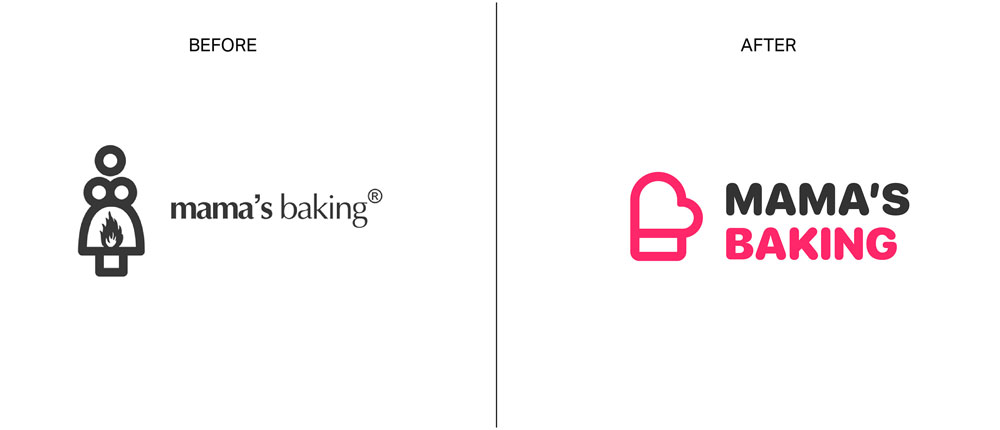
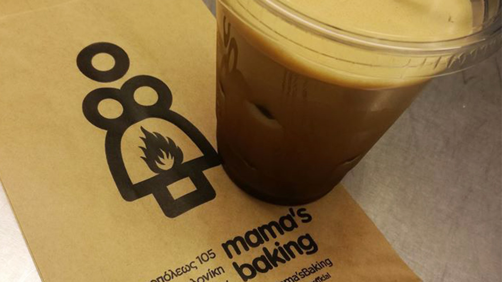
Just what does Mama have in the oven? Something's on fire, and it sure ain't the logo design. A lot of designers will have ideas about how to improve this logo for a Greek bakery. Again Abrate opted for a wholesale redesign, picking an oven mitt as a symbol, which he combines with a heart to convey a sense of passion for the kitchen. He also brought some colour into the design and went for a more friendly rounded font.
Get the Creative Bloq Newsletter
Daily design news, reviews, how-tos and more, as picked by the editors.
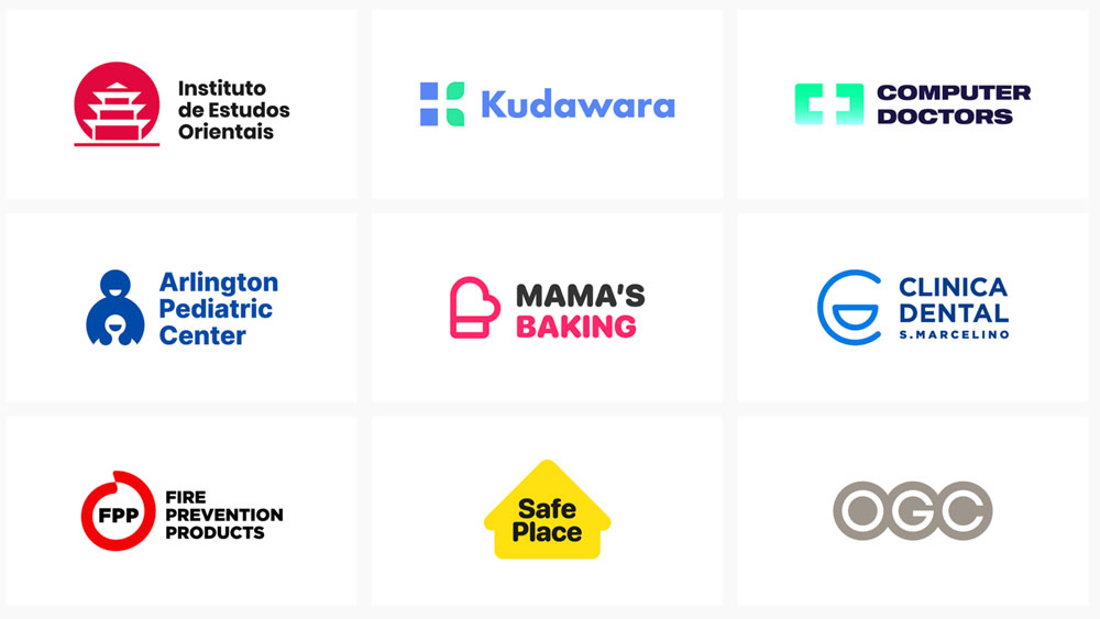
You can see more examples of Abrate's makeovers of the world's worst logo designs on this Behance page, along with some neat mock-ups showing his redesigned logos in situ on products and business cards. Redesigning bad logo designs like these is a great creative exercise in itself, and also a great calling card to showcase your own design skills to potential clients, giving them confidence that you won't make them a laughing stock like any of the brands here.
As we approach the start of the new year, it's certainly an exercise to consider, and we'd be interested to see designers' reworkings of the most controversial logo designs of 2021. See our guide to the golden rules of logo design for some tips to guide you, and check the best current prices for Adobe's Creative Cloud apps below in need to upgrade your design software.
Read more:

Thank you for reading 5 articles this month* Join now for unlimited access
Enjoy your first month for just £1 / $1 / €1
*Read 5 free articles per month without a subscription

Join now for unlimited access
Try first month for just £1 / $1 / €1

Joe is a regular freelance journalist and editor at Creative Bloq. He writes news, features and buying guides and keeps track of the best equipment and software for creatives, from video editing programs to monitors and accessories. A veteran news writer and photographer, he now works as a project manager at the London and Buenos Aires-based design, production and branding agency Hermana Creatives. There he manages a team of designers, photographers and video editors who specialise in producing visual content and design assets for the hospitality sector. He also dances Argentine tango.
