The year is at almost an end, and as we look back at what 2022 has left us, a few logo designs stand out. And not for the right reasons. There were plenty of good logo designs in 2022, but inevitably what we're most likely to remember are those logo fails that made us laugh or scratch our heads – or both.
That maybe raises the question of whether a bad logo design can actually create more brand recognition than a good one. We certainly won't be forgetting these designs any time soon, so there could be an argument that abandoning logic, legibility and aesthetics and even including inappropriate innuendo can win a brand attention, but it's probably not going to crate the right impression.
Generally, we'd advise sticking our tips on how to design a logo – and you might want to make sure you have the best graphic design software to make sure you implement the design correctly (and don't turn out something like number two on our list). In the meantime, here are the worst logo fails of 2022 in all their glory.
Latest Videos From Creative Bloq
This plastic surgery logo
This year we also saw a logo that might not be only the worst logo we saw in 2022, but perhaps the worst logo ever. This frankly terrifying design was shared on Reddit's r/crappydesign channel by a user named Phedericus, who said only that it was for a plastic surgery company. We don't know the name or location of the company or whether the logo has since received surgery itself – we certainly hope so.
The design features an enormous single eye hovering over a huge mouth that blends into what looks like a cheap carving knife. Every decision just seems wrong, from the colours to the lack of symmetry and different thicknesses, which all give the design an even more monstrous lopsided feel. Surely someone would only go to this clinic if they want to come out looking like Frankenstein's monster.
Users on Reddit couldn't believe what they were seeing. "I hope the surgeon is better than the designer," one person said. "This is bad in such a bizarre way. So many specific unfortunate choices were made," someone else said, and we have to agree.
SpaceX's Nasa logo
Wait…what…what happened to Crew-5’s meatball? pic.twitter.com/JiXJuYRFgEOctober 6, 2022
See more
Sometimes a logo fail isn’t in the design itself but the execution. Nasa’s ‘meatball’ logo has its fans (although others prefer the ‘worm’ logo, but that’s another story). But when SpaceX's Falcon 9 sent a Crew Dragon spacecraft into orbit in October, sharp-eyed viewers noted that while the rocket thankfully followed its course, something else appeared to be a little off.
Get the Creative Bloq Newsletter
Daily design news, reviews, how-tos and more, as picked by the editors.
Something seemed to have gone wrong with the application of NASA's iconic star-sparkled blue logo with its red swoop. The logo was way off-centre. "Wait… what… what happened to Crew-5’s meatball?" tweeted Florida Today space reporter Emre Kelly. "That's what happens when your logo doesn't have an extensive manual describing its proper usage." someone else suggested (for extensive logo manuals, just check out the rather epic new Olympics branding).
It was all the more amusing when we know how much SpaceX's Elon Musk loves logos (although the Tesla logo has also been ridiculed for its hilarious resemblance to something that was completely unintended). Hilariously, several people took to Twitter to offer their own takes on the logo, and homemade creations of the SpaceX logo too.
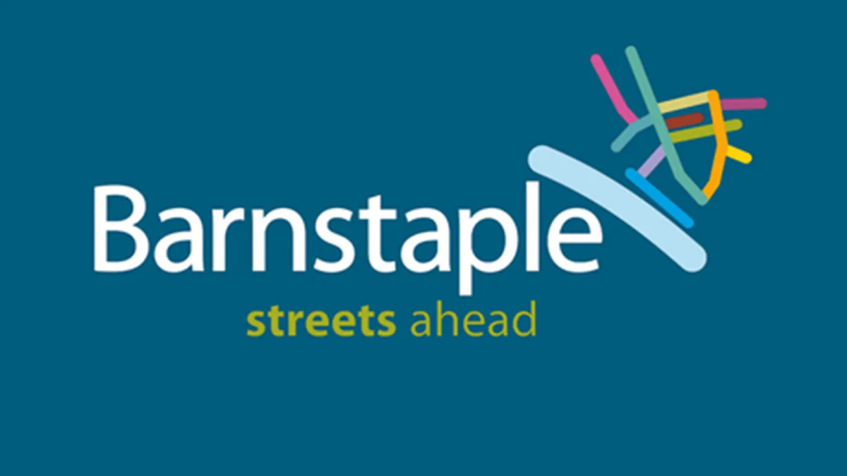
Barnstaple wanted a busy town centre, but it got a busy logo instead (Image credit: Barnstaple/Devon County Council)
One of the basic rules of logo design is to keep it simple. A simple logo is usually much more memorable, which means people are more likely to recall the brand. And limiting the number of colours and amount of detail also make a logo easier to apply in different sizes and applications (just look at the Apple logo history to see how it went from a fussy logo that would be impossible to put on the back of an iPhone to something super streamlined but immediately recognisable).
So just what is going on in this logo for the town of Barnstaple in Devon? The confusing jumble of coloured lines looks like it might be supposed to show a half-demolished house on the bank of a river. But it turns out that there's a clue in the tagline, "streets ahead". Of course, it's a map of Barnstaple's town centre.
Now, a logo design must be appropriate for its audience and use. So could this apparently random design be instantly recognisable and meaningful for the people of Barnstaple. "Load of cr*p. Two-year old could have done it for a free Farley's Rusk," one resident wrote on Facebook. On the upside, if you're lost in the centre of Barnstaple and Google maps is on the blink, look out for the logo and it should help you find a way out. Maybe.
The Australian government's Women’s Network logo
Image 1 of 2
The women's network, you say?(Image credit: Department of Prime Minister and Cabinet)
The logo formed part of a wider family(Image credit: Department of the Prime Minister and Cabinet)
The last thing you'd want the logo for a women's network to look like is a male genitalia, but somehow the Australian government's Women's Network managed to do just that. Now, we've seen a fair few accidentally rude logos in our time, but this one was perhaps the most inappropriate.
The curly 'w' and a girthy line look so much like a juvenile sketch of a penis that people couldn't believe nobody at the network itself notice. The purple colour just makes things worse, recalling the aubergine emoji. "I thought this was satire, but it is either thoughtless or an insult," one person tweeted, while Yumi Lee at the Older Women's Network was upset about "how little they have thought about women".
Some suggested that it could only the resemblance could only have been intentional. "Looking at this logo as a graphic designer, I can tell you the designer knew EXACTLY what they were doing from font choice to layout to colour. This isn’t a mistake. It reeks of teenage boy mentality malevolence," one designer wrote on Twitter.
In reality the ill-advised logo copied the form of a series of other of government logos. It has, however, been replaced after the outcry. The Department of the Prime Minister and Cabinet of Australia said in a statement in March: "The rebrand was completed internally, using existing resources, and designs were consulted on widely. No external providers were engaged for this work. The logo has been removed from the department’s website, pending consultation with staff."
Joe is a regular freelance journalist and editor at Creative Bloq. He writes news, features and buying guides and keeps track of the best equipment and software for creatives, from video editing programs to monitors and accessories. A veteran news writer and photographer, he now works as a project manager at the London and Buenos Aires-based design, production and branding agency Hermana Creatives. There he manages a team of designers, photographers and video editors who specialise in producing visual content and design assets for the hospitality sector. He also dances Argentine tango.