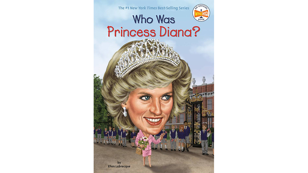
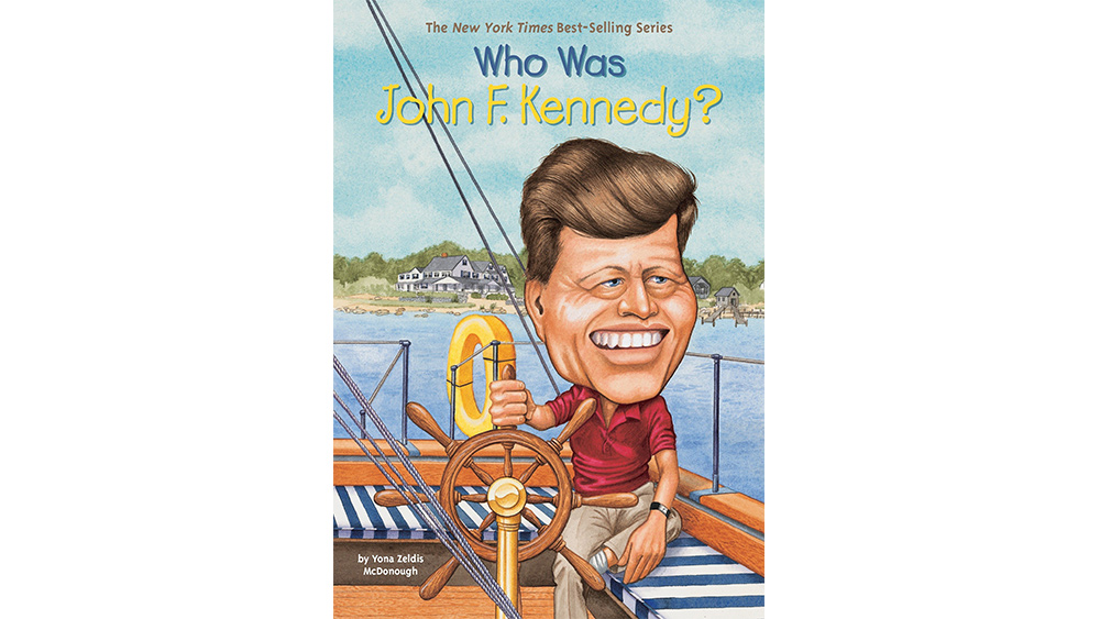
Illustration for book covers is a whole genre of art of its own right, with a rich history and tradition. When it's successful, the cover can help sell a book, despite the old adage, and will stay with us as a fond memory of the book. But get it wrong and the cover can haunt readers forever, or put people off reading what could be a great, or important book.
Users on Reddit think they might have found the most horrifying example ever in this 2002 instalment from the "Who Was" series. The cover of Who Was Harriet Tubman? shows the American political activist leading a fleeing family on the Underground Railroad, but the depiction of Tubman has been ridiculed for its ludicrously outsized head and neck, while some think she looks more like Willem Dafoe than the great abolitionist (to avoid such pitfalls, see our guide to how to illustrate a children's book).
this_horrifying_book_cover from r/CrappyDesign
One person commented on the post: "I feel like the artist started drawing the head (as most artists do) hoping to have a bust as the cover, and then editor came and was like "yeah that's great, but we really need to illustrate what exactly she did" and the artist was like ya no fuckin way I'm erasing this it's lit."
Some people thought the head was unrelated to the rest of the image until spotting that Tubman's neck is also enlarged. "It wouldn’t have been nearly as bad if they didn’t try to make the neck so large," one person commented. "Just let the giant head be giant and cartoony; don’t make it look like a science experiment." Others dig the idea, but think the illustrator went too far. "The head is just a little...too big. I get the style and it could look cool, but it's dialled up to 11, IMO. Take it down a few notches and I don't think anyone would be put off."
Penguin's whole Who Was/What Was series featured the same oversized head device – not all by the same illustrator. The reemergence of the title above on Reddit had users nostalgically recalling which title gave them the worst nightmares. It's a tough call, with the series including titles on Jesus, Mother Teresa and Princess Diana. Several titles could compete head-to-head for the worst cover prize, but What Was the Holocaust? may be the most questionable in terms of the appropriateness of the series' caricature-like oversized heads (see below).


"I always hated their book covers, it's so terrifying," one user commented on Reddit. "I still remember Eleanor Roosevelt's giant head staring into my soul in the 5th grade," another recalled. The series might be another example to add to our list of design fails.
Think you can do better? To get working on your own cover illustrations, see the best prices for Adobe's Creative Cloud suite of apps below. You can download Adobe Illustrator, or see our guide to how to design a book cover in InDesign.
Get the Creative Bloq Newsletter
Daily design news, reviews, how-tos and more, as picked by the editors.
Read more:

Thank you for reading 5 articles this month* Join now for unlimited access
Enjoy your first month for just £1 / $1 / €1
*Read 5 free articles per month without a subscription

Join now for unlimited access
Try first month for just £1 / $1 / €1

Joe is a regular freelance journalist and editor at Creative Bloq. He writes news, features and buying guides and keeps track of the best equipment and software for creatives, from video editing programs to monitors and accessories. A veteran news writer and photographer, he now works as a project manager at the London and Buenos Aires-based design, production and branding agency Hermana Creatives. There he manages a team of designers, photographers and video editors who specialise in producing visual content and design assets for the hospitality sector. He also dances Argentine tango.
