Apple's worst ever design crime is here to stay
Now in more colours!

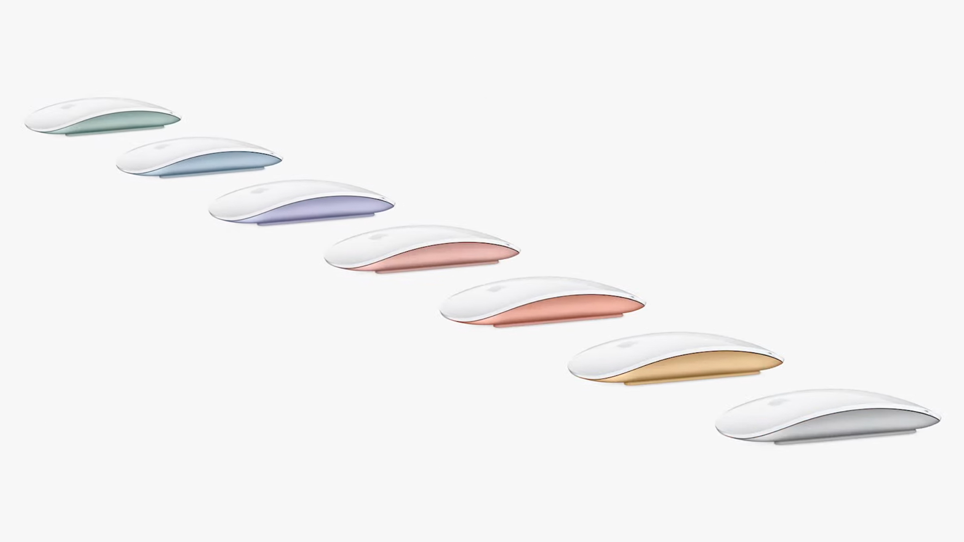
Of everything Apple announced at this week's product launch event, the addition of six new Magic Mouse colours (designed to match the beautiful new iMacs) wasn't exactly headline news. But we couldn't help but notice that the device's charging port is still in the same place – which means Apple is, unbelievably, continuing to stick by one of its most wildly unpopular designs.
The Magic Mouse 2 is a typically sleek-looking Apple peripheral, and even made our best mouse for Mac list. It's a solid option – until you need to charge it. In possibly Apple's most mind-boggling design decision ever, it placed the lightning port on the bottom of the mouse, rendering it utterly unusable while being charged. Could Apple really not have moved the charging port as well as adding the new colours this year?
Absolutely stacked Apple Event and yet this still exists pic.twitter.com/bTRc13FV32April 21, 2021
Apple adding color to the Magic Mouse but not moving the charging port pic.twitter.com/ePjpzpcWnoApril 22, 2021
Fun fact: The "Refreshed" Apple Magic Mouse still charges with a stupid port on the bottom.April 22, 2021
Many have speculated about what led to the bizarre decision to place the port on the bottom of the mouse. "It seems like they wanted to ensure that the design aesthetic wasn’t compromised," one Reddit user suggests, while another wonders whether Apple put in the "least amount of effort possible" by simply replacing the Magic Mouse 1's battery compartment with a port. "I suspect they wanted to sell a designated charging station for these but scrapped it at some point," another user adds.
Whatever the reason, it's one of the most infuriating design quirks ever – and as any Magic Mouse users will attest, this thing always manages to run out of battery just as you're making headway on an incredibly important and time-sensitive task. Just search 'worst Apple design' on Twitter, and you'll be met with countless photos of upside-down Magic Mice:
This is still one of the most insane things to happen in modern history pic.twitter.com/p39BI8t9oGFebruary 13, 2021
This has got to be one of the worst design fails of today's technology! who came up with this ridiculous idea? @Apple #Apple #design #fail #SitAndWaitForItToCharge #tech pic.twitter.com/DztYZrDRhHFebruary 11, 2021
There's no denying that the Magic Mouse 2 is a case of form over function – but hey, at least it looks good. While that's the case with most of its products, Apple has let out a few aesthetic monstrosities over the years, from the iPhone 6 Smart Battery Case to the 2003 iMac Keyboard. Here are the 10 most beautiful Apple products – and the 5 ugliest. And be sure to check out our best MacBook deals below – with a massive, built-in trackpad, a separate mouse is very much an optional extra.
Read more:
- With the new 2021 iMac, Apple is back to its fun, retro best
- Apple's hilarious AirTag design restriction revealed
- New Procreate iPad feature is blowing the internet's mind
Get the Creative Bloq Newsletter
Daily design news, reviews, how-tos and more, as picked by the editors.

Thank you for reading 5 articles this month* Join now for unlimited access
Enjoy your first month for just £1 / $1 / €1
*Read 5 free articles per month without a subscription

Join now for unlimited access
Try first month for just £1 / $1 / €1

Daniel John is Design Editor at Creative Bloq. He reports on the worlds of design, branding and lifestyle tech, and has covered several industry events including Milan Design Week, OFFF Barcelona and Adobe Max in Los Angeles. He has interviewed leaders and designers at brands including Apple, Microsoft and Adobe. Daniel's debut book of short stories and poems was published in 2018, and his comedy newsletter is a Substack Bestseller.
