Why have the words gone from Dairy Milk bars?

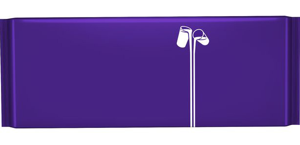
Do you recognise Pantone 2685C? The trademarked colour belongs to Cadbury's Dairy Milk and it's recently taken centre stage. Cadbury has removed the words from Dairy Milk's iconic packaging as part of its heartfelt new campaign, leaving behind a vast blank purple space and the 'glass and a half' logo design.
Cadbury has launched the 'donate your words' campaign to raise awareness of loneliness amongst older people aged 65 or older. This is in response to new research from Age UK, which has revealed that 225,000 people can often go for a week without speaking to anyone, while 2.6 million people speak to three or fewer people they know in that time.
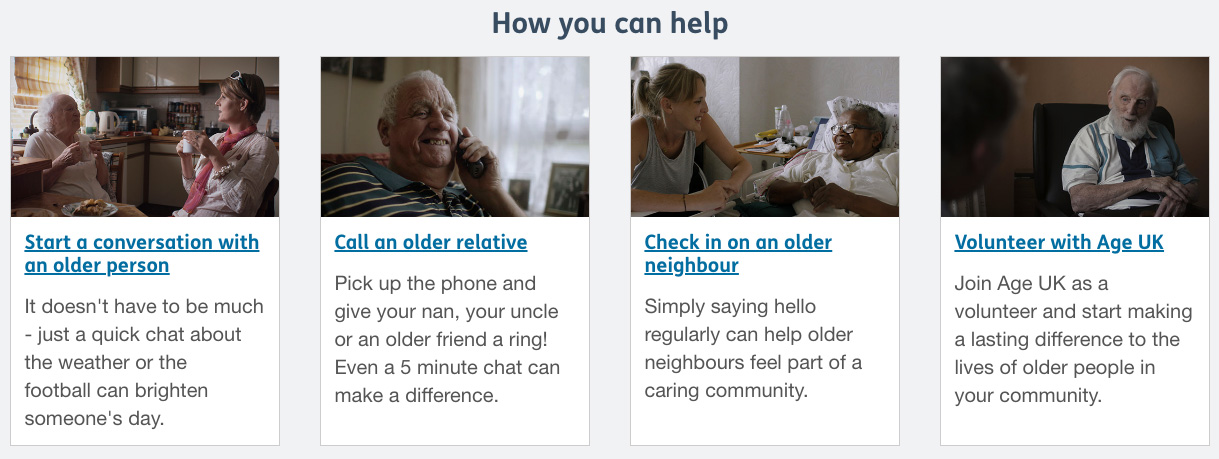
As well as taking away the words from each bar of Dairy Milk to raise awareness, Cadbury is also donating 30p to Age UK from every bar sold. It says that it hopes the limited edition bar will encourage people to reach out to the older members of our society. It has even put together a list of small things you can do to make a 'real difference' to the lives of older people, things as simple as saying hello to a neighbour or writing a letter to a grandparent.
Caroline Abrahams, charity director at Age UK, says: "A friendly 'hello' or 'how are you?' is something most of us take for granted – it's just part of every day life, but these latest figures show that hundreds of thousands of older people in the UK will spend today and the rest of this week alone, with no one to share even a few simple words with.
"That's why Age UK’s expert advice and support services are so crucial and help people in all sorts of ways, every day of the year."
We're thrilled to be working with @CadburyUK on #DonateYourWords, a campaign to help tackle #loneliness.Cadbury has donated the words from their Dairy Milk bars and will donate 30p from every sale to @age_uk to help us provide vital services & support: https://t.co/qfgI4BMryw pic.twitter.com/2PZv9DpZd1September 4, 2019
Cadbury isn't the first brand to ditch its traditional branding this year. Doritos recently abandoned its logo to appeal to Generation Z in an edgy rebrand that will last until the end of the year. Mastercard also dumped its wordmark in an attempt to simplify its digital identity (see our comment on this in our roundup of logo design success stories).
Removing the words from a brand's visual identity is a bold move, whatever the reason, and one for the big players who have the confidence to back it up. But Cadbury's short term move is more poignant than most.
Daily design news, reviews, how-tos and more, as picked by the editors.
Read more:

Georgia has worked on Creative Bloq since 2018, and has been the site's Editor since 2023. With a specialism in branding and design, Georgia is also Programme Director of CB's award scheme – the Brand Impact Awards. As well as immersing herself with the industry through attending events like Adobe Max and the D&AD Awards and steering the site's content streams, Georgia has an eye on new commercial opportunities and ensuring they reflect the needs and interests of creatives.

