You need to see this Gen Z media brand – it's pretty much perfect
I'm officially Woo-ed.

As a member of the Gen Z generation, it's safe to say that not all media outlets are targeted toward my age group. However, one new platform is hoping to change that. Woo might be my new favourite website (after Creative Bloq, of course) with its exciting content and delicious design.
Founded by Stephen Mai, Woo is a new platform targeted at Gen Z, and it perfectly reflects today's youth culture. The brand has been backed by ITV's Studio 55 and features stories about everything from movies to house plants, "all through the lens of wellbeing". And if the articles aren't enough to grab you, then its gorgeous aesthetic will be sure to attract your attention. If you're feeling inspired by Woo's design and would like to have a go at creating your own website, then why not sign up for one of the best online web design courses?
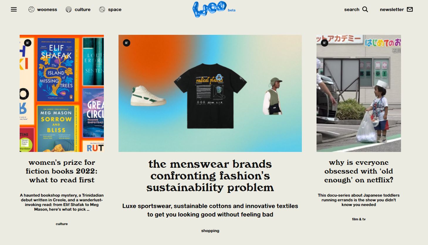
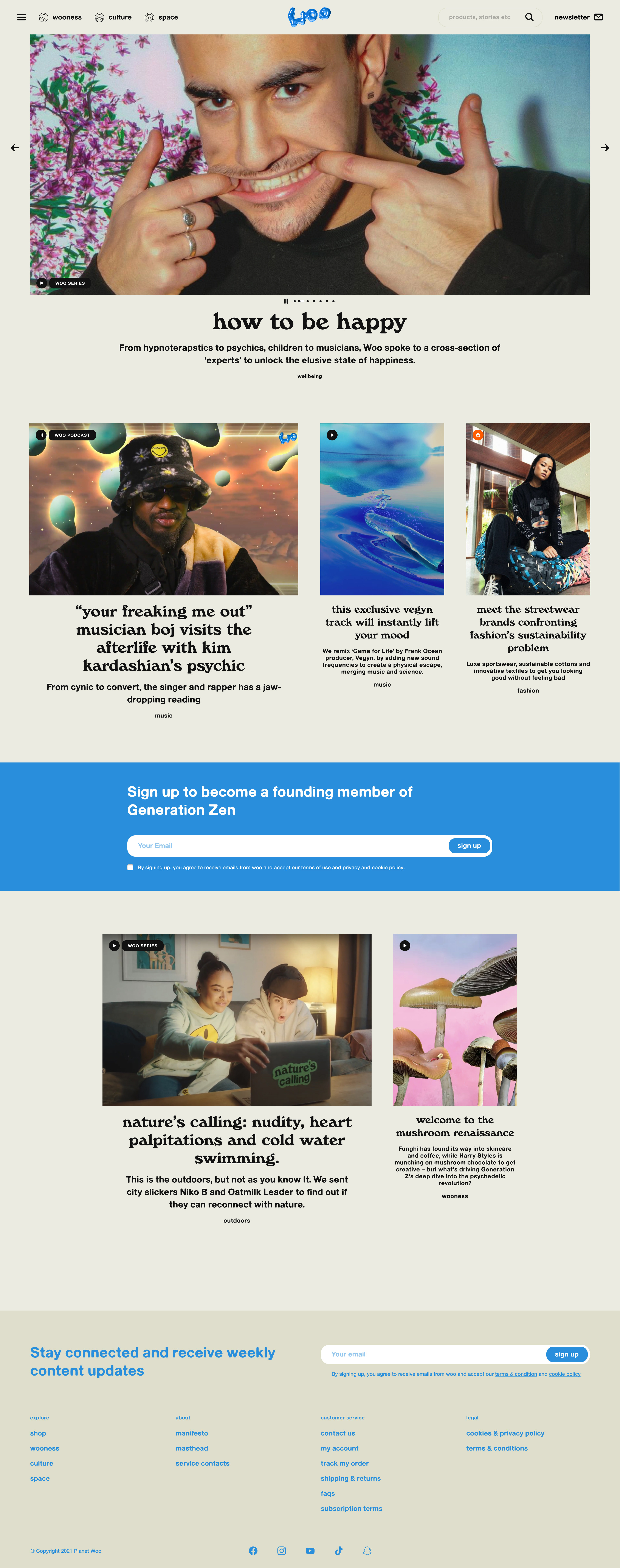
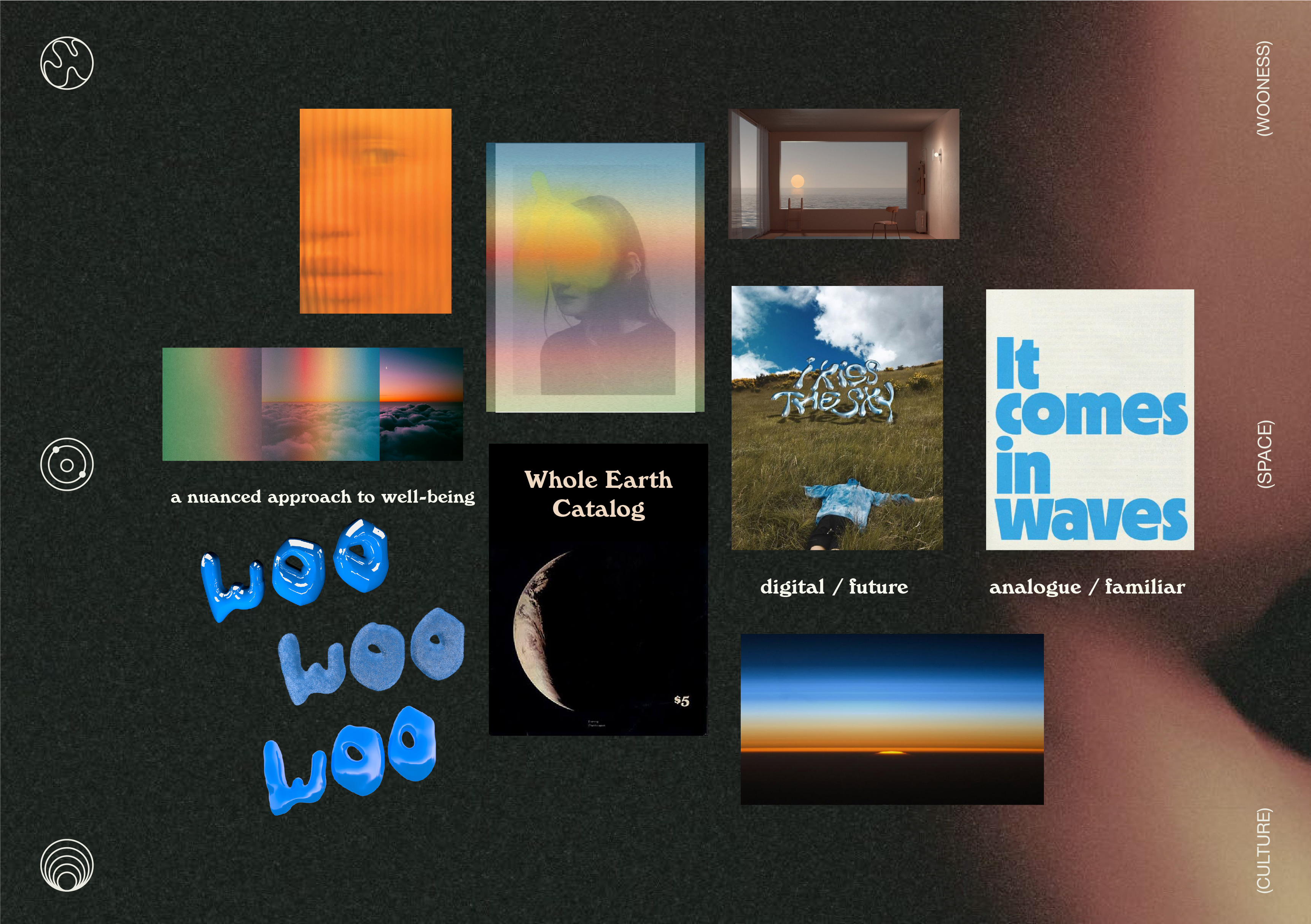
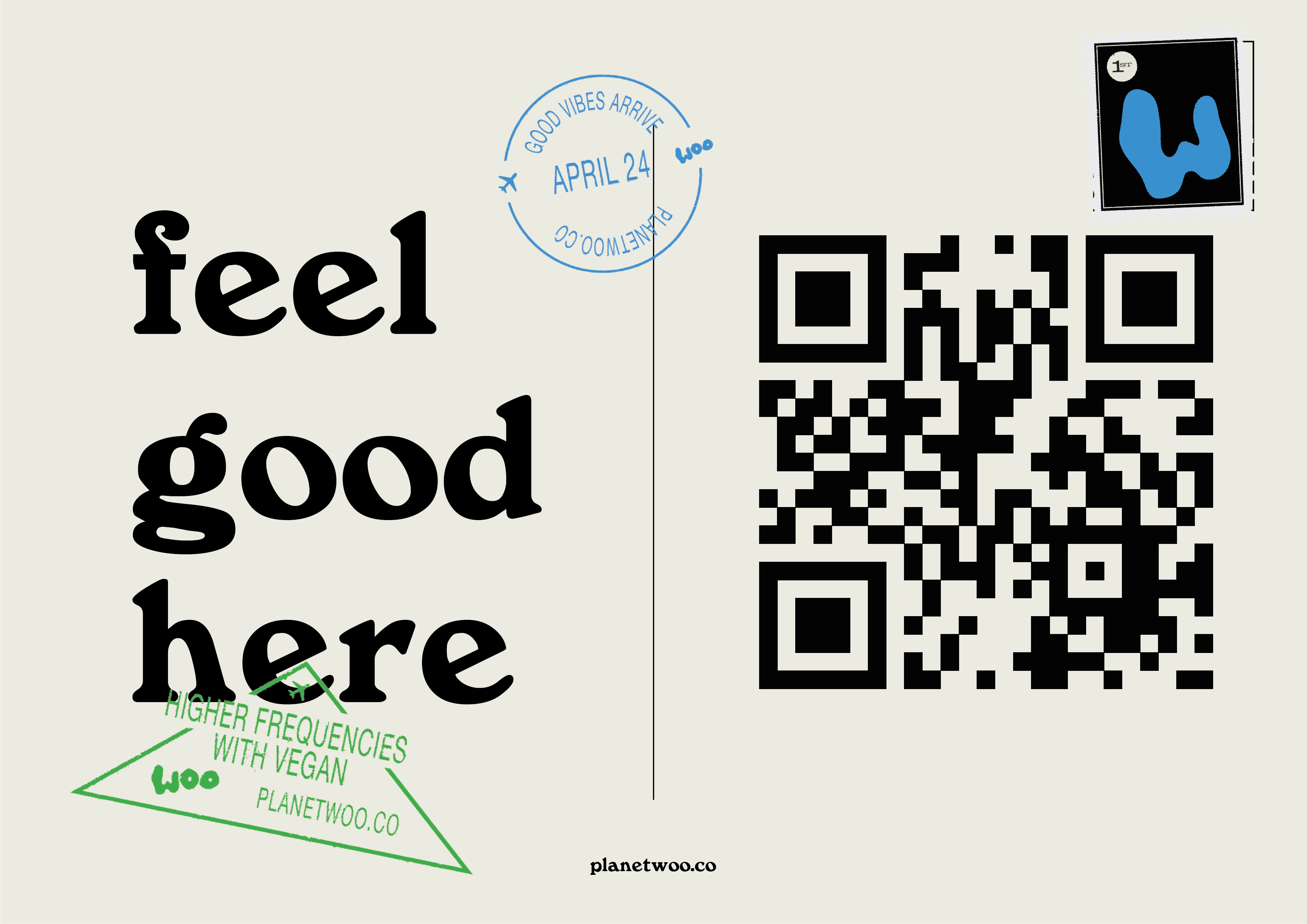

According to the Woo team, "Woo is the defining Gen Z media business born out of the post-pandemic age, here to redefine wellness for an entire generation by making it relatable, and culturally relevant". The site sports the tagline "feel good here", alongside a '90s-centric aesthetic with psychedelic graphics and pop culture references, making it hard not to feel totally zen while scrolling through the site.
The site was designed by Dan Mitchell, who told DesignWeek, "We really dived into youth culture and the key components that make up today’s cultural movement". Mitchell then goes on to explain that the Woo logo was inspired by his approach to wellness; "ever-evolving and always moving". Not only does the logo work as a glossy 3D design, but it also looks great as a flat design too (see below).
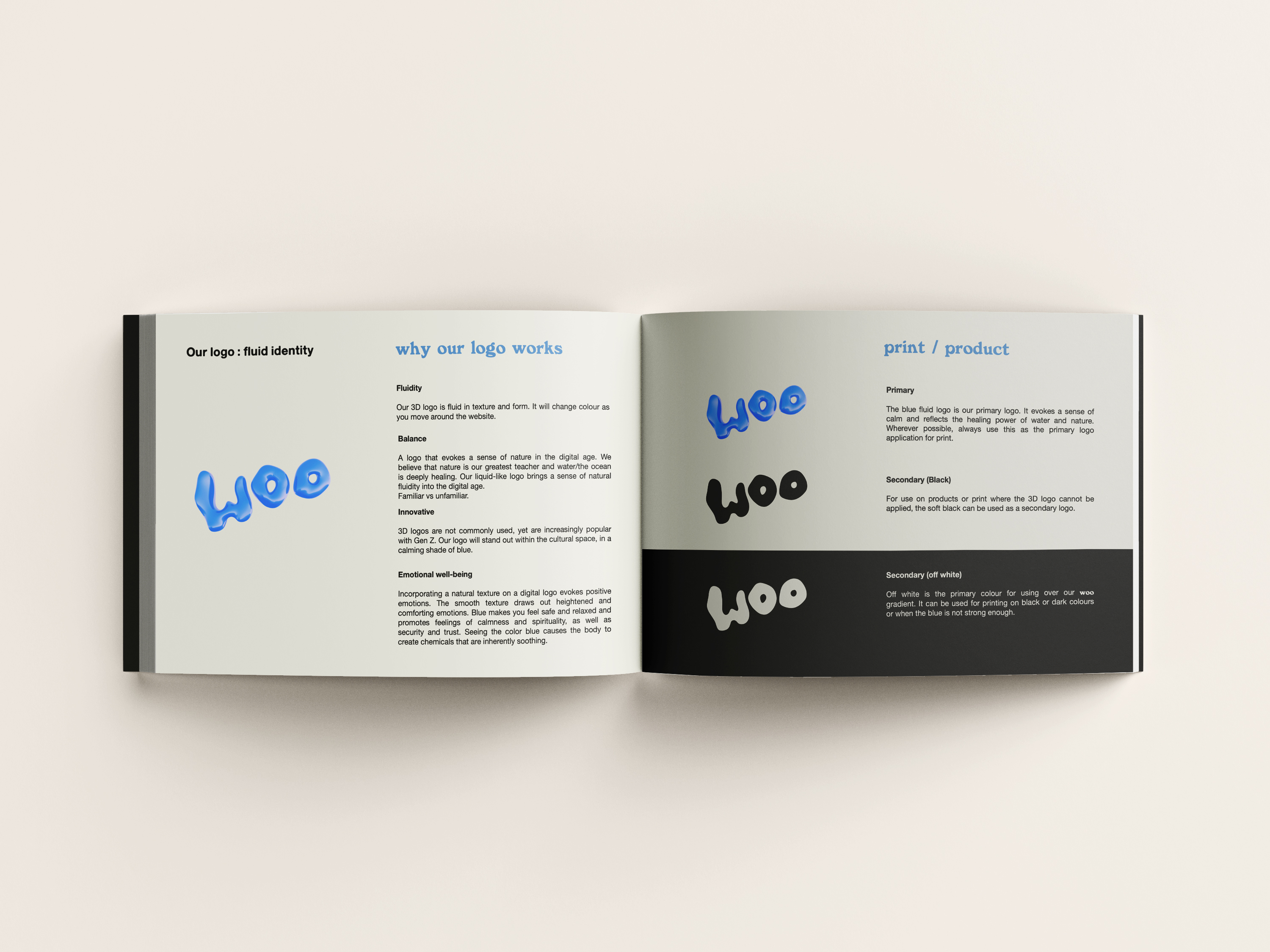
What I love about Woo's web design is the attention to detail that makes it so appealing to us Gen Z-ers – it's clear that Mitchell has done the research into what designs and graphics are popular in today's youth culture. The 35mm style photos, vibrant grainy gradients, handsome use of the Windsor Bold font and its versatile logo feel youthful and fun, which suits its target audience to a T.
It's safe to say I'll be spending a lot of my free time indulging in Woo's website. If you're designing your own brand and are hoping to make it as effective as Woo's, then brush up on your branding knowledge with some of the best branding books. And once you're fully equipped with all you need to know, then make sure you check out our roundup of the best web design software to get creating your site.
Read More:
Get the Creative Bloq Newsletter
Daily design news, reviews, how-tos and more, as picked by the editors.

Thank you for reading 5 articles this month* Join now for unlimited access
Enjoy your first month for just £1 / $1 / €1
*Read 5 free articles per month without a subscription

Join now for unlimited access
Try first month for just £1 / $1 / €1

Amelia previously worked as Creative Bloq’s Staff Writer. After completing a degree in Popular Music and a Master’s in Song Writing, Amelia began designing posters, logos, album covers and websites for musicians. She covered a range of topics on Creative Bloq, including posters, optical illusions, logos (she's a particular fan of logo Easter eggs), gaming and illustration. In her free time, she relishes in the likes of art (especially the Pre-Raphaelites), photography and literature. Amelia prides herself on her unorthodox creative methods, her Animal Crossing island and her extensive music library.
