First look: Wonder Woman 1984 poster revealed
And it's a retro art masterpiece.

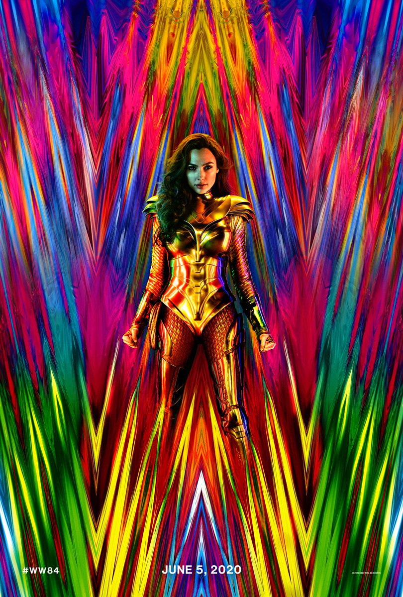
The second Wonder Woman film might be a year away, but today we got a tantalising taste of what to expect with the release of the movie's official teaser poster.
And what a tease it is. Unveiled by Wonder Woman actor herself Gal Gadot, along with the film's director Patty Jenkins, the poster for Wonder Woman 1984 is a suitably retro masterpiece.
With its bold and straightforward layout, this teaser is up there with the most inspirational of poster designs. We're a big fan of its saturated colours, and the front and centre positioning of Wonder Woman herself. There's also the new costume design reveal that's sure to excite fans.
The artwork is a welcome change to some of the crowded superhero posters of recent years, which lead us to ask: are movie posters in a design crisis? If the poster for Wonder Woman 1984 is anything to go by, the answer is: not anymore.
One... year... from... TODAY... #WW84 pic.twitter.com/2LQllhixFJJune 5, 2019
Comic book fans have been lapping up the poster on social media. Many have commented that the lurid colours and striking design means that the poster has gone "full Ragnarok". This is a reference to the Marvel film Thor Ragnarok, the official poster for which was also warmly received by designers.
It's gone full Ragnarok https://t.co/ETGsKzWeGeJune 6, 2019
Already have a wonder woman poster in my room but I guess I'm gonna have to add one to the collection https://t.co/iCNYCYUcMlJune 6, 2019
I know there's more at play here but I love this so much. #WonderWoman pic.twitter.com/ca4hr4PTrWJune 5, 2019
Can we all take a sec and look at how amazing this Wonder Woman 1984 Poster looks. The colours are very 80's and the armour is straight out of Kingdom Come. Love it. pic.twitter.com/wynbTRJdS6June 6, 2019
No matter which fandom we belong to, we can all admit this #WonderWoman poster is one of the most beautiful posters ever! Look at those trippy colors.Cant wait to see #WW84 from @PattyJenks and @GalGadot https://t.co/rU6elBf1auJune 6, 2019
Don't get us wrong, we love the poster for Wonder Woman 1984. But question whether its design is authentically 1980s-themed, as the film title suggests. The neon colours and eye-catching graphics have lead us to debate whether they're more suited to the '90s? (The stacked metallic 'W' lettering calls to mind the '90s logo for WWF wrestling.)
Either way, this Wonder Woman poster has a very retro feel about it, but also looks stylish and appealing to modern audiences to, which is no easy feat. All we've got to do now is wait a year to see if the film lives up to the standard of its poster design.
Get the Creative Bloq Newsletter
Daily design news, reviews, how-tos and more, as picked by the editors.
Related articles:

Thank you for reading 5 articles this month* Join now for unlimited access
Enjoy your first month for just £1 / $1 / €1
*Read 5 free articles per month without a subscription

Join now for unlimited access
Try first month for just £1 / $1 / €1

Dom Carter is a freelance writer who specialises in art and design. Formerly a staff writer for Creative Bloq, his work has also appeared on Creative Boom and in the pages of ImagineFX, Computer Arts, 3D World, and .net. He has been a D&AD New Blood judge, and has a particular interest in picture books.
