Psygnosis's Wipeout series is known for its fast gameplay, 3D design and its thumping soundtrack featuring the likes of The Chemical Brothers and Orbital. But the futuristic hover racing games also had a less obvious influence: graphic design.
People continue to be impressed by the ingenious hidden meaning behind the Wipeout logo itself, one of the best gaming logos of all time. But over on Reddit, designers have been talking about how they were inspired to choose their careers not only by the main logo but by the in-game logos of the individual racing teams.
Not sure about you guys but the team logos from Wipeout got me interested in graphic design. from r/DesignPorn
"Not sure about you guys, but the team logos from Wipeout got me interested in graphic design," WinglyBap wrote on Reddit. And it turns out the design aesthetic had a similar impact on others.
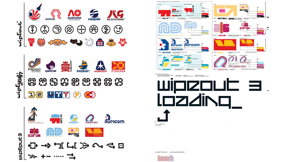
While the logos all have a certain look, along with typography that today looks like it might have been generated by an AI image generator, the designs formed part of one of the most complete and immersive exercises in fictional branding we've seen.
Each team had its own brand language, which extended to trackside ads and background billboards. Some of the logos had design secrets of their own, with the mark for Harimau (tiger in Malay) said to have been inspired by an abstract representation of a tiger's nose. The result created a world that felt coherent but distinctly different; an entirely plausible fictional future.

Like the rest of the design for the game, from packaging to typography, the fictional team logos for the original 1995 release for the first PlayStation were the work of Sheffield-based The Designers Republic, who are also famed for their work for electronic music artists like Pop Will Eat Itself and The Orb.
The same team saw through several releases, while later games added logos designed by Good Technology as well as in-house designs. One fan, Robin Ottens, has even created a stunningly detailed Wipeout design infographic timeline exploring the design development across the games.
Get the Creative Bloq Newsletter
Daily design news, reviews, how-tos and more, as picked by the editors.

"It was the Designers Republic art for these games that made me want get into design," someone commented on Reddit. Some have even suggested that Wipeout was so influential that its logo and The Designers Republic's F500 Ang-ular font inspired the design of the current Formula 1 logo and its angular F1 regular.

Thank you for reading 5 articles this month* Join now for unlimited access
Enjoy your first month for just £1 / $1 / €1
*Read 5 free articles per month without a subscription

Join now for unlimited access
Try first month for just £1 / $1 / €1

Joe is a regular freelance journalist and editor at Creative Bloq. He writes news, features and buying guides and keeps track of the best equipment and software for creatives, from video editing programs to monitors and accessories. A veteran news writer and photographer, he now works as a project manager at the London and Buenos Aires-based design, production and branding agency Hermana Creatives. There he manages a team of designers, photographers and video editors who specialise in producing visual content and design assets for the hospitality sector. He also dances Argentine tango.
