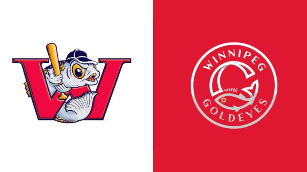
When revamping a logo, it can be tempting to go for a more modern look, which is often interpreted to entail stripping things down to create something simpler and more abstract. But that can be a risky strategy – especially when it comes to messing with sports fans' much-loved mascots. The Canadian baseball team the Winnipeg Goldeyes has just learned that the hard way, revealing a radical new look to widespread horror from fans.
The team's waved goodbye to its longstanding cartoon angry fish logo for an altogether sleeker design. Such an update might have worked just fine for many brands, but it just doesn't seem to say baseball like the old logo did. And fans don't like it at all (see our golden rules for logo design to avoid similar pitfalls with your own work).

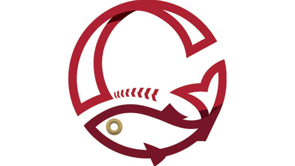
The team is named after a type of fish that's often served as a smoked delicacy locally. For decades, its logo has sported the eponymous freshwater creature wielding a baseball bat. It's now been radically simplified to show a much more abstract fish with a flopping tail that forms the bottom of a letter “G”. There’s a gold circle representing the fish’s eye and a faint waterline flowing through the bottom half of the logo.
According to the team, the overlapping elements represent “the rivers that join in the heart of Winnipeg and the location of our home ball park.” But for fans, no amount of symbolism can make up for the fact the goldeye is no longer a fierce cartoon character, but rather cold and flat. And for many, it just doesn't have anything to do with baseball.
One fan said on Twitter: "Looks like they should be launching a new line of fish sticks." Another commented: "This is so bad. Looks like it’s a certification on a tuna can. Looks bad in digital and will reproduce terribly on other mediums like print and embroidery."
The season may be done, but our journey continues...#LetsGoGoldeyes pic.twitter.com/BD7vRa64RTSeptember 7, 2021
The new logo does actually make an attempt to keep a baseball reference in there – at least we think. Look closely and it seems that the marks around the fish's head are designed to represent the stitching on a ball. It just takes a while to spot them – if you spot them at all.
Other than the unfortunate packaged fish comparisons, fans' biggest complaint is that the design is just too boring and lifeless. "Not impressed. Too dull and no character," one person tweeted. Another person said: "Looks like the team is transitioning into becoming a law firm. Terrible new look.... Most of the logos in the league are fun cartoons. You're named after a fish. Just put a cartoon fish on it, sell some hats to little kids, everyone eats a hotdog and has a nice day." Oh, and fans also reckon the fish's characteristic gold eye now looks like a Cheerio.
Get the Creative Bloq Newsletter
Daily design news, reviews, how-tos and more, as picked by the editors.

Sports fans are among the most difficult people to please with logo revamps. Wasps rugby supporters were very unhappy about their team's rebranding earlier this year, and in the US, basketball fans panned the NBA 75th anniversary logo. However, when a sports team gets it right, it can create an iconic logo that truly stands the test of time – see our list of the best sports logos of all time for examples.
If you want to try revamping your team's logo, check out the best prices available for Adobe's industry-leading creative apps below, and see our guide to the hottest logo design trends for inspiration.
Read more:

Thank you for reading 5 articles this month* Join now for unlimited access
Enjoy your first month for just £1 / $1 / €1
*Read 5 free articles per month without a subscription

Join now for unlimited access
Try first month for just £1 / $1 / €1

Joe is a regular freelance journalist and editor at Creative Bloq. He writes news, features and buying guides and keeps track of the best equipment and software for creatives, from video editing programs to monitors and accessories. A veteran news writer and photographer, he now works as a project manager at the London and Buenos Aires-based design, production and branding agency Hermana Creatives. There he manages a team of designers, photographers and video editors who specialise in producing visual content and design assets for the hospitality sector. He also dances Argentine tango.
