Windows 11 users discover controversial new design detail

When Windows 11 was revealed last month, it seems fair to say users weren't blown away. Many feel the UI is a flat-out copy of macOS, and others are unhappy with design touches such as the Start menu being moved to the centre of the screen. And now, users have spotted another surprise detail – and it might just be the most sacrilegious yet.
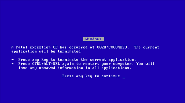
Nobody wants to see the 'Blue Screen of Death', the error page that means something's really (really) wrong with your PC. But at 30 years old, the BSOD has reached an almost affectionate level of infamy, to the point that its shock departure from Windows 11 has users feeling a little, well, blue. Because what use is one of the best laptops for graphic design if it doesn't feature a blue screen telling you you've just lost all your work?
Microsoft's famous Blue Screen of Death (BSOD) is changing to black in Windows 11. It's the first big change to the BSOD since the sad face was added in 2012. Details here: https://t.co/ARCRBQjSMM pic.twitter.com/wv1J6RFqtxJuly 1, 2021
As first spotted by The Verge, the famous Blue Screen of Death is now the Black Screen of Death (at least it's still the BSOD, eh?) – which, we have to say, sounds even more sinister. But seeing as the blue screen has been a symbol of catastrophe since the early 90s, we're a little sad to see it go. And it seems we're not alone.
😥 RIP Blue Screen of Death BSOD https://t.co/VeWKcUxbyaJuly 1, 2021
Nooooo... the old ways must be honored. // Microsoft’s Blue Screen of Death is changing to black in Windows 11 https://t.co/IJkPqKe380July 2, 2021
The Blue Screen of Death first appeared on Windows 3.0 in the early nineties. It's been a mainstay ever since, with the most major recent change being the addition of a sad face in 2012's Windows 8 (because what could be more comforting when you've just lost hours of work than a sad emoticon?).

While Microsoft itself hasn't acknowledged the update in its official Windows 11 release notes, it's made its way into the first Insider Preview for beta users. Time will tell whether Microsoft opts to go back to blue in future releases, but for now, it appears to be the end of an error (sorry). If you'd rather never see a BSOD of either the black or blue variety, check out today's best Mac deals below.
Read more:
- The Sony PlayStation logo as you've never seen it before
- Is this cancelled Apple product about to make a surprise comeback?
- Real-life Studio Ghibli rooms are serious interior design goals
Daily design news, reviews, how-tos and more, as picked by the editors.

Daniel John is Design Editor at Creative Bloq. He reports on the worlds of design, branding and lifestyle tech, and has covered several industry events including Milan Design Week, OFFF Barcelona and Adobe Max in Los Angeles. He has interviewed leaders and designers at brands including Apple, Microsoft and Adobe. Daniel's debut book of short stories and poems was published in 2018, and his comedy newsletter is a Substack Bestseller.
