I Have Nothing but respect for Whitney Houston's new branding
This visual identity is sleek yet playful.
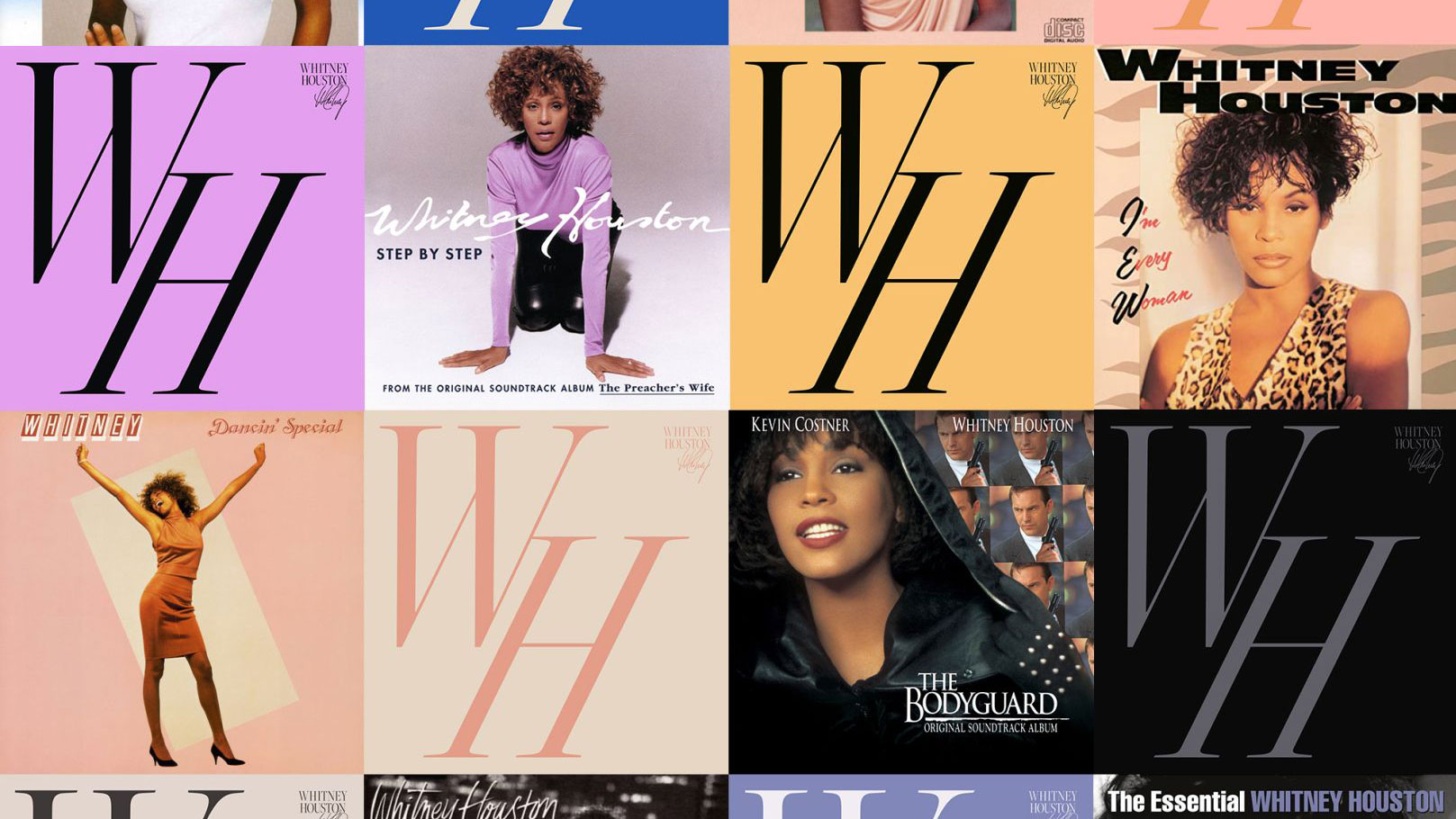
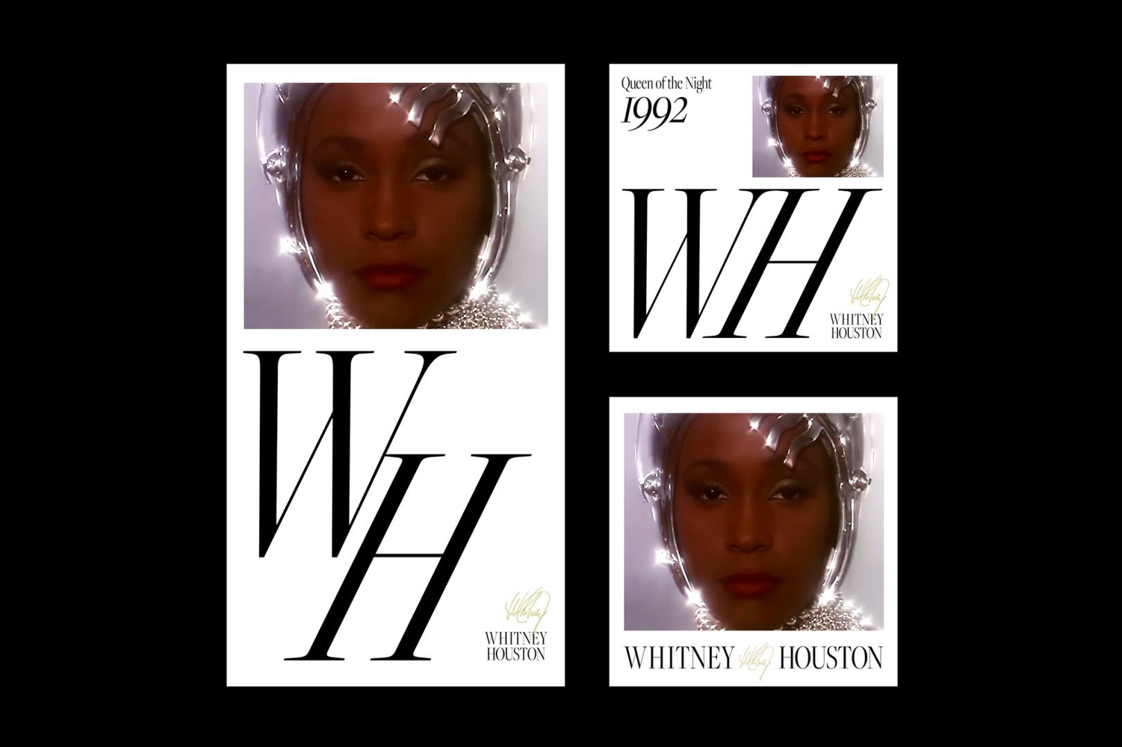
Whitney Houston has been rebranded for the digital space, with a whole new visual identity based on iconography, typography and design found across her vast collection of works. The new branding – commissioned by Sony – aims to encapsulate the star's identity for a modern audience. It's a huge ask to redefine a legend for a modern, online space, but we think the project is an overwhelming success.
The new identity will accompany Houston's work wherever you find it officially placed by Sony, from on Spotify to Sony-owned interviews and everywhere in between. Consisting of a dynamic monogram logo, new colour palette and brand-new typography, we're big fans of the sleek aesthetic that somehow remains playful, and feels classic all at the same time. We especially appreciate the inclusion of Houston's handwritten signature (below). See our monogram logo list to compare it to some other favourites.
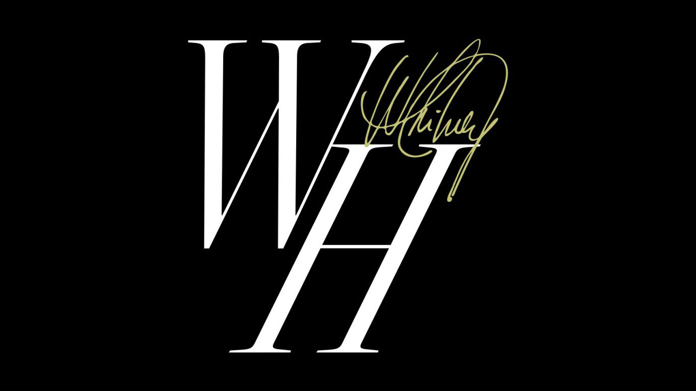
Swedish designer Erik Herrström designed the iconography to be fluid, allowing it to be used across the online space seamlessly. This means instances where the monogram logo is duplicated to fill the background (below), and others where you'll find the logo moving to intersect with other page elements such as photos. It's a clever approach, which feels as iconic as the singer herself.
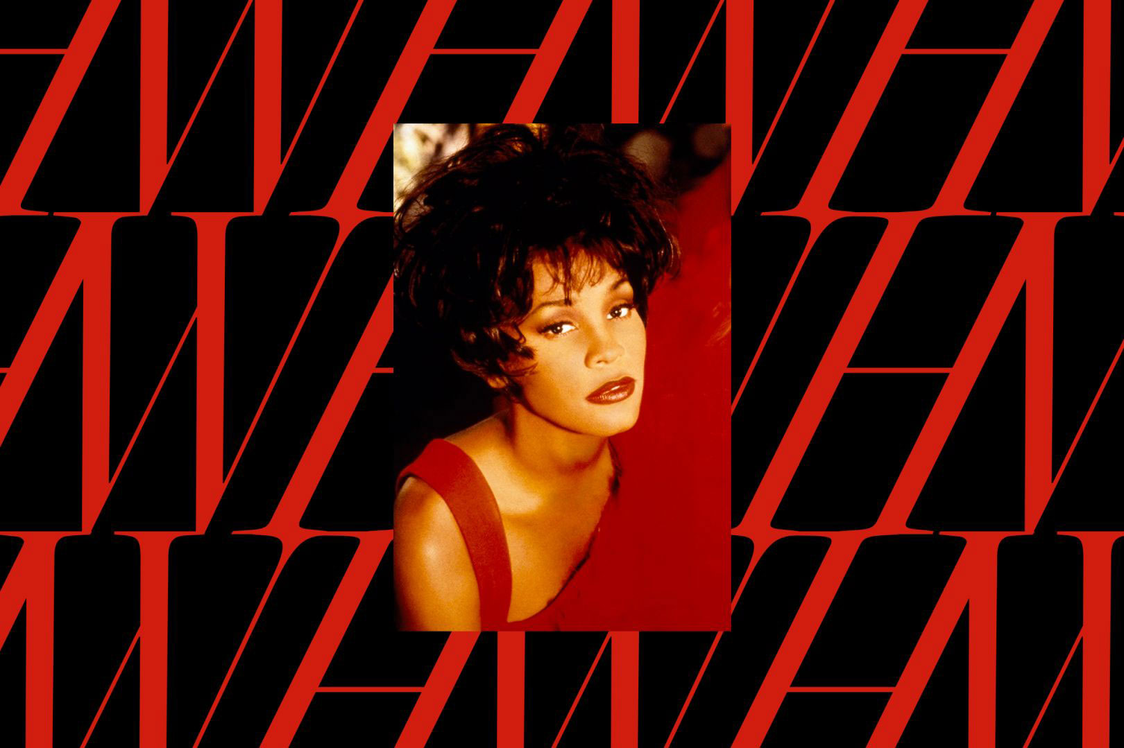
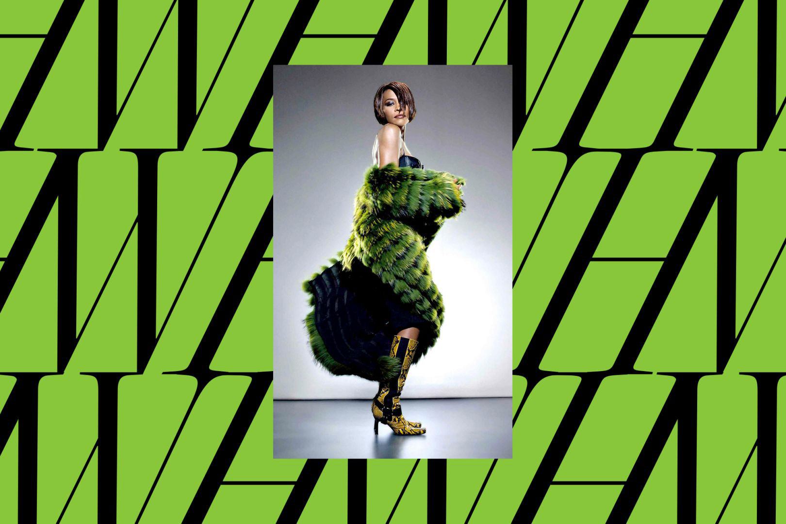
And that wasn't an accident, of course. Herrström scoured Houston's back catalogue of merchandising, discography and branding to find the perfect look – and conceived the logo when he found the use of her initials in the All The Man I Need video. The colour palette was decided on in a similar way, he told Creative Boom. The chosen colours provide flexibility for Houston's range of musical eras – defining colours for each period in her career and range from a classy monochrome to bright green (below), but the selections remain cohesive. You can check out the whole rebrand on Behance.
With I Wanna Dance With Somebody currently showing in theatres, Houston is having a moment back in the spotlight, and this rebrand has come at a brilliant time. But one place she didn't appear was in the iconic The Bodyguard movie poster – did you know about the secret behind this image? We explain all.
Read more:
- Arsenal Stadium is undergoing a deliciously retro makeover
- Apple's touchscreen MacBook can't come soon enough
- How to design a logo: 15 pro tips
Get the Creative Bloq Newsletter
Daily design news, reviews, how-tos and more, as picked by the editors.

Thank you for reading 5 articles this month* Join now for unlimited access
Enjoy your first month for just £1 / $1 / €1
*Read 5 free articles per month without a subscription

Join now for unlimited access
Try first month for just £1 / $1 / €1

Georgia is lucky enough to be Creative Bloq's Editor. She has been working for Creative Bloq since 2018, starting out as a freelancer writing about all things branding, design, art, tech and creativity – as well as sniffing out genuinely good deals on creative technology. Since becoming Editor, she has been managing the site and its long term strategy, helping to shape the diverse content streams CB is known for and leading the team in their own creativity.
