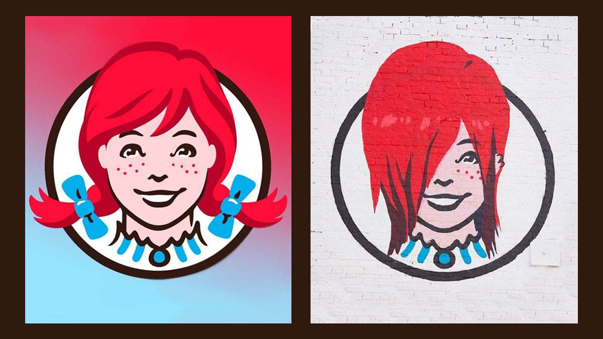
The Wendy's logo can truly be described as iconic, and not just because of its alleged hidden message (more on that later). Featuring a fun drawing of Melinda-Lou 'Wendy' Thomas, daughter of founder Dave Thomas, the basic design has barely been changed since the company launched in 1969.
The most recent update was a whole 10 years ago (it's as old as us! It's our ten year-anniversary this year). That simplified matters, incorporating a new, friendlier drawing and a more modern hand-script font. But it still didn't stray very far from the original design, which has helped make Wendy's the third biggest burger chain after McDonald's and Burger King.
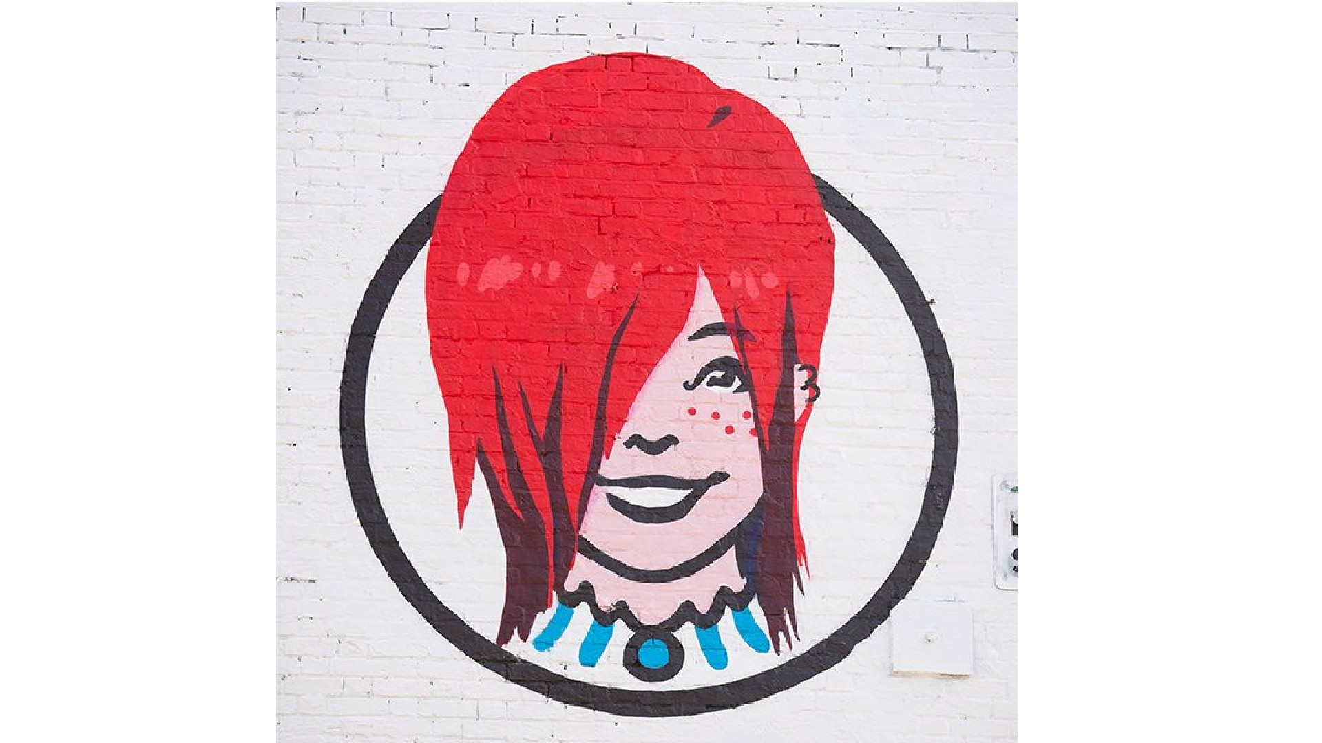
It's quite a shock, then, to see Wendy's launch a radical new logo mascot. Melinda-Lou has been reimagined with an emo look featuring a sideswept fringe, black streaks and a double ear-piercing (UPDATE: we've since also seen the Wendy's logo go grey).

And let's be clear: this is not a speculative design or fan remake, but appears on the side of an actual Wendy's restaurant, as spotted by Alt Press and shared in the tweet below.
what if we…. kissed outside the emo wendys? @Wendys pic.twitter.com/8Mwko14vwZJuly 17, 2022
We love the new look, but note that it's strictly a one-off... for now, anyway. This special logo has been created for a new branch of Wendy's that's just opened in London's iconic Camden Town. (If you're in the UK capital and want to see it for yourself, it's just opposite the Tube exit, on 189 Camden High Street.)
Created in partnership with Camden Open Air Gallery, the emo design appears on the side of the store, underneath a sign showing the main Wendy's logo, just in case anyone is confused about what they're looking at.
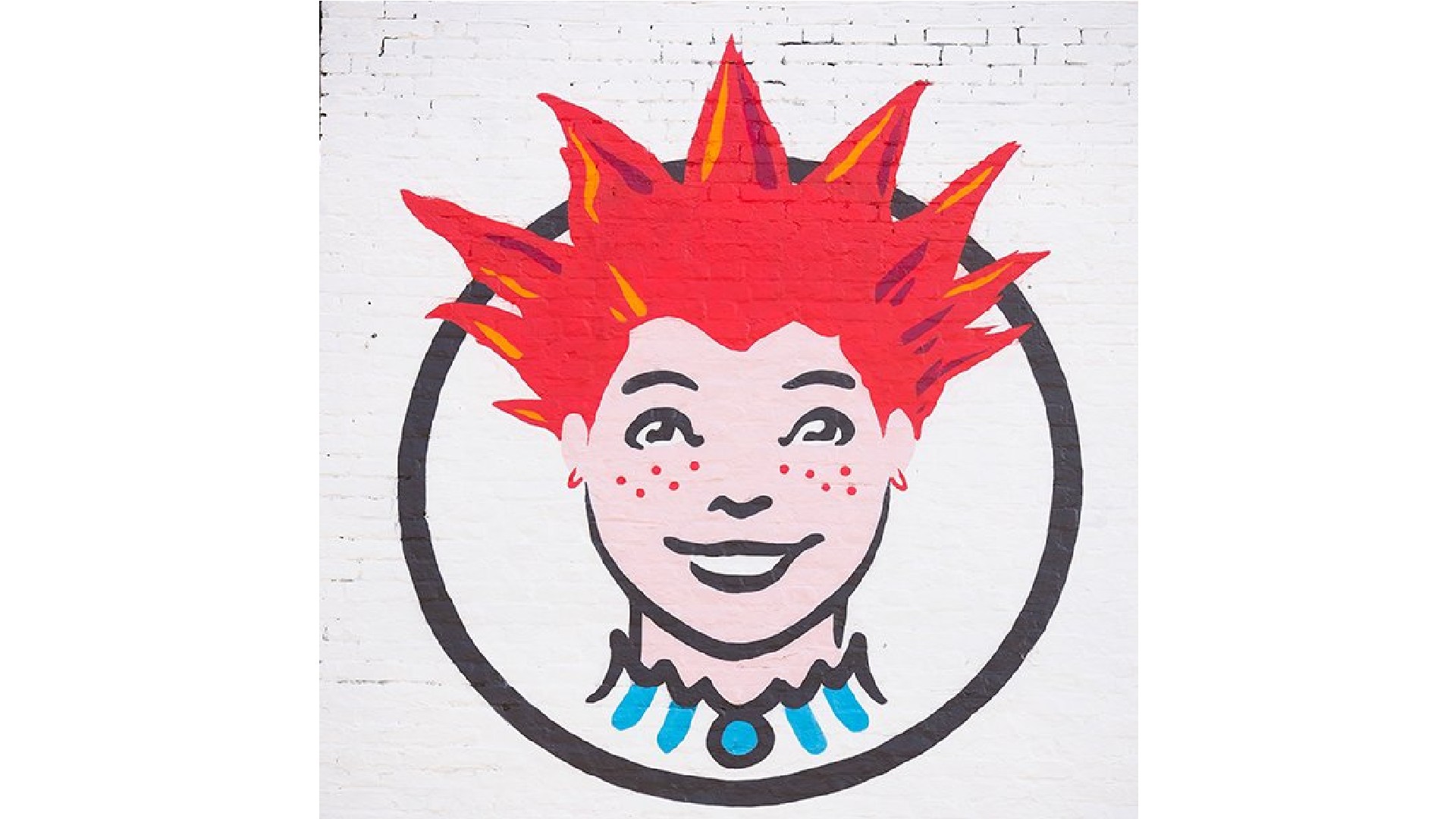
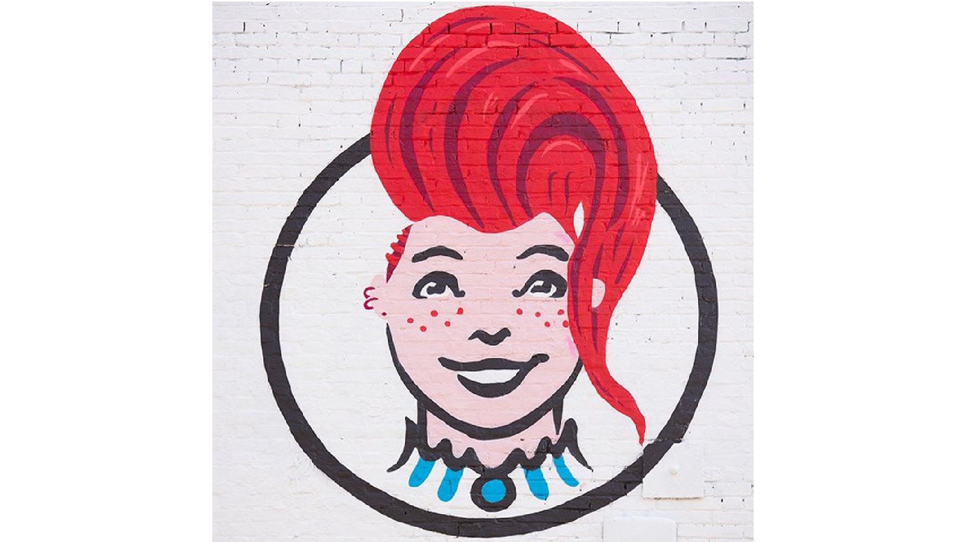
The logo was chosen out of a possible three designs Wendy's put to its Twitter audience last month, including a punk version of Wendy and one with a bouffant quiff. Each design reflects Camden's long history as an epicentre of UK music and fashion, as well as its popular and innovative street market.
Get the Creative Bloq Newsletter
Daily design news, reviews, how-tos and more, as picked by the editors.


We'll be honest, though: we'd love to see any of these designs rolled out further. And the UK would be a great place to trial them, as it's a nation where Wendy's isn't hugely well known (Camden is only its eighth outlet), so the risk of losing brand capital would be fairly low.
We'd love, too, to see Wendy's push these logo looks further into the 2010s and 2020s. A VSCO Girl Wendy, a morute Wendy or a vaporwave Wendy, for example, would truly be a sight worth seeing! For now though, we'll just keep ourselves busy looking at the Wendy's logo hidden message we covered earlier this year.
Read more:

Thank you for reading 5 articles this month* Join now for unlimited access
Enjoy your first month for just £1 / $1 / €1
*Read 5 free articles per month without a subscription

Join now for unlimited access
Try first month for just £1 / $1 / €1

Tom May is an award-winning journalist and editor specialising in design, photography and technology. Author of the Amazon #1 bestseller Great TED Talks: Creativity, published by Pavilion Books, Tom was previously editor of Professional Photography magazine, associate editor at Creative Bloq, and deputy editor at net magazine. Today, he is a regular contributor to Creative Bloq and its sister sites Digital Camera World, T3.com and Tech Radar. He also writes for Creative Boom and works on content marketing projects.
