Last June, a mock-up logo design for Warner Bros. Discovery, a new partnership between Warner Bros. and Discovery, Inc, was leaked. The obscure golden design (see below) received plenty of criticism, with people saying that the design looks like it was made with Microsoft's WordArt. But now, Warner Bros. has finally revealed the actual design – and it's not a lot better.
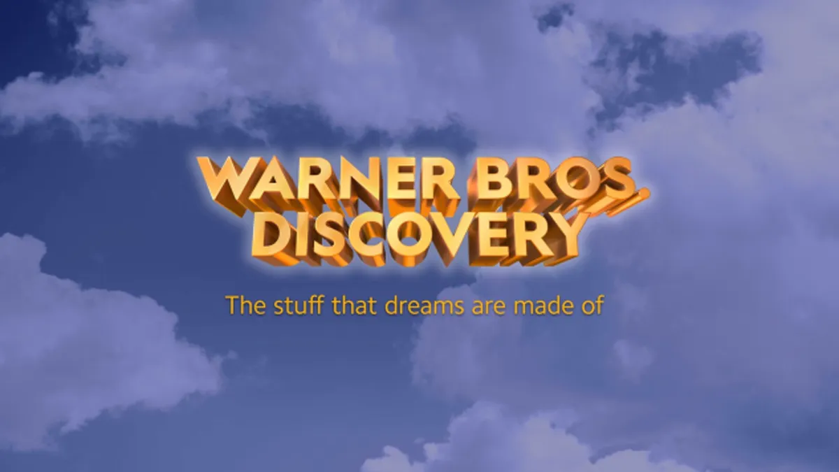
The new logo (see above) features a minimalistic design with a simplified wordmark. And while the fresh look is meant to celebrate the collaboration between the companies, I can't help but feel a little underwhelmed by it. If you're looking to create your own logo but aren't sure where to start, then make sure you check out our guide on how to design a logo.
The leaked design was not popular (Image credit: Warner Bros.)
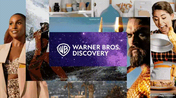
The new design (see below), based on the famous Warner Bros shield, sports a simplistic yet bold look. There's also an alternative logo in all white (see top of the page), which looks a lot smarter than its garish yellow/blue counterpart (and a hell of a lot better than that golden wordmark and Warner's 100th anniversary design).
Latest Videos From Creative Bloq
The logo was designed by Chermayeff & Geismar & Haviv, who explain that the look reflects Warner Bros. Discovery's goal "to establish a creative powerhouse that builds on its history as well as its unmatched talent and vision for the future". Chief Corporate Affairs Officer of Warner Bros, David Leavy said, "With great reverence to the heritage of Warner Bros., our mark is the perfect banner for our new company".
What do you think about the new look? (Image credit: Chermayeff & Geismar & Haviv/Warner Bros. Discovery)
Partnered with a Sans Serif font, the logo certainly looks a lot slicker than the previous 3D golden design, but its oversimplified look is fairly uninspiring. Warner Bros. is responsible for some of the most magical movies of all time (quite literally – Warner made Harry Potter after all), so I feel like the logo should reflect the imagination and creativity of its movies. Perhaps a livelier font would give the logo a little more flair (maybe one of the typefaces from our roundup of the best free fonts would do the trick).
If you're feeling inspired and fancy having a go at designing your own logo, then why not download Photoshop and get creating? Or if you'd rather just have a good old-fashioned movie binge, then make sure you sign up to Disney Plus.
Read More:
Get the Creative Bloq Newsletter
Daily design news, reviews, how-tos and more, as picked by the editors.
Amelia previously worked as Creative Bloq’s Staff Writer. After completing a degree in Popular Music and a Master’s in Song Writing, Amelia began designing posters, logos, album covers and websites for musicians. She covered a range of topics on Creative Bloq, including posters, optical illusions, logos (she's a particular fan of logo Easter eggs), gaming and illustration. In her free time, she relishes in the likes of art (especially the Pre-Raphaelites), photography and literature. Amelia prides herself on her unorthodox creative methods, her Animal Crossing island and her extensive music library.