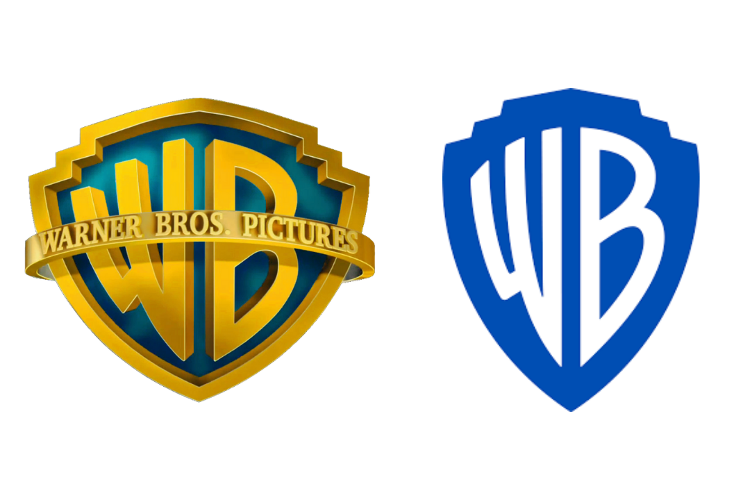
New Warner Bros logo is not what we were expecting
(But fans are loving the surprise.)
Way back in the halcyon days of 2019, we learned that Warner Bros (the studio behind series from Looney Tunes to Harry Potter) would be celebrating its centenary with a brand new logo. Over a year later, the design has finally appeared on screen – and it isn't quite what we were expecting.
As shared by Cartoon Crave on Twitter (below), the new logo has appeared in front of the brand new HBO Max original film, Locked Down. Like all of the best logos of all time, the new design remains instantly recognisable – but it seems the refreshed logo has been tweaked since it was first revealed in 2019.
Here's a better look at the new Warner Bros. Pictures logo. pic.twitter.com/oANQNvXEOQJanuary 14, 2021
Designed by Pentagram, the new logo (below) is based on the original, which has been with Warner Bros since 1923. But with the gold shield now blue and metallic lettering now a striking white, the new design is yet another entrant to the flat design party. Or so we thought.

Based on the version of the logo spotted in front of Locked Down, it seems Warner Bros has decided to bring back a touch of shine. Indeed, the edge of the shield has now been rendered in a metallic silver, as has the 'WB' lettering, which is no longer starkly white. Perhaps Warner Bros simply decided a little more shine was needed in 2021 – or perhaps it decided to heed the advice of disgruntled fans who preferred the retro version to 2019's flat design.
Either way, it seems Warner Bros has managed to find a happy medium between flat design and skeuomorphism. And judging by the response on Twitter, the studio has finally got it right.
The new Warner Bros logo looked beautiful. pic.twitter.com/XVGOgXlymfJanuary 15, 2021
So this is officially the new Warner Bros logo sequence. And I already love it! It’s modern but not cheap and the inclusion of the water tower at the beginning was perfect. It’s gonna take a lot of getting used to but I can tell effort was put. pic.twitter.com/bapHidcosYJanuary 14, 2021
This is a great new logo for @warnerbros! https://t.co/CilFWvoPGhJanuary 14, 2021
While flat design has been all the rage for years with everyone from BMW to Burger King opting for flat versions of their old or existing logos, it seems things could soon swing back in the other direction. Like Warner Bros, Apple seemed to suffer a design identity crisis recently, with its MacOS Big Sur logos unable to decide whether they're flat or 3D. But if you're about to embark on a design project, don't worry – our logo design guide will help make sure it doesn't fall flat.
Read more:
Get the Creative Bloq Newsletter
Daily design news, reviews, how-tos and more, as picked by the editors.

Thank you for reading 5 articles this month* Join now for unlimited access
Enjoy your first month for just £1 / $1 / €1
*Read 5 free articles per month without a subscription

Join now for unlimited access
Try first month for just £1 / $1 / €1

Daniel John is Design Editor at Creative Bloq. He reports on the worlds of design, branding and lifestyle tech, and has covered several industry events including Milan Design Week, OFFF Barcelona and Adobe Max in Los Angeles.
