The new Warner Bros. logo is an embarrassment of riches
Iconic characters galore.

We've seen plenty of new logos arrive in 2022, with varying degrees of success. For every brilliant new NBC peacock, there's an illegible Kia wordmark – but in a late entry for the most ostentatious logo drop of the year, Warner Bros has gone and given us tons of variations of its brand new centenary design.
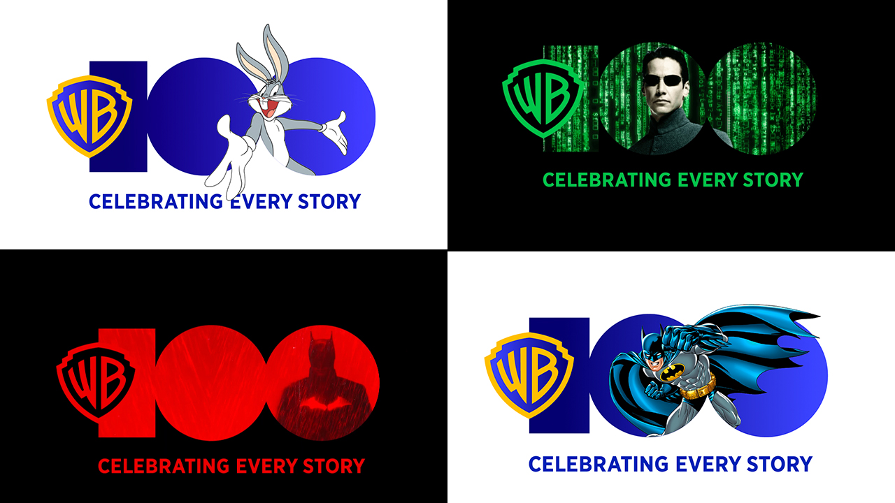
The studio's 100th anniversary logo is simple enough, feauturing a flat, geometric '100' beside the classic WB logo. But the simplicity has allowed for a whole bunch of playful compositions featuring Warner Bros.'s most beloved characters. (Looking for more inspiration? Check out the best logos of all time.)
The design, by creative agency Chermayeff & Geismar & Haviv, involves "every division of the studio, from home entertainment to video games, from consumer products to live events." The tagline for the campaign is "Celebrating every story," which, based on the amount of different applications of the logo, sounds about right.
From Batman to Superman, via Bugs Bunny, Harry Potter and The Matrix's Neo, it seems pretty much every Warner Bros. character is getting a look in. In most cases the image simply sits inside the '100', although a few examples are more three-dimensional, with characters bursting out of the logo.
The campaign even includes a delightful animated version of the logo (below), in which Looney Tunes' Wile E. Coyote crashes into, turning it from 3D shapes to the final, flat design.
As the studio explains, "The logo combines the newly redrawn Warner Bros. Discovery shield we created, and a bold 100 graphic in a dramatic, eye-catching composition. The bold, geometric numberforms provide a weighted counterbalance to the fine lines of the new outlined shield, and the overall capacious mark allows for playful compositions featuring the studio’s intellectual property."
Get the Creative Bloq Newsletter
Daily design news, reviews, how-tos and more, as picked by the editors.
Indeed, in a world of minimal designs, it's great to see a brand having fun so much fun with its logo. And, unlike the new Kia wordmark, we can happily say that '100' is entirely legible. Looking for logo design tips? Check out our guide on how to design a logo.
Read more:

Thank you for reading 5 articles this month* Join now for unlimited access
Enjoy your first month for just £1 / $1 / €1
*Read 5 free articles per month without a subscription

Join now for unlimited access
Try first month for just £1 / $1 / €1

Daniel John is Design Editor at Creative Bloq. He reports on the worlds of design, branding and lifestyle tech, and has covered several industry events including Milan Design Week, OFFF Barcelona and Adobe Max in Los Angeles.
