Turns out the Walmart logo isn't what you think it is
Sun? Nope. Flower? Nope.
There are some logos designs we see so often that we don't stop to think about what they're actually meant to represent. Sure, some don't require much thought (we're fairly sure the Apple logo is an apple), but others are a little more abstract – like Walmart's.
Some assume they're looking at a flower, others a sun. But according to a blog post on the company's website, those yellow lines in the shape of a circle represent something else entirely. (Looking for more inspiration? Check out the best logos of all time).

"In 1962, A spark of inspiration led Sam Walton to open the first Walmart," begins the blog post at The Walmart Digital Museum (who knew such a thing existed, eh?). The post goes on to explain that the symbol is in fact - you guessed it – a spark.
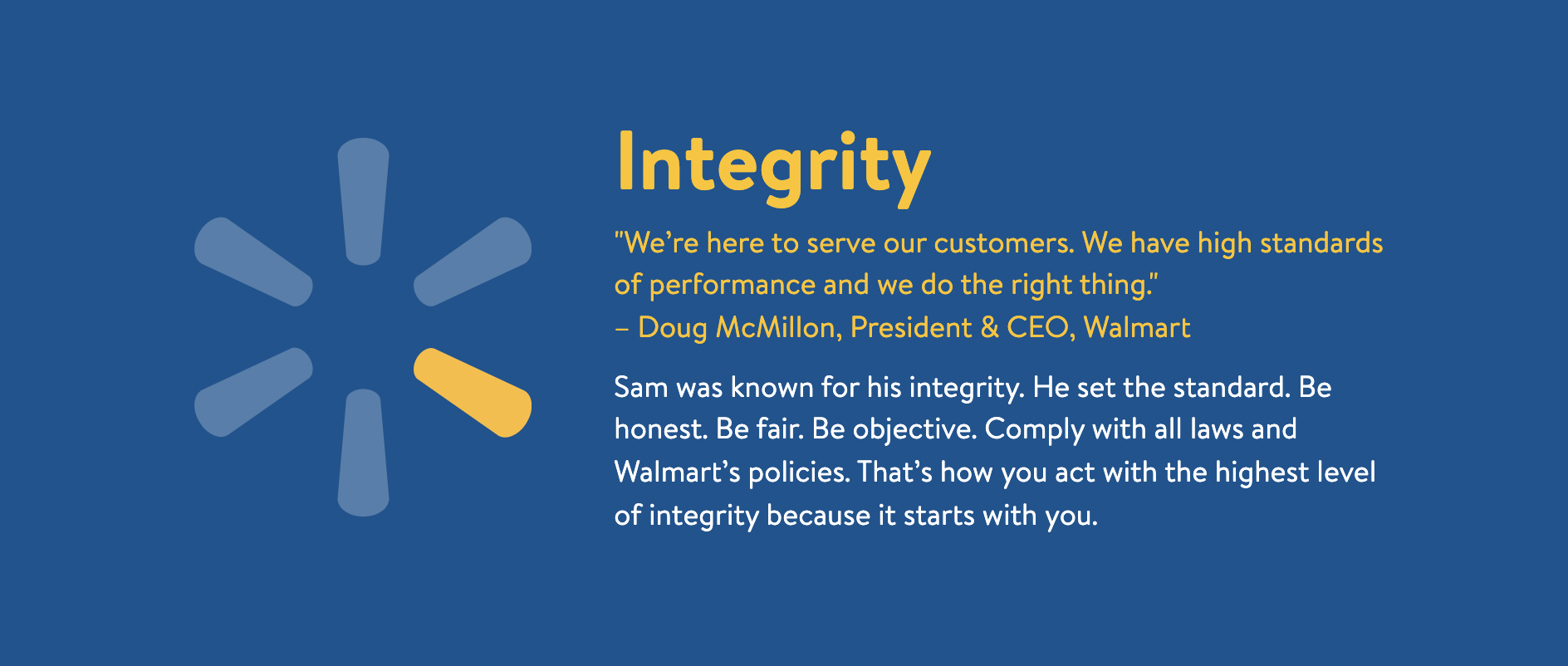
Article continues belowBut did you know that each of the 6 parts of the spark are officially called 'sparklets'? Us neither – and we're not sure how we feel about it. According to Walmart, the sparklets (sorry) represent the customer, respect, integrity, associates, service, and excellence.


The 'spark' logo was introduced in 2008 as part of a major rebrand for Walmart. Before then, it took the form of a wordmark featuring a star between 'Wal' and 'mart'. In a statement, Walmart called the new logo "a symbol of all of the great ideas that have helped to develop our company over the years. And it’s a symbol of the inspiration that’s inside all of us."
So there we have it. It isn't a flower, it isn't a sun – it's a spark. And it's by no means the only famous logo with a secret meaning we've seen lately – from Starbucks to Toyota, we've seen all sorts of logo surprises. And there are icon surprises too, just like the power button. But not every meaning or resemblance is deliberate – just ask Tesla.
Sign up to Creative Bloq's daily newsletter, which brings you the latest news and inspiration from the worlds of art, design and technology.

Daniel John is Design Editor at Creative Bloq. He reports on the worlds of design, branding and lifestyle tech, and has covered several industry events including Milan Design Week, OFFF Barcelona and Adobe Max in Los Angeles. He has interviewed leaders and designers at brands including Apple, Microsoft and Adobe. Daniel's debut book of short stories and poems was published in 2018, and his comedy newsletter is a Substack Bestseller.
