Wahaca rebrand looks good enough to eat
A clean identity accompanies the Mexican chain's expansion.

Scaling an identity to keep up with your growth is a problem that faces a lot of brands. For Mexican restaurant Wahaca, going from a start-up to a chain meant refining its image without turning its back on its heritage, and defining its mission statement in a new logo design. No mean feat, but it's done it with style.
Launched this week, the new identity created by London studio Without sees Wahaca do away with its shabby chic aesthetic, which was once ahead of its time.

Distressed furniture was revolutionary back when Thomasina Miers and Mark Selby opened the first Wahaca restaurant in 2007, but since it started opening more branches outside of London, the Mexican eatery started to lose focus on the graphic design front.
"As [the brand] expanded, I think the team needed a bit more guidance as to how to set things up in say, a shopping centre in Manchester," Without's creative director Roly Grant told Creative Review. "On a technical level, [the identity] needed to be a bit simpler and a bit more robust."

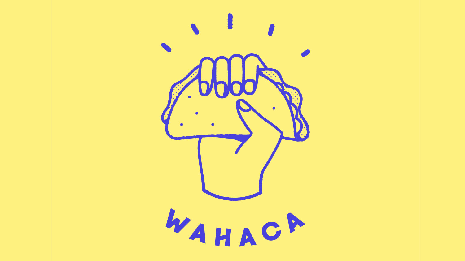
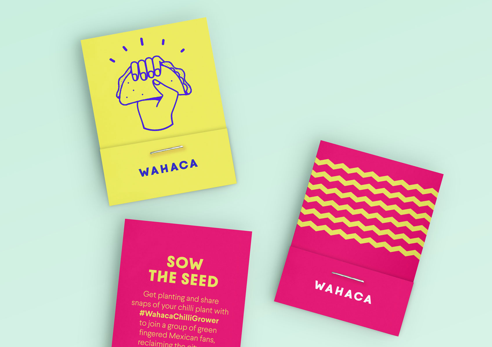
Through close collaboration with Miers and Selby, Without has created a straightforward aesthetic that packs a punch. Take the new logo, which sees a taco raised defiantly in a fist. As well as looking polished, the design and reduced colour palette also identifies Wahaca's territory as a Mexican restaurant that offers fresh, flavoursome food.
"We also liked this idea that it was quite political," Grant adds. "This fist raised in the air was a symbol of where Wahaca started which was [telling consumers] 'forget about cheesy nachos and tequila shots – come to a place that serves real Mexican food'."

There's more to Wahaca than just tacos, though. And part of the rebrand's mission was to position Wahaca as a place for sunny, vibrant food. This extends to the new identity's bespoke typography, which pairs bright pinks, purples and blues with distinctive slanted crossbars that channel a zig zag motif found on menus and marketing material.
Get the Creative Bloq Newsletter
Daily design news, reviews, how-tos and more, as picked by the editors.
Now armed with a more manageable set of assets, Wahaca's internal designers will find it easier to represent the chain across its communications. Grant sums it up best by saying, "The point was reducing [Wahaca] down to some really bold elements that can be used across a variety of things."
Related articles:

Thank you for reading 5 articles this month* Join now for unlimited access
Enjoy your first month for just £1 / $1 / €1
*Read 5 free articles per month without a subscription

Join now for unlimited access
Try first month for just £1 / $1 / €1

Dom Carter is a freelance writer who specialises in art and design. Formerly a staff writer for Creative Bloq, his work has also appeared on Creative Boom and in the pages of ImagineFX, Computer Arts, 3D World, and .net. He has been a D&AD New Blood judge, and has a particular interest in picture books.
