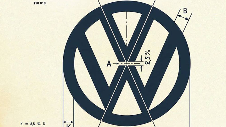
Old VW logo specs will make you grateful for Illustrator
Ever wondered how logos were designed before digital art software?

German car manufacturer Volkswagen boasts one of the most world's most recognisable logos. And thanks to some recently shared vintage specifications, we can take a look at the fascinating precision that went into creating it.
With its straightforward, stripped back aesthetic, the Volkswagen logo perfectly reflects the ergonomic elegance that has come to define the brand's vehicles. It's a textbook example of our logo design advice in action.
On the face of it, the design might just appear to be the letters 'VW' sitting in a circle. But the logo's composition is so deceptively harmonious that your brain appreciates that it works, perhaps without immediately knowing why.
Don't believe us? Just take a look at these vintage specifications for the logo, which have recently ignited an excited conversation on Reddit's r/Design channel.

As you can see, the angles and the spacing of the various design elements are all clearly labelled in relation to one another.
But what's really got people engaged is that these specifications pre-date vector files. Just imagine trying to create something so precise by hand, without the help of logo design tools such as Adobe's Illustrator CC.
This explains why the specifications were so precise and clear, too. The plans for the VW logo ensure that it will look the same no matter the scale, which helps to keep the Volkswagen brand consistent.
Get the Creative Bloq Newsletter
Daily design news, reviews, how-tos and more, as picked by the editors.
In a time before digital art tools were commonplace this consistency required more clarity to achieve, because you couldn't just sling over a vector file to a client or agency. Thanks goodness for the best digital art software for making our lives easier.
This really highlights the importance of drawing things with optical proportions instead of technical ones
In the comments section in response to these plans, creators have taken a moment to marvel the old school approach to logo design. "This is fascinating, and really highlights the importance of drawing things with optical proportions instead of technical ones," says user SyntheticEverything.
Meanwhile, user cream-of-cow explains when the landscape of logo design changed. "Up until the mid 1990s, many design schools were still this precise, this was for someone to reproduce or make the logo in 3D form."
"Nowadays, everything is computer perfect, I don't recall when's the last time I had to call out the size of something unless it was for 'if smaller/larger than X-dimensions, use this version of the logo'," they add.
So have designers lost something with the rise of vector files and digital tools such as the best iPad apps? Not necessarily. But as the amusing tweet from Logo Geek points out (below), if you're going to rely on grids to help refine and perfect your mark, don't let them lead the design process. Otherwise you can end up with some pretty mangled results...
For those using grids... Design the logo first, then recreate/rework the logo AFTER using grids and guides as a way to refine and perfect the mark. Don’t let grids dictate the design. Create something beautiful first, then perfect after👌🏻 pic.twitter.com/8SzYS6DmFBJuly 7, 2019
If these specifications have got you eager to start creating a logo of your very own, check out our guide to the best free logo design tools. Of course, you can always just pick up a pencil and a protractor and do it the VW way.
Related articles:

Thank you for reading 5 articles this month* Join now for unlimited access
Enjoy your first month for just £1 / $1 / €1
*Read 5 free articles per month without a subscription

Join now for unlimited access
Try first month for just £1 / $1 / €1

Dom Carter is a freelance writer who specialises in art and design. Formerly a staff writer for Creative Bloq, his work has also appeared on Creative Boom and in the pages of ImagineFX, Computer Arts, 3D World, and .net. He has been a D&AD New Blood judge, and has a particular interest in picture books.
