These painful volume controls show how not to do UI
Turn these down.

Volume control UX is one of those things that you don't notice when it works, but when it goes wrong, it can be incredibly frustrating. Anyone who's ever spent time tapping and waving at their headphones in an attempt to get them to work, or spent a while peering at their screen and making minute adjustments with their mouse in an attempt to get the volume they want will know what we're talking about.
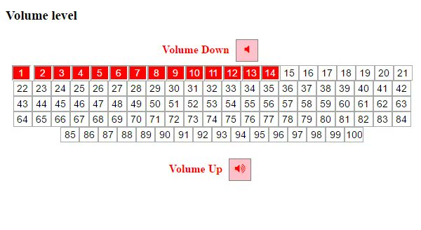
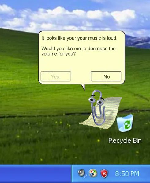
When it comes to volume control on a computer or phone, Twitter user @0xDesigner has gathered up some of the absolute worst examples, which initially came from a Reddit thread of developers, who competed to make the worst volume control interface back in 2017. The results are worth a look. They range from the overly complicated:

To the nostalgic (and not in a good way):

And there are plenty more in-between. A few more of our favourites are below:
6/ pic.twitter.com/zBO44GddMOApril 2, 2023
9/ pic.twitter.com/BPIgLPbe4QApril 2, 2023
19/ pic.twitter.com/sMR5jaIcwCApril 2, 2023
We recommend checking out the full thread and the original Reddit post. And if you want to make sure you avoid making such abominations in your next project, see our best UI design tools, and take note of more UI design fails, including the lessons you can learn from them.
Read more:
- 14 design fails that were so bad they were actually good
- The video game UI design fail that's driving players wild
- The 7 golden rules of UX design
Get the Creative Bloq Newsletter
Daily design news, reviews, how-tos and more, as picked by the editors.

Thank you for reading 5 articles this month* Join now for unlimited access
Enjoy your first month for just £1 / $1 / €1
*Read 5 free articles per month without a subscription

Join now for unlimited access
Try first month for just £1 / $1 / €1

Rosie Hilder is Creative Bloq's Deputy Editor. After beginning her career in journalism in Argentina – where she worked as Deputy Editor of Time Out Buenos Aires – she moved back to the UK and joined Future Plc in 2016. Since then, she's worked as Operations Editor on magazines including Computer Arts, 3D World and Paint & Draw and Mac|Life. In 2018, she joined Creative Bloq, where she now assists with the daily management of the site, including growing the site's reach, getting involved in events, such as judging the Brand Impact Awards, and helping make sure our content serves the reader as best it can.
