Virgin Money’s new look tries to be fun (but not too fun)
Is Pentagram's latest rebrand on the money?
While the financial services industry isn't exactly synonymous with fun, exciting or indeed 'cool' graphic design, the arrival of challenger banks like Monzo has certainly seen it move in a more creative direction. Virgin Money has now revealed a brand new identity designed to appear more friendly and approachable – but is it on the money?
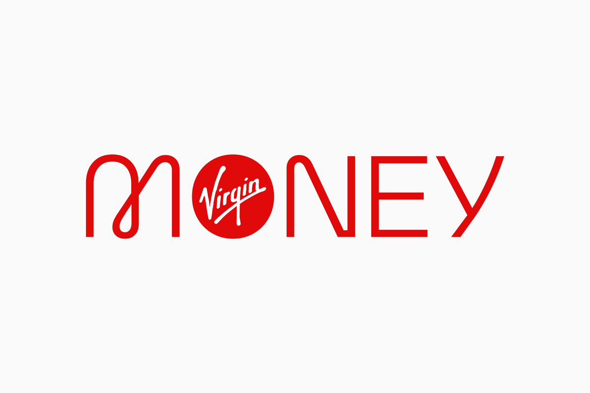
The rebrand by Pentagram is designed to shift Virgin Money away from the "faceless, corporate look" of other banks, and includes a bespoke mono-linear wordmark as well as two new typefaces. (For more typographical inspiration, check out our best free fonts.)

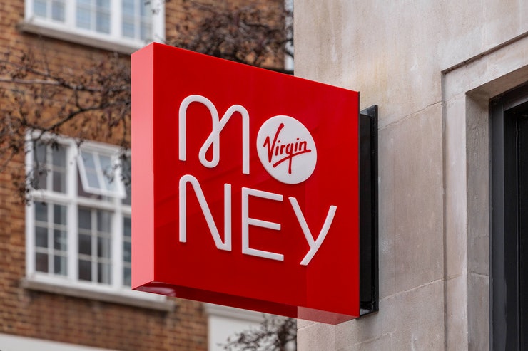
The new wordmark (above) features a "carefully crafted" balance of curves and hard angles, and can be presented either horizontally or stacked (below). Pentagram says this is ideal for applications where users are "already familiar with the brand", or where horizontal space is limited – such as bank cards.

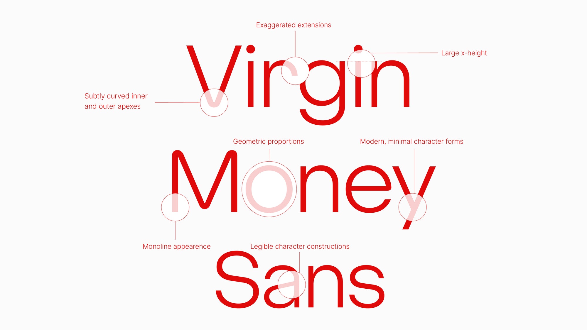
Pentagram also commissioned typographer Luke Prowse to create the two new typefaces. Virgin Money Sans (below) features a combination of geometric curves and hard edges, in an attempt to convey Virgin Money's "functional and pragmatic side while embodying its people-centred approach."
Virgin Money Loop, meanwhile, is a modified version with the distinctive 'loop' element of the new wordmark incorporated into each character, adding an extra level of "visual personality".

In acknowledging the need to capture Virgin's Money's functional side as well as its supposed "friendly and approachable" side, perhaps Pentagram highlights the unique challenge of rebranding a bank. Indeed, the catch-22 of balancing fun-but-not-too-fun with serious-but-not-too-serious is no doubt difficult to navigate, but it's fair to say Pentagram has pulled it off here.
The 'loop' feature of the wordmark and the rounder typeface certainly add more personality than could be found in the previous branding (below), and in managing to inject some much-needed friendliness to Virgin Money's identity, we'd say Pentagram's rebrand is a success. As much as we'd like to have seen more visual flourishes, or some bolder colour choices (it's all about Virgin's signature red here), the rebrand feels both safe and approachable – which is probably as much as we can ask for.
Get the Creative Bloq Newsletter
Daily design news, reviews, how-tos and more, as picked by the editors.

While Virgin Money's friendly new look is unlikely to become one of the most hated rebrands of the year, neither is among the most exciting we've seen lately. Thankfully, we've seen lots of brilliant examples in 2020, from Rolls-Royce's detail-driven triumph to Hello Fresh's clean new look.
Read more:

Thank you for reading 5 articles this month* Join now for unlimited access
Enjoy your first month for just £1 / $1 / €1
*Read 5 free articles per month without a subscription

Join now for unlimited access
Try first month for just £1 / $1 / €1

Daniel John is Design Editor at Creative Bloq. He reports on the worlds of design, branding and lifestyle tech, and has covered several industry events including Milan Design Week, OFFF Barcelona and Adobe Max in Los Angeles. He has interviewed leaders and designers at brands including Apple, Microsoft and Adobe. Daniel's debut book of short stories and poems was published in 2018, and his comedy newsletter is a Substack Bestseller.
