Bizarre new Virgin Galactic logo fails to take off
Interstellar symbol is less than stellar.

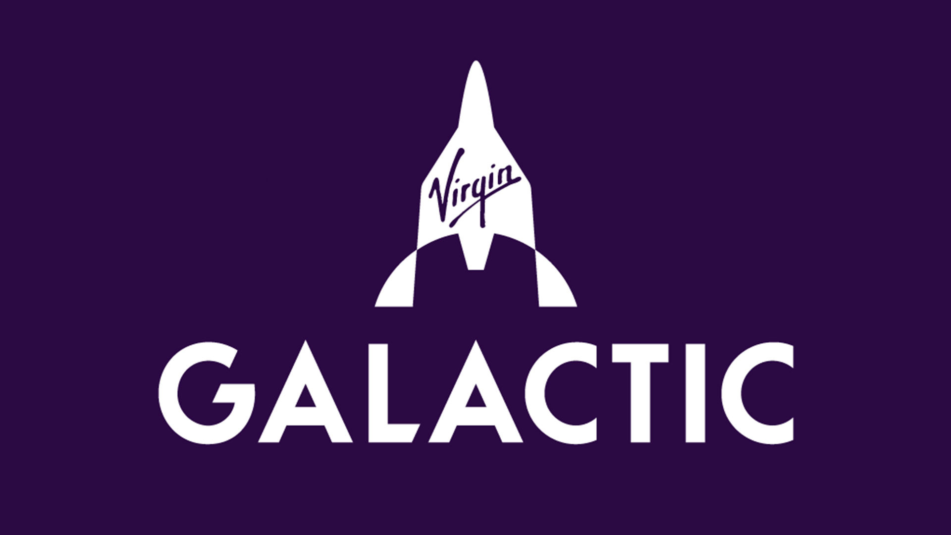
Whatever your take on the billionaire space race, there's no denying that the idea of commercial interstellar travel is slowly becoming more of a thing. And to drive the point home, Virgin Galactic has revealed a new brand identity, complete with a bizarre new logo.
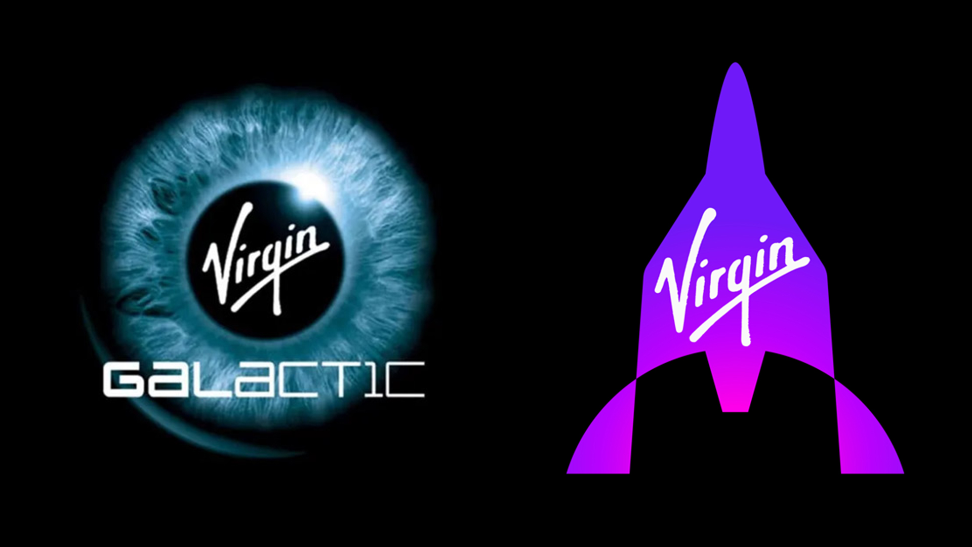
Designed by Pentagram, the new identity is a very purple affair. At the heart of the new look is the logo, made to represent the company idiosyncratic spaceship design. But followers are already giving the design a drubbing. Let's just say our best logos roundup won't be getting a new, intergalactic entry any time soon.
A post shared by Pentagram (@pentagramdesign)
A photo posted by on
Designed to "connect the world to the love, wonder and awe created by space travel," the new logo replaces the previous logo, which was designed in collaboration with famed French industrial designer Philippe Starck and featured Branson’s eye (because that's not terrifying at all).

The Pentagram-helmed rebrand coincides with Virgin Galactic, the world's "first commercial spaceline", opening ticket sales for 90-minute space journeys set to take off at the end of this year. Starting at a mere $450,000, these will offer the experience of viewing the earth from space, aboard the company's VSS Unity shuttle.
But while the new logo certainly does convey the unique shape of the ship, it also looks like, um, some other things. From elf hats to fireplace blowers, the design is drawing some unfortunate comparisons online.
"Looks like an ancient war helmet," one user comments on Pentagram's Instagram post, while another adds, "what kinda hat is that?". Many have also taken issue with Pentagram's association with Virgin Galactic during a climate crisis. "Embarrassing and massively irresponsible. We are in a climate emergency, maybe designers at Pentagram would like to think about that?" comments one user.
Indeed, while we're normally big fans of Pentagram's work, from the ingenious San Diego zoo logo to the brilliant Rolls-Royce rebrand, we're not sure the studio was aiming for the stars with this corporate-looking concept. Still, at least it didn't do a US Space Force and literally nick the logo from Star Trek. If you're inspired to create your own logo, check out our guide on how to download Photoshop.
Get the Creative Bloq Newsletter
Daily design news, reviews, how-tos and more, as picked by the editors.
Read more:

Thank you for reading 5 articles this month* Join now for unlimited access
Enjoy your first month for just £1 / $1 / €1
*Read 5 free articles per month without a subscription

Join now for unlimited access
Try first month for just £1 / $1 / €1

Daniel John is Design Editor at Creative Bloq. He reports on the worlds of design, branding and lifestyle tech, and has covered several industry events including Milan Design Week, OFFF Barcelona and Adobe Max in Los Angeles.
