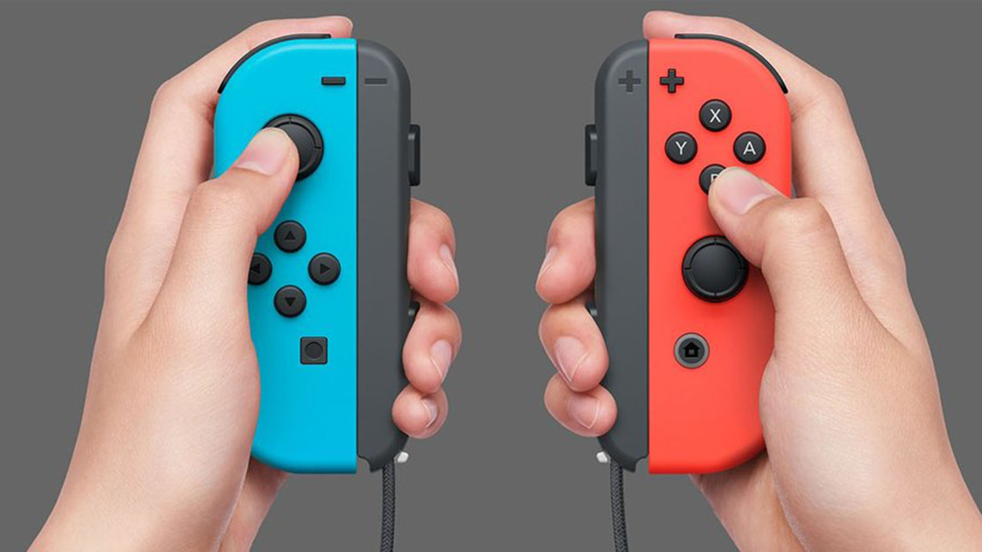
The video game UI design fail that's driving players wild
Game developers, take note.

Video game design is a complex art. Not only does it require creativity, but designers must also navigate the demands and limitations of hardware. But a new Twitter thread has highlighted a common UI design flaw that's all too familiar to gamers – regardless of what console they're using.
Games will often direct players to press a specific button by flashing its symbol on the screen, without also showing its position on the controller. And if your controller's layout isn't imprinted on your brain, you might end up pressing the wrong thing – and suffering an untimely virtual death. (Check out our UI design guide if you're looking for tips.)
game UI take pic.twitter.com/Wv5OtdRRTPFebruary 9, 2021
Twitter user Kyle McKernan (above) suggests games that display the required button in the context of other buttons around it are the ones that are getting it right. And his hot "game UI take" has clearly touched a nerve with thousands of gamers, most of whom agree that this simple design decision makes things much, much clearer.
Things are especially complicated for gamers who use multiple platforms. Take the 'X' symbol for example – it's present on Sony's, Nintendo's and Microsoft's game controllers, but in a different position on each. For users of all three consoles, finding the right button to press can feel like a game in itself.
I said this the other day!!! Why are they all different??? It makes it so difficult!! pic.twitter.com/se3AEyGedSFebruary 9, 2021
as someone who switches between platforms and controllers: YES PLEASE!! https://t.co/A8zAb2J6hxFebruary 9, 2021
Absolutely yes, this should be mandatory. https://t.co/rIWNaultiL pic.twitter.com/dcd3os4mjuFebruary 10, 2021
Take notes, devs. Some of us either play different consoles or just never used a controller before. This would make it a hundred times quicker to learn controls. https://t.co/5lCqfbh2DLFebruary 9, 2021
Thankfully, not every game commits this newly anointed design sin. Several users have shared screenshots of their favourite games that spell out exactly which button the player is meant to be pressing (and many note that the best Nintendo Switch games are particularly good at making use of the feature).
Absolutely correct. Only game that comes to mind that uses this is botw (but I guarantee there are hundreds more) and it really helps with the level of accessibility to the game pic.twitter.com/x0Tq5M1rXJFebruary 9, 2021
The classic AC games did this very well, I’d love to see it come back pic.twitter.com/xhTcmmd68UFebruary 9, 2021
ah yes, the one thing zelda has never gotten wrong. https://t.co/td5hWrC81XFebruary 10, 2021
the nintendo switch was the first time i realized this can just be. its way smart. https://t.co/cIYTUt2zqSFebruary 9, 2021
I see this already a lot in nintendo switch UI flows and yes it's significantly better https://t.co/7w4G5x5LxbFebruary 9, 2021
It might seem like an insignificant UI design tweak, but judging by the response online, anything that makes gameplay even slightly more accessible is a very good thing – and there's clearly no shortage of gamers out there who regularly switch between consoles and controllers. If you're ready to start gaming, check out today's best games console offers below, and be sure to take a look at these unbeatable Nintendo Switch deals.
Read more:
Get the Creative Bloq Newsletter
Daily design news, reviews, how-tos and more, as picked by the editors.

Thank you for reading 5 articles this month* Join now for unlimited access
Enjoy your first month for just £1 / $1 / €1
*Read 5 free articles per month without a subscription

Join now for unlimited access
Try first month for just £1 / $1 / €1

Daniel John is Design Editor at Creative Bloq. He reports on the worlds of design, branding and lifestyle tech, and has covered several industry events including Milan Design Week, OFFF Barcelona and Adobe Max in Los Angeles. He has interviewed leaders and designers at brands including Apple, Microsoft and Adobe. Daniel's debut book of short stories and poems was published in 2018, and his comedy newsletter is a Substack Bestseller.
