The internet wheelie rates this clever bike fair logo

Velo logo
(Image credit: Velo)

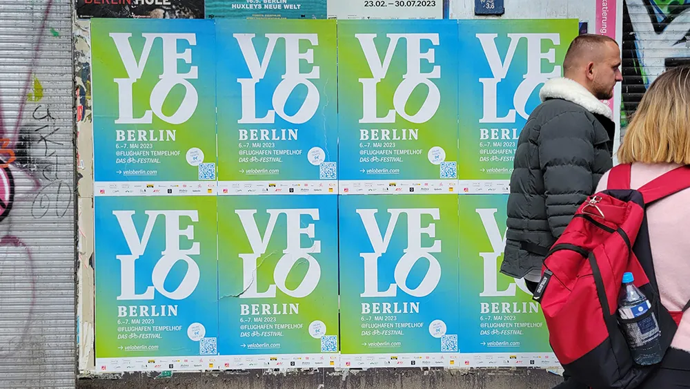
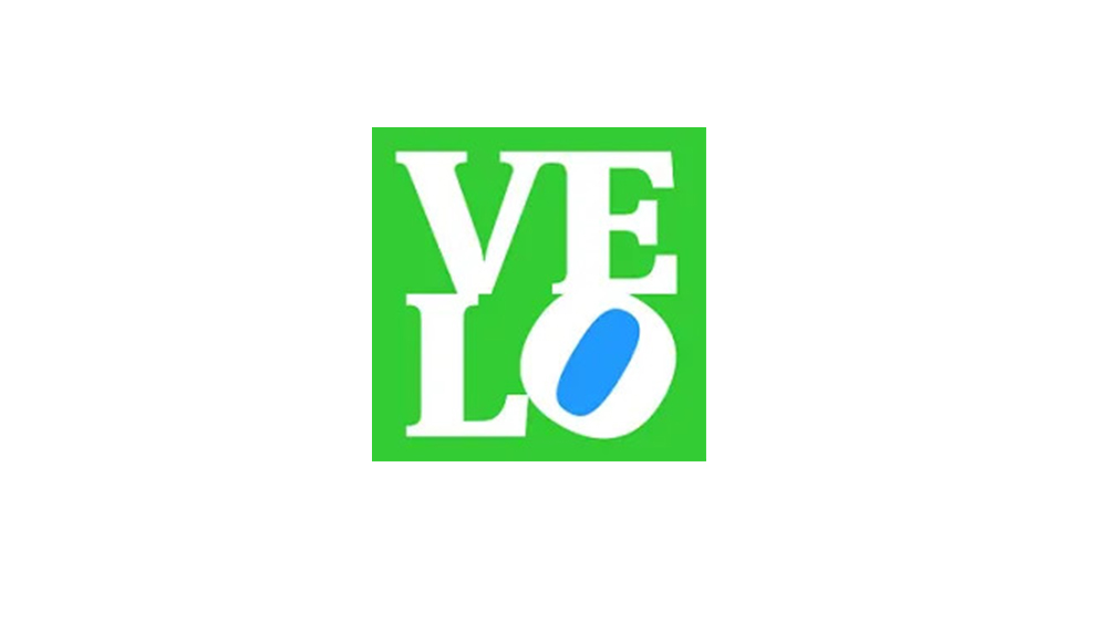
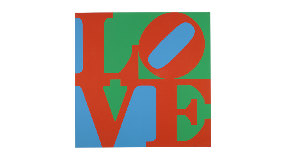
What did you read first in the logo design above? The identity is for a German bicycle trade fair called Velo, but chances are that if you're familiar with Robert Indiana's classic 1967 screenprint, you'll have read it as 'love', and that's exactly the intention.

The logo design uses the wide recognition of Indiana's work to create a kind of visual pun expressing the event's love of all things bicycle-related (see our pro tips on how to design a logo for more inspiration).

Thank you for reading 5 articles this month* Join now for unlimited access

Enjoy your first month for just £1 / $1 / €1

*Read 5 free articles per month without a subscription

Join now for unlimited access

Try first month for just £1 / $1 / €1

Joe Foley

Joe is a regular freelance journalist and editor at Creative Bloq. He writes news, features and buying guides and keeps track of the best equipment and software for creatives, from video editing programs to monitors and accessories. A veteran news writer and photographer, he now works as a project manager at the London and Buenos Aires-based design, production and branding agency Hermana Creatives. There he manages a team of designers, photographers and video editors who specialise in producing visual content and design assets for the hospitality sector. He also dances Argentine tango.

Read more
Kellogg's ad
Brilliant or baffling? Designers are torn over the new Kellogg's billboards
four different logos for Discord, Sun Day Red, Slipknot
Our most read logo and rebrand stories of 2024
Apple logo
The 10 best logos of all time
2024 logos
The best (and worst) logos of 2024
Walmart new visual identity
Walmart’s refresh attracted criticism – but designers loved it
Jaguar logo
The best (and worst) rebrands of the year
Latest in Logos & Icons
Microsoft To Do
People have some Very Strong Opinions on the Microsoft To Do icons
Clippers logos old vs new
New LA Clippers logo is an instant classic
WLCO logo design
This hip neighbourhood's logo is totally loopy, but I love it
The superman logo as based on a potential design from Superman: Legacy
Possible new Superman logo divides fans
Lyle's Golden Syrup and Lyles Black Treacle tins showing the lion logo
Lyle's apologises for its Golden Syrup logo redesign as even the church expresses dismay
Steve Jobs and the Google logo
Apparently Steve Jobs hated the Google logo on his iPhone
Latest in News
Images from a Painkiller game remake
The classic demon-shooter Painkiller is being remade, and it looks even darker and bloodier than the original
INIU Power Bank
This INIU power bank is perfect for content creators and 36% off right now
Stills from an Aston Martin CGI advert made in Unreal Engine
Aston Martin's Unreal Engine CGI car adverts look incredibly real
iPhone 13 render
Apple gets the green light to design the iPhone of its dreams
GIMP
Want to learn GIMP for free? This tutorial page is the perfect place to start
Lilo & Stitch Snow White poster
It's hard to describe how hilarious these Lilo & Stitch Disney mashup posters are (seriously, Stitch as Cinderella is all kinds of genius)