Stranger Thing's Vecna was meant to be even more terrifying
These concepts will give you nightmares.
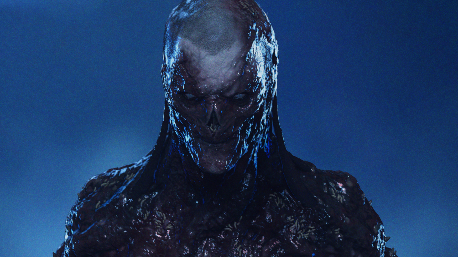
It's been two weeks since Stranger Things Season 4 Volume ii (or ST4) was released, and it's pretty much taken over the internet. The latest season has already made waves for its terrifying monsters and tense moments – but it turns out that Vecna was originally supposed to be much scarier (I know, it's hard to believe!).
The concept artist responsible for Vecna has revealed some alternative designs for the ST villain. They show a far creepier version of the Upside Down overlord – one cries blood and another has skin permanently melting off his body (yep, that's as gross and as terrifying as it sounds, just take a look below if you want nightmares – and if you're inspired by these designs to have a go at creating your own alternative Vecna, check out our top tips on character design).
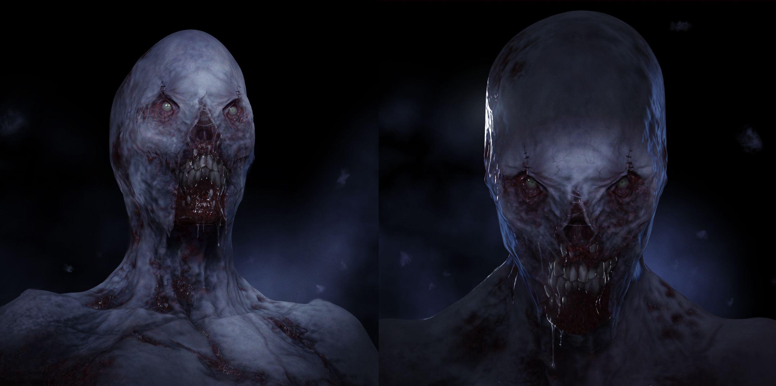
Michael Maher Jr is the artist responsible for all of the nightmarish Vecna designs, including the final design that made it into the Netflix series. On his website, Maher explains that the Duffer Brothers (the directors of the show) had asked him to create a monster that took inspiration from Nightmare on Elm Street and Hellraiser while also fitting in with the existing Stranger Things aesthetic and Dungeons and Dragon themes.
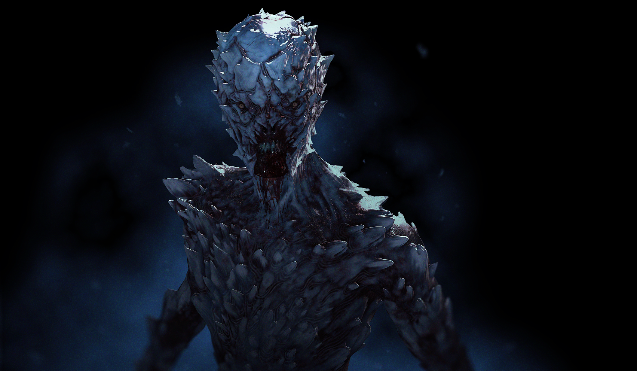
He shares many of the different versions of Vecna that he designed. One features a reptilian-like skin with sharp barbed scales, another has maggots in his nose (due to rotting flesh) and another has 14 eyes – we're not sure which is more terrifying; they all look as scary as each other. Maher explains that many of the designs were scrapped because they didn't allow him enough expression – because of course, what's a villain without the ability to evilly emote?
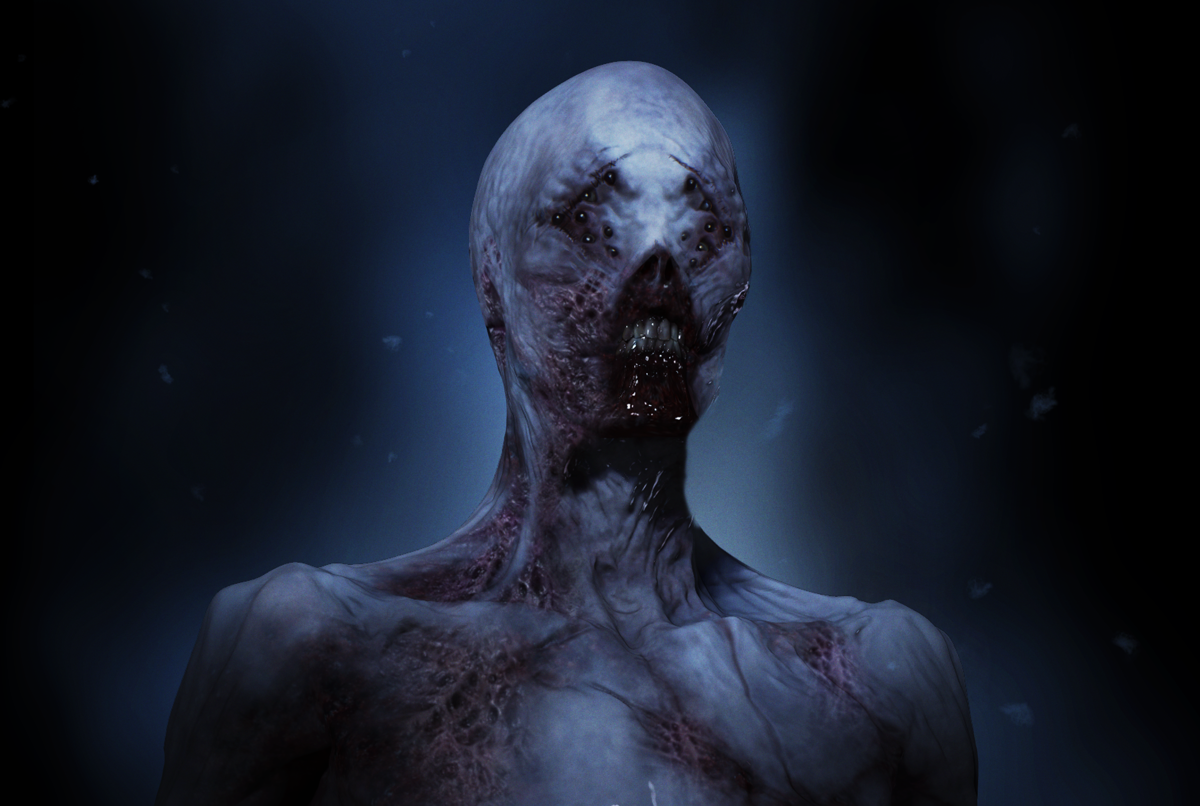
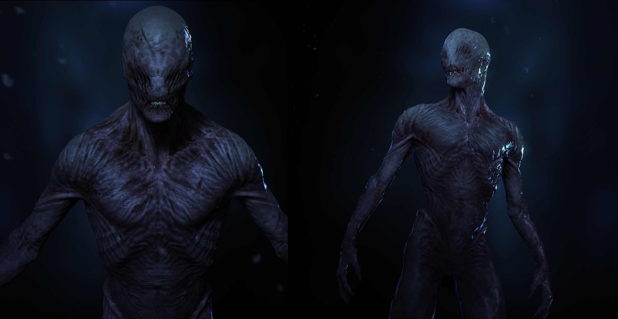
While the designs are nightmare-inducing, I'm in awe of the artistry involved and love being able to see the creative process behind the building of such a horrifying villain. This isn't the first time we have had a behind-the-scenes look at the ST creative process: when the show was first released we got a peek at what the Stranger Things title may have looked like.
The new season has been fantastic for clever and impactful (and terrifying) design. Last month we couldn't get over the brilliant Stranger Things 4 poster set designed by Butcher Billy. And earlier this week we were spooked by a chilling Demogorgon optical illusion at a Stranger Things pop-up in Japan. We've also had fun playing with this interactive Stranger Things fan art of the Mind Flayer.
I don't know about you, but I feel inspired to go and binge-watch the entire show all over again. If you're yet to catch up on the big finale, why not treat yourself to one of the best TVs for a truly immersive Stranger Things experience? Or if you'd like to have a go at creating your own ST4-themed designs, make sure you check out our roundup of Stranger Things fonts to give your work an authentically stranger feel.
Get the Creative Bloq Newsletter
Daily design news, reviews, how-tos and more, as picked by the editors.
Read More:

Thank you for reading 5 articles this month* Join now for unlimited access
Enjoy your first month for just £1 / $1 / €1
*Read 5 free articles per month without a subscription

Join now for unlimited access
Try first month for just £1 / $1 / €1
Amelia previously worked as Creative Bloq’s Staff Writer. After completing a degree in Popular Music and a Master’s in Song Writing, Amelia began designing posters, logos, album covers and websites for musicians. She covered a range of topics on Creative Bloq, including posters, optical illusions, logos (she's a particular fan of logo Easter eggs), gaming and illustration. In her free time, she relishes in the likes of art (especially the Pre-Raphaelites), photography and literature. Amelia prides herself on her unorthodox creative methods, her Animal Crossing island and her extensive music library.
