Web designers create the most annoying UI ever
Frustrating site calls out the biggest UI design sins.

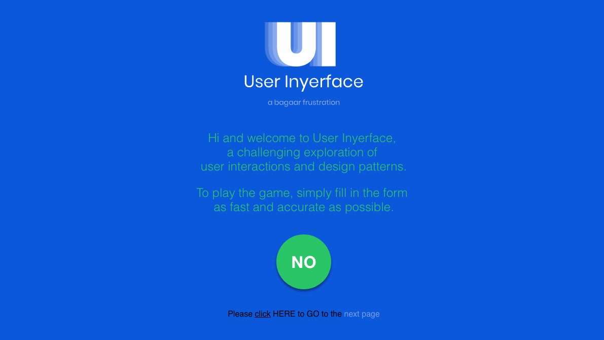
Web design has come a long way over the years, but this doesn't mean that it's perfect. There are still plenty of user interface issues that bug people when they try to fill out a form or sign up to an agreement. And it's these clunky UI headaches that get brilliantly called out in this parody site, User Inyerface.
We've already looked at what you should do when designing an online page with our guide to the perfect website layout. But if you're looking for something a little sillier, User Inyerface is an entertaining alternative that demonstrates the frustrating consequences of bad UI (you can also see our post on painful UI fails).
Created by Belgian digital product agency Bagaar, the disgustingly designed User Inyerface challenges visitors to complete a sign up form as quickly as possible. If you've ever filled in your details to get registered on a website, the questions will look familiar. However it's never been more difficult to submit your name, contact email and date of birth.
That's because User Inyerface bends over backwards to make the process as irritating and tricky as possible. Data fields require you to delete content before you type in your details, reCAPTCHA tests use vague and confusing language, and an intermittent pop up with a confusing button layout will pester you at every turn.
Weirdly, once you've got your head around what it's doing User Inyerface becomes a fun exercise in frustration. Just when you think it can't get any more difficult, it'll pull a confusing button or age slider out of the bag. And for web designers, the site will leave them wondering if they're guilty of any of its UI design sins.
If you power through to the end and complete the forms, you'll be greeted by a GIF of Carlton from The Fresh Prince of Bel-Air doing a dorky dance. There's also a link through to the Bagaar job page, which makes us wonder if User Inyerface is some kind of filtration process for a vacancy. (See our design jobs page if you are looking for a new design role.)
Either way, we managed to complete User Inyerface in a tortuous five minutes and fifteen seconds. Can you do any better?
Get the Creative Bloq Newsletter
Daily design news, reviews, how-tos and more, as picked by the editors.
Related articles:

Thank you for reading 5 articles this month* Join now for unlimited access
Enjoy your first month for just £1 / $1 / €1
*Read 5 free articles per month without a subscription

Join now for unlimited access
Try first month for just £1 / $1 / €1
Dom Carter is a freelance writer who specialises in art and design. Formerly a staff writer for Creative Bloq, his work has also appeared on Creative Boom and in the pages of ImagineFX, Computer Arts, 3D World, and .net. He has been a D&AD New Blood judge, and has a particular interest in picture books.
