Microsoft's unused Windows XP logos are pretty wild
Did they choose the right one?

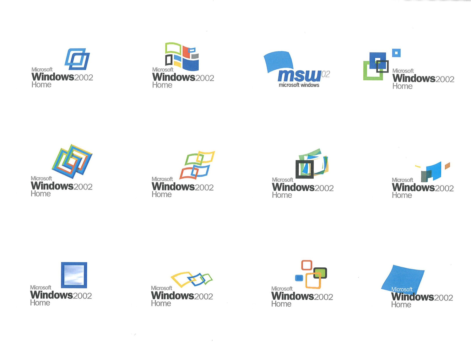
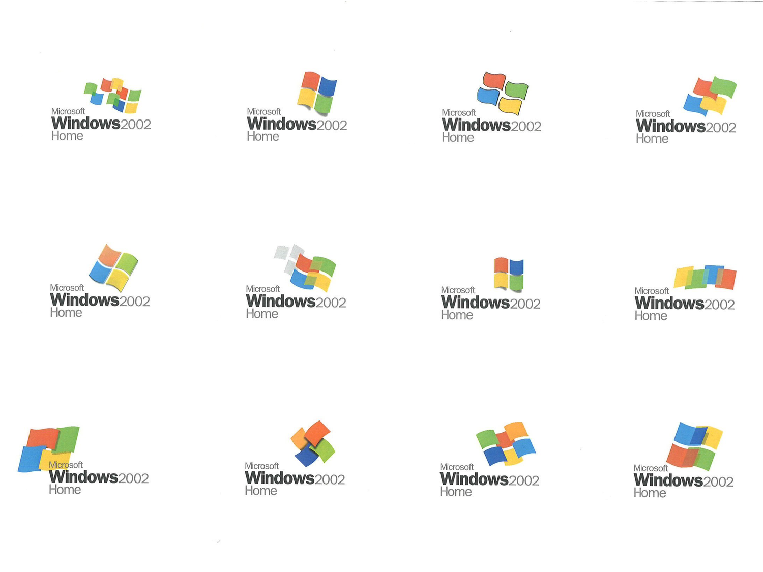
The iconic Microsoft Windows logo has seen a few transformations over the years, from the decorative swoosh of Windows 95 to today's more minimal affair. It was 2001's Windows XP that introduced a 3D take on the four coloured squares – but it could have looked very different.
Creative agency Frog Design has shared several unused prototype logos from 2001, and it's a tantalising glimpse at what could have been. Perhaps most the most interesting takeaway is that inclusion of the four coloured squares wasn't always a given. (Looking for inspiration? Check out the best logos of all time.)


The designs, shared by creative director Casey Potter, came about because "Microsoft wanted an outside perspective for the design of its next-generation operating system, Windows XP."
"The Windows mark needed to maintain the brand equity it had accrued in its long history while expressing the evolution towards a more flexible, user-friendly brand," Potter explains on his website. "Our team developed a slate of fifty new logos, ranging from simple to radical alterations." The designs recently resurfaced on Twitter, and users have been fascinated by the glimpse behind the curtain of the design process.
During Windows XP’s (2001) development, Microsoft asked design company Frog Design to help “generate key elements of the UI”. This included a new Windows logo. 50 potential logos were drafted, which were whittled down to a top 3. With a few tweaks, the final XP logo was born. 🤩 pic.twitter.com/5Z23u1HBJkFebruary 14, 2023
Just like those unused Nintendo Wii logos, these prototypes show that for every final logo, there are often dozens of rejected prototypes. If you're inspired to create a design of your own, take a look at out guide on how to design a logo.
Read more:
- The Super Bowl LVIII logo is its most original design in years ...
- People are still just discovering the tiny imperfection in Google's logo
- Turns out the Bitcoin logo has a tiny design flaw
Sign up to Creative Bloq's daily newsletter, which brings you the latest news and inspiration from the worlds of art, design and technology.

Daniel John is Design Editor at Creative Bloq. He reports on the worlds of design, branding and lifestyle tech, and has covered several industry events including Milan Design Week, OFFF Barcelona and Adobe Max in Los Angeles. He has interviewed leaders and designers at brands including Apple, Microsoft and Adobe. Daniel's debut book of short stories and poems was published in 2018, and his comedy newsletter is a Substack Bestseller.
