We all know the Sony logo. Part of the reason it's so successful is that it's barely changed over the company's more than 50 years in business. It's also exceedingly simple, with an elegant serif font that feels timeless. But things could have been very different.
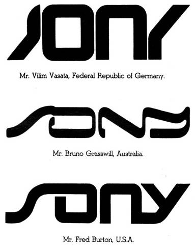
Back in 1981, the Japanese corporation decided that it would update its logo to mark its 35th anniversary, and it held an international competition to find a new design. All three of the shortlisted designs would have created a brand identity very much connected to the moment (see our pick of the best new logos for redesigns that got it right).

Sony's logo redesign competition came a little over a year after the launch of the first Sony Walkman. Already a household name, the company received almost 30,000 entries. These were whittled down to 59 that were shown to the board and finally to three finalists, which it appears the company gave serious consideration to.
The shortlisted designs included those of one Vilim Vasata, from the Federal Republic of Germany, Bruno Grasswill from Australia and Fred Burton of the US. However, Sony co-founder Masaru Ibuka finally decided that none of the designs was superior to the existing logo.
Sony Logo Competition, Circa 1981 http://t.co/yw9kVgB0l2I'm so glad they didn't pick those. pic.twitter.com/30VTS3wkhrNovember 21, 2014
The company ended up brushing aside the competition by announcing that there was no clear winner and dividing the prize money equally between the three finalists. It described the entries as "gratifying" but announced that "the Sony logo will remain the same". We don't know that went down with entrants', but K-pop heartthrob Changsub's logo design competition last year reminded us of the danger of such endeavours.
A post shared by Ralph Michael (@orangerafi)
A photo posted by on
The Instagram post above, featuring an image from the Ginza Sony Park, shows just how little the Sony logo design has changed over the years. And I have to say that I think Sony made the right decision. The three final designs from the competition were each striking in their own way, and they have their appeal. But while they might have worked on a Sony Walkman in 1981, it's hard to imagine any of them on Sony's products today.
There is something of a dichotomy in logo design for tech companies. The desire to appear modern and cutting-edge, a defining characteristic of the sector, can often lead to a temptation to adopt trends. But a logo that looks 'modern' in its day may not do so a few years down the line. This is the risk run by examples such as the new Nokia logo. The Sony logo, meanwhile, like the Apple logo, presents a brand that feels timeless and yet always at the forefront of new tech.
Get the Creative Bloq Newsletter
Daily design news, reviews, how-tos and more, as picked by the editors.
Intrigued to see how more big brands could have looked? We featured these unused Sony logos and more in our pick of big brand logos that never saw the light of day.

Thank you for reading 5 articles this month* Join now for unlimited access
Enjoy your first month for just £1 / $1 / €1
*Read 5 free articles per month without a subscription

Join now for unlimited access
Try first month for just £1 / $1 / €1

Joe is a regular freelance journalist and editor at Creative Bloq. He writes news, features and buying guides and keeps track of the best equipment and software for creatives, from video editing programs to monitors and accessories. A veteran news writer and photographer, he now works as a project manager at the London and Buenos Aires-based design, production and branding agency Hermana Creatives. There he manages a team of designers, photographers and video editors who specialise in producing visual content and design assets for the hospitality sector. He also dances Argentine tango.
