Unused Nintendo Wii logos include some serious design crimes
A glimpse at what could (and shouldn't) have been.
With the Nintendo Switch continuing to top wish lists five years into its life, it can be easy to forget some of the weird and wonderful consoles that came before it. Nintendo has always had a penchant for unorthodox designs – and it seems that spirit extends to its products' logos too.
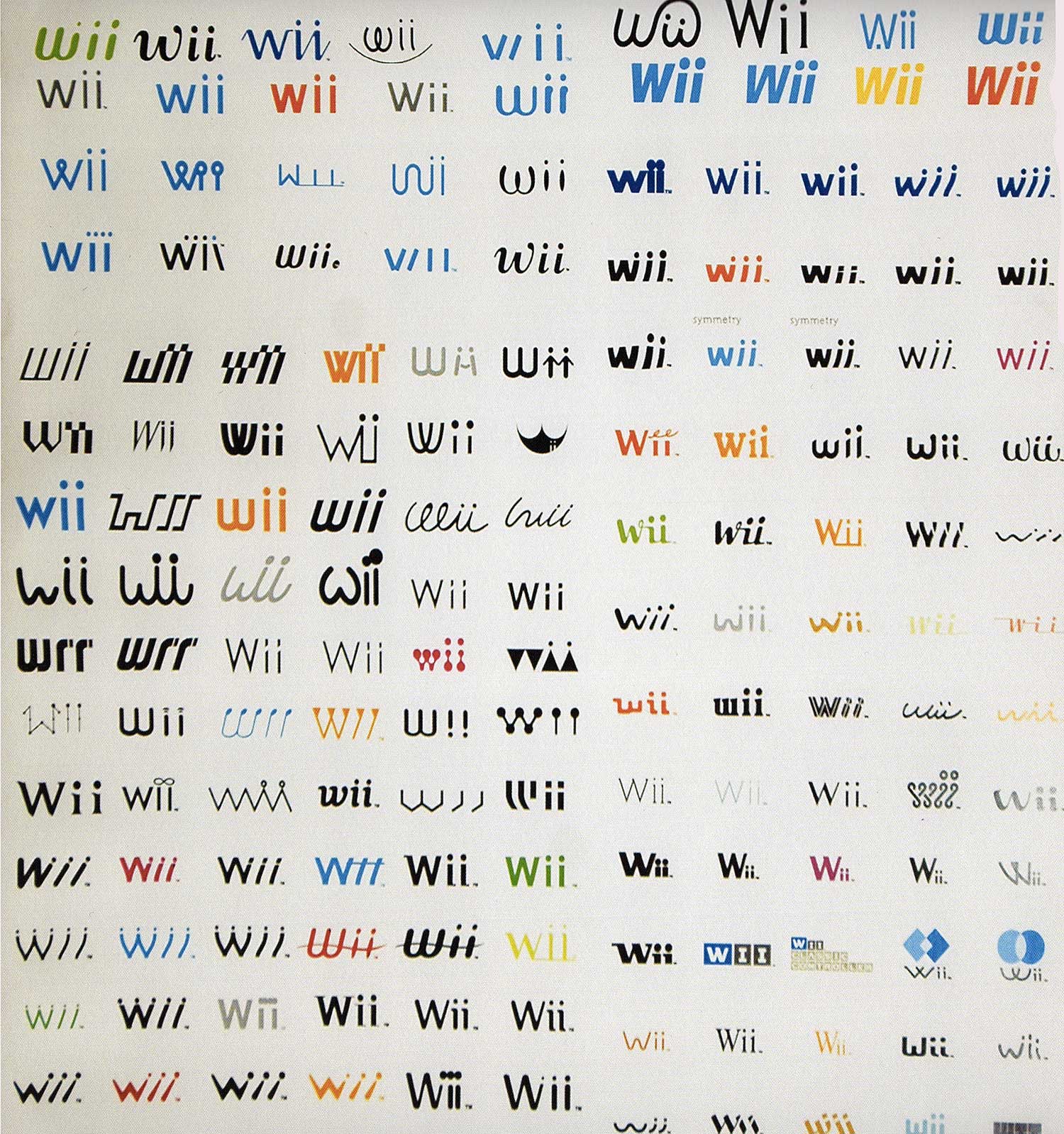
Last year, a huge bunch of unused Nintendo Wii logos resurfaced – just 14 years after the console was released. The logos, spotted in a 2007 Nintendo company handbook, are rendered in a dizzying range of styles – and some are pretty dire. Let's just say the designs in our best logos round-up have nothing to worry about. But Nintendo is, of course, on something of a high right now – check out the best Nintendo Switch deals if you want to experience the best-selling console of the last few years.

There's lots to see here. We have stick figures. We have lots of dots. Wii have lots of colours. And a whole lot of typographical styles, from sans serif to downright squiggly. Indeed, the final logo looks thoroughly pedestrian compared with some of these offerings.


The designs were shared by Twitter account Nintendo Memories, and went down a storm with gaming fans. Users revelled in pointing to their favourite designs that never saw the light of day.

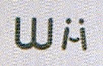
this one is awesome, it looks like a wiimote being swung around and it even has the player number dots pic.twitter.com/nj4oWkawPyJanuary 28, 2021
Which unused Wii logo are you? I'm the one that's just 4 triangles pic.twitter.com/K8ymk1NPuPJanuary 30, 2021
You can explore more about the world of logo design in our guide, and while you're at it, why not check out where to find logo design inspiration, too. And now that we've taken a fascinating tour of Nintendo's past, let's look to the future – here's everything we know about the Nintendo Switch Pro.
Read more:
- The Lord of the Rings: Ring of Power logo is literally fire
- The new green M&M design is the worst thing that's ever happened, apparently
- Halo Infinite design fail has gamers fuming
Get the Creative Bloq Newsletter
Daily design news, reviews, how-tos and more, as picked by the editors.

Thank you for reading 5 articles this month* Join now for unlimited access
Enjoy your first month for just £1 / $1 / €1
*Read 5 free articles per month without a subscription

Join now for unlimited access
Try first month for just £1 / $1 / €1

Daniel John is Design Editor at Creative Bloq. He reports on the worlds of design, branding and lifestyle tech, and has covered several industry events including Milan Design Week, OFFF Barcelona and Adobe Max in Los Angeles. He has interviewed leaders and designers at brands including Apple, Microsoft and Adobe. Daniel's debut book of short stories and poems was published in 2018, and his comedy newsletter is a Substack Bestseller.
