UK Parliament reveals new digital-friendly brand identity
The new design aims to make UK Parliament fit for purpose on digital platforms.
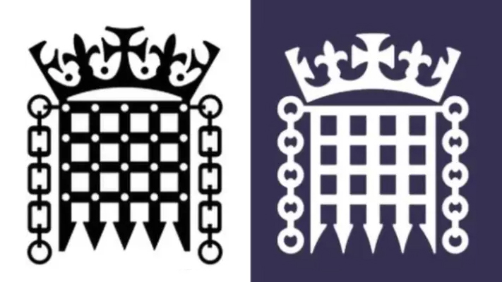
The first visual identity for the Houses of Parliament was unveiled earlier this week. As with all political matters, the news, in particular the logo design (above), has been met with a divided reaction.
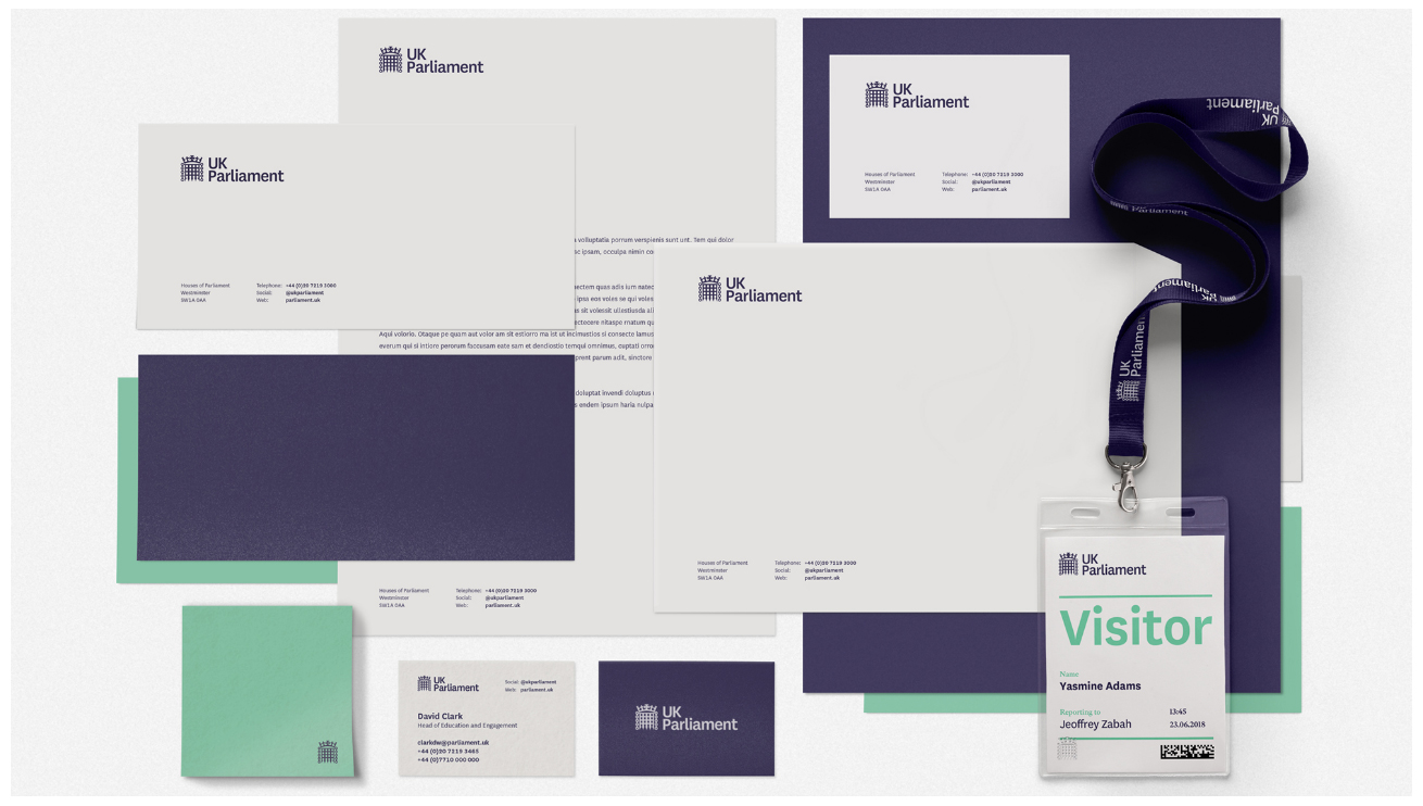
Created in collaboration between the House of Commons and the House of Lords with brand and digital design studio SomeOne, the new identity aims to make UK Parliament (as it's now referred to as a brand) fit for purpose on digital platforms.
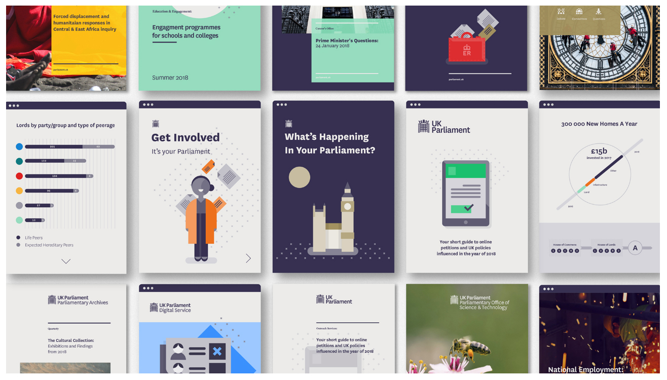
As part of the identity, SomeOne created a wordmark, typefaces, website guidelines, icon suites, digital guidelines and responsive templates. Logos created for digital optimisation were also included, and it's here where the project's £50,000 budget has started to bite for some people.
At first glance, the new logos appear remarkably similar. The main differences seem to be a tidying up of an existing portcullis design, which includes the removal of a few dots and a uniform shape applied to the chain links.
To onlookers eager to lay into government spending the apparently barely altered logo is a perfect target, especially when you factor in what looks like an exorbitant price tag.
However this subtle smartening up was at the heart of the new identity, rather than a complete overhaul. "Clarity, Simplicity and Efficiency all drive the new design work, so that anyone can get to the information they want, when they want and how they want it," explains SomeOne co-founder Simon Manchipp on the studio's site.
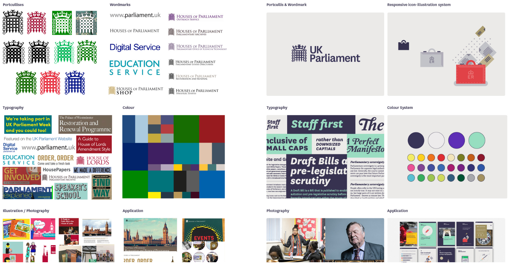
Furthermore, the new identity extends well beyond the fine tuning of a logo. With more people interacting with government services digitally, it was time for Parliament to make navigation easier across these channels. This is where the new responsive iconography and palette of purples, greens and whites come into play.
Get the Creative Bloq Newsletter
Daily design news, reviews, how-tos and more, as picked by the editors.
"Rather than repetitively stamping a single symbol on all communications, we’ve developed a more in-depth design system to accommodate any kind of application," says Cosmo Jameson, senior designer at SomeOne.
And with UK Parliament's new identity hosted and managed on Cloudlines, anyone designing a new communication can access the brand's principles.
Spending public money on design frequently comes under fire, especially if the changes are as understated as they are here. Only last year another governmental hot potato, the NHS, came under scrutiny when it launched a strict new set of brandling guidelines.
As far as rebrands go though, UK Parliament's is far from the most costly. We've already looked at expensive logos and what they teach us, and if we apply these lessons to the government's new identity you can see where the money went.
First of all, this identity has been years in the making, with consultations held throughout the entire process. Secondly, does it work? The success of a rebrand and a logo lies in how well at works as much as how good it looks. If the consistent identity makes it easier for users to access government services, we're inclined to give it a pass.
Only recently we've seen companies make minor changes to improve functionality. so why shouldn't politics follow suit? Take Ericsson, which tweaked its 'three sausages' logo ever so slightly in February so that it aligns with pixel grids better. This decision was made to promote simplicity and enhance productivity, which sounds like a manifesto pledge in itself.
So is the UK Parliament identity a successful design that's worth the money? Well, we've seen politicians claim worse things on expenses.
Related articles:

Thank you for reading 5 articles this month* Join now for unlimited access
Enjoy your first month for just £1 / $1 / €1
*Read 5 free articles per month without a subscription

Join now for unlimited access
Try first month for just £1 / $1 / €1

Dom Carter is a freelance writer who specialises in art and design. Formerly a staff writer for Creative Bloq, his work has also appeared on Creative Boom and in the pages of ImagineFX, Computer Arts, 3D World, and .net. He has been a D&AD New Blood judge, and has a particular interest in picture books.
