The new Twitter UI is getting roasted (on Twitter)
Thanks for the migraine, folks.
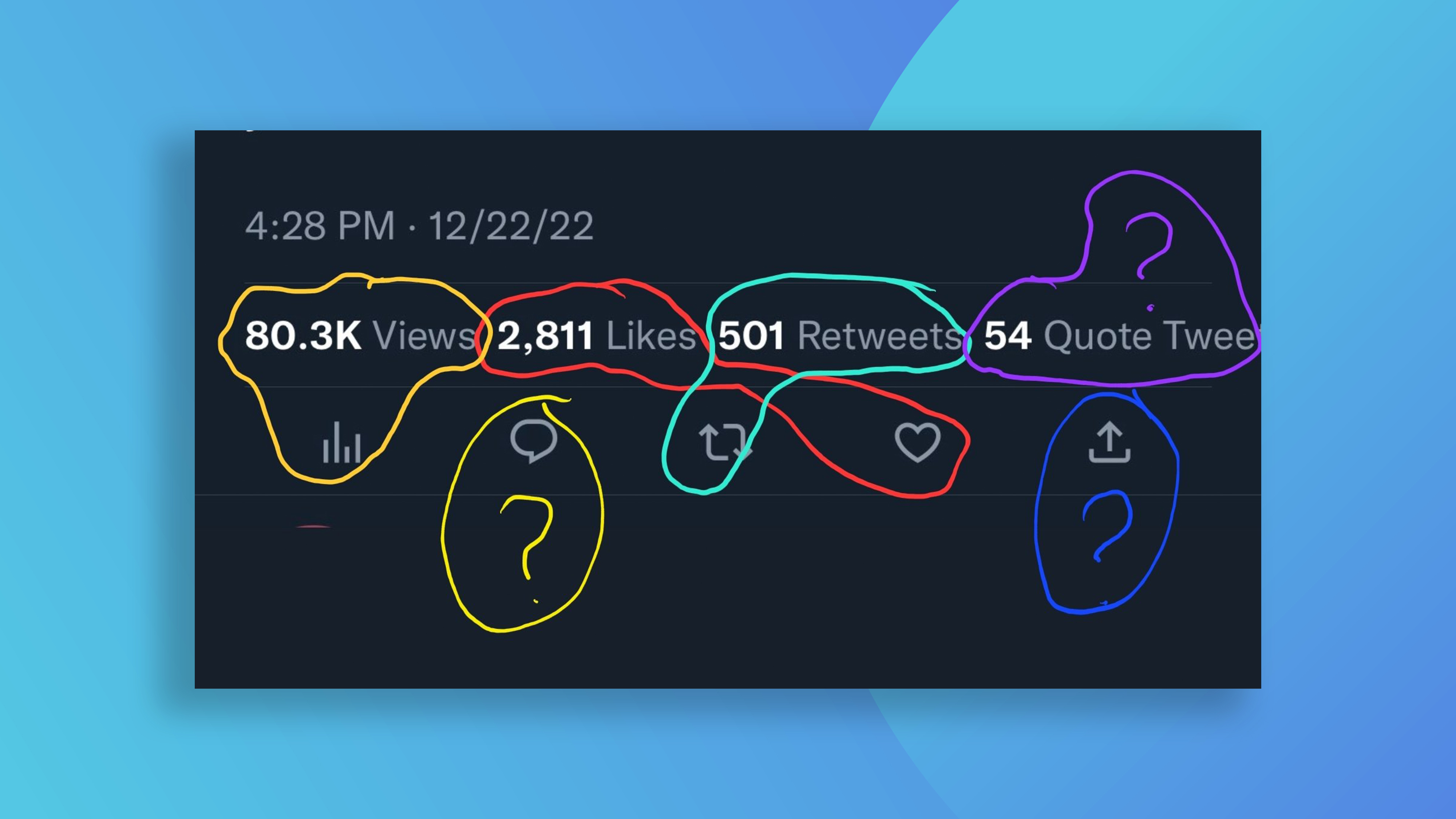
Ah, Twitter. Unless you've been living under a rock (and I wouldn't blame you after the last few years), you're probably aware that the social media platform's new ownership has led to a few, er, teething problems. And acting as a perfect microcosm for the company itself, Twitter's new UI has been declared an absolute mess.
The various icons beneath a tweet have been tweaked, with extra information and spacing added. But from the double instance of a tweet's view count to inconsistent ordering, the whole enterprise suggests Elon Musk definitely fired all of the brand's competent designers. (Need a palette cleanser? Check out the best website templates around.)

Right now, 'Twitter UI' is trending on, yes, Twitter. And after a cursory glance, it seems fair to say that over 100% of the comments are negative. The cluttered new design is reminding users of a 90s virus-infected Microsoft Internet Explorer, thanks to its cluttered mess of information. We'll let some tweets do the talking.
The new interface is so bad! Bring back the designers you fired. They are there for a reason. The spacing between icons on posts is WILD.December 23, 2022
Worst part of the new twitter ui is this pic.twitter.com/CzlUNM2avfDecember 22, 2022
The new Twitter UI is like some coked up exec burst in like “Hey! What if we just crammed everything in there and make it super distracting and cluttered? Yeah people will love it.” pic.twitter.com/pv5cCGeVnlDecember 23, 2022
new twitter ui pic.twitter.com/gR88LxJ9fxDecember 23, 2022
Indeed, from a design perspective, Twitter isn't having a great time of late. The company's new Twitter Blue logo got roasted last week, while the whole buy-a-blue-tick debacle has been a well-publicised disaster.
So there we have it – one week before the end of the year, and we have a late contender for the worst web UI of 2022. For a roundup of the year, check out the best (and worst) web design trends of 2022.
Read more:
- Please tell me this isn't the new DC Studios logo
- The Kia logo fiasco just won't go away
- Audi drivers get road rage over new logo
Get the Creative Bloq Newsletter
Daily design news, reviews, how-tos and more, as picked by the editors.

Thank you for reading 5 articles this month* Join now for unlimited access
Enjoy your first month for just £1 / $1 / €1
*Read 5 free articles per month without a subscription

Join now for unlimited access
Try first month for just £1 / $1 / €1

Daniel John is Design Editor at Creative Bloq. He reports on the worlds of design, branding and lifestyle tech, and has covered several industry events including Milan Design Week, OFFF Barcelona and Adobe Max in Los Angeles. He has interviewed leaders and designers at brands including Apple, Microsoft and Adobe. Daniel's debut book of short stories and poems was published in 2018, and his comedy newsletter is a Substack Bestseller.
