Twitter gets a new minimal look
Your feed will never be the same again as fresh, minimal icons rejuvenate Twitter's UI.
Twitter has given its desktop and mobile sites an update to keep the brand fresh as it faces an ever-increasing assault on its microblogging dominance.
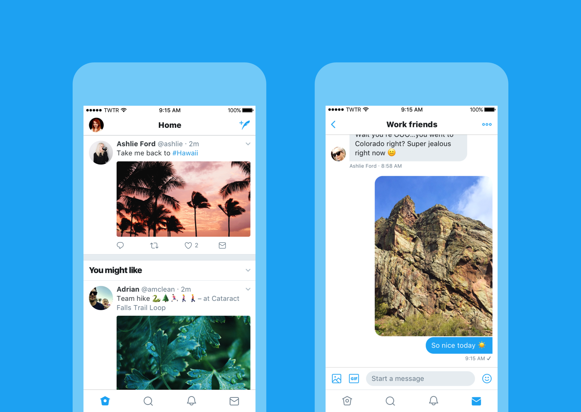
The most obvious alteration is a new set of icons for the familiar reply, retweet, like, and DM buttons, as well as for the home, Moments, notifications and messages on the menu of the browser version. But there are other visual and UI tweaks that add up to a lighter, more minimal Twitter experience.
So fresh. So clean. So live.Check out our new look. 👀👇https://t.co/ClWbwi8CEH pic.twitter.com/nR27POQkEiJune 15, 2017
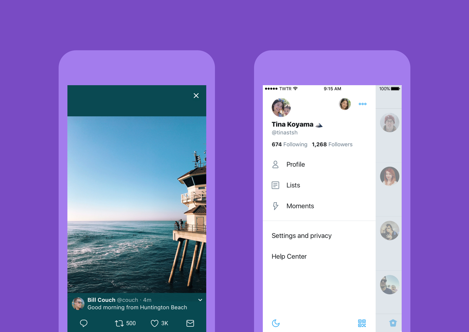
Profile, additional accounts, settings, and privacy are now contained in a new side navigation menu with fewer tabs at the bottom of the app. This change was rolled out on Android last year but now makes its way to iOS. Also on iOS, links to articles and websites now open in Safari’s viewer in the Twitter app.
Twitter's typography has been tweaked, most obviously with bolder headlines, and profile photos are now round, similar to Instagram and Pinterest.

But the big talking point among designers is the icon update. Twitter believes that the icons are more intuitive, which should improve the experience particularly for first-time users.
In a blog post, Twitter says that people thought the reply icon, an arrow, meant delete or go back to a previous page. "We switched to a speech bubble, a symbol most know and love. We also made the icons lighter for more seamless interaction."

Finally, Twitter's mobile apps now live-update instantly with reply, retweet, and like counts so you can see conversations as they’re happening.
Get the Creative Bloq Newsletter
Daily design news, reviews, how-tos and more, as picked by the editors.
Some designers have already commented on the softer, more rounded look being friendlier – and artist Ash Huang makes an interesting point about Twitter conversations with strangers…
I wonder: if Twitter had bubblier, gentler edges to begin w/, which conveys a gentler Twitter ethos, if trolls would have latched on less.June 15, 2017
Related articles:

Thank you for reading 5 articles this month* Join now for unlimited access
Enjoy your first month for just £1 / $1 / €1
*Read 5 free articles per month without a subscription

Join now for unlimited access
Try first month for just £1 / $1 / €1

Craig Stewart is a writer, SEO strategist and content marketer, and is a former editor of Creative Bloq. Craig has written about design, typography, tech and football for publications including Creative Bloq, T3, FourFourTwo and DSG, and he has written a book on motoring for Haynes. When he's not writing, you'll usually find Craig under his old car learning about DIY repairs the hard way.
