Twitch's rebrand is here – and you're already part of it
The colourful Twitch community is at the heart of its new look.

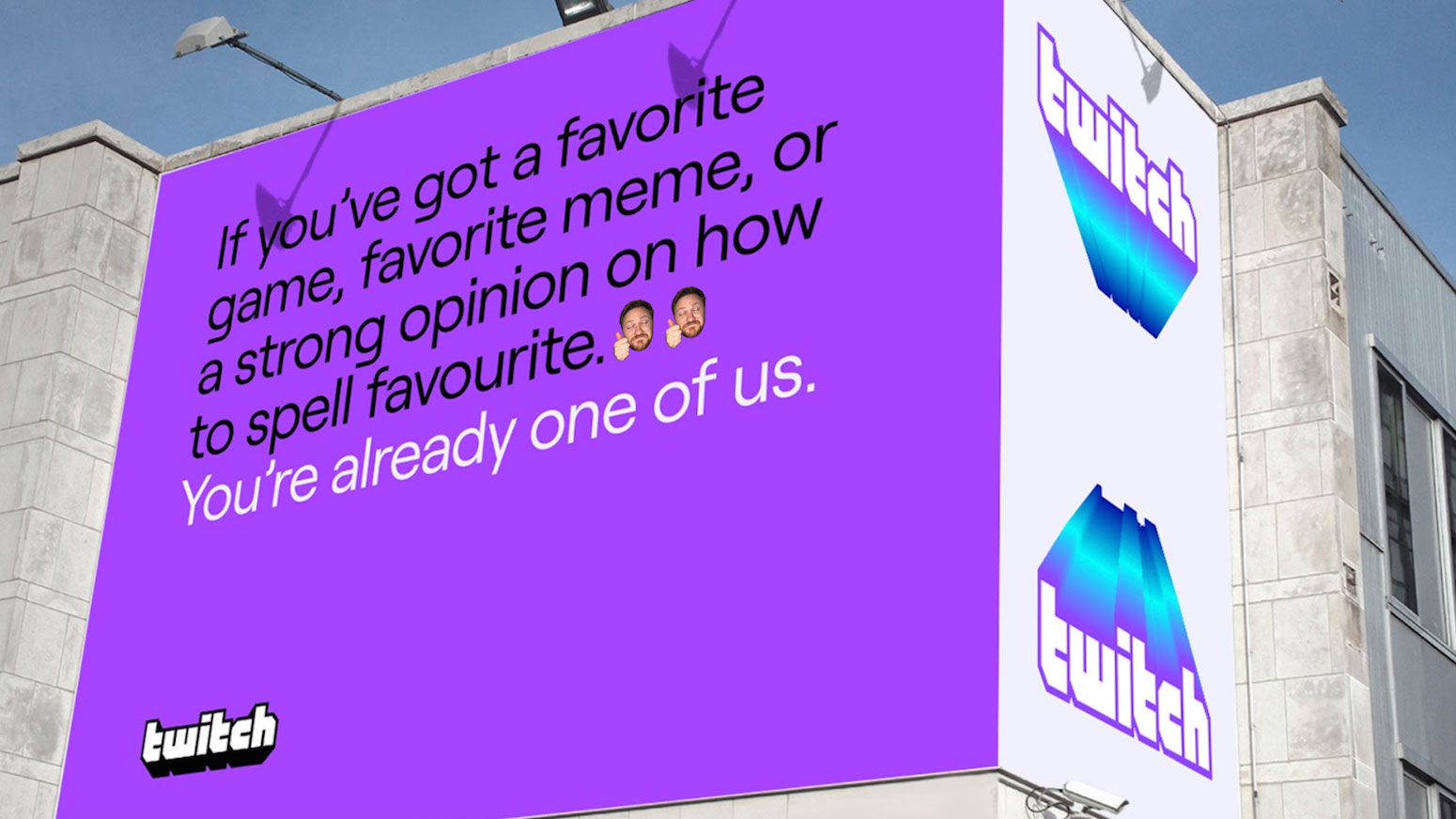
Ahead of this year's TwitchCon, video streaming platform Twitch has revealed a bold rebrand that aims to celebrate the vibrant energy of its creators and communities. As its accompanying slogan proclaims: "you're already one of us."
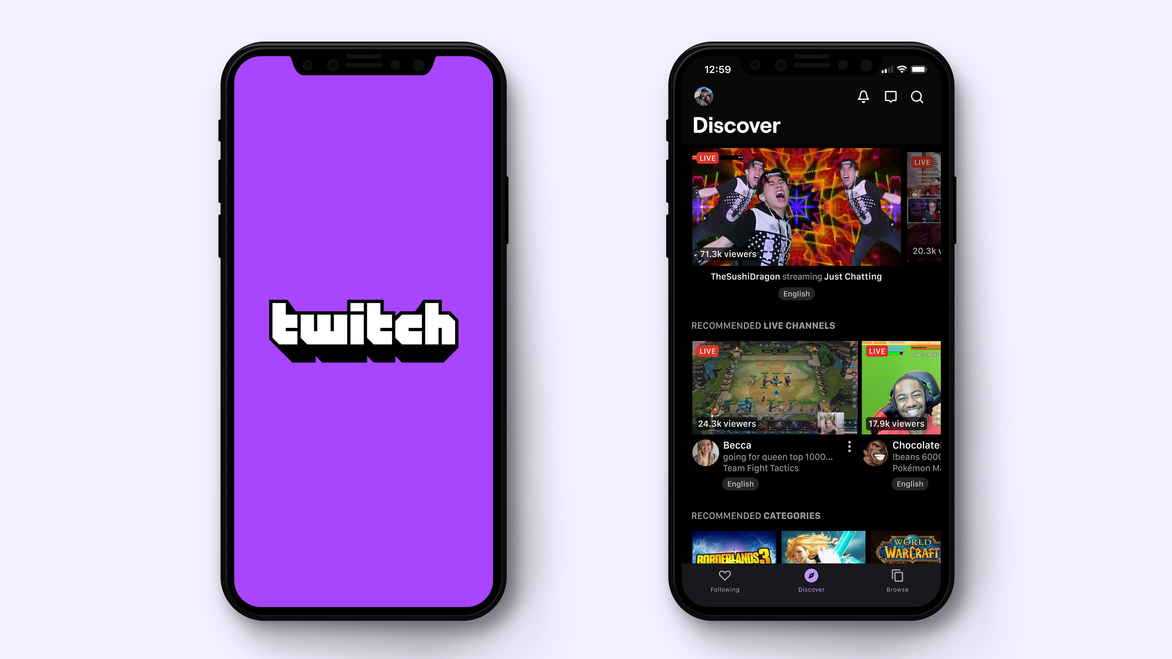
The new look has been a year in the making, and is the first major rebrand for Twitch since it was established back in 2011. Whipped up by Collins in collaboration with Twitch's in-house design team the overhaul includes a new colour palette, a blocky letterform, a polished version of the Glitch mascot, and a Moog synthesiser-inspired typeface that's up there with the best retro fonts we've seen.
If you're familiar with Twitch, you'll be relieved to see that the fundamental elements of the brand are still in place, they've just been given a bit of a polish. Take the colour scheme, which still retains Twitch's signature colour, purple.
"Purple is the only colour alive enough to represent our collective creativity, mischievousness, and energy," the company revealed in press release. "Our new purple is brighter and more vibrant to match that energy."
And to help users express themselves, the Creator Color tool will allow them to set a specific colour to their channel.

Accompanying the heavy-lifting purple is a lineup of over two dozen new colours that all take their names from iconic games and pop culture characters. So expect to see hues such as Mudkip blue and Red Alert... red appear everywhere from the Twitch site, to its advertising and apps.
Sitting alongside these colours is a modified version of the Roobert typeface, which ticked all of Twitch's boxes thanks to its clean, modern design that also comes with a pinch of quirkiness. "It’s also modelled off the retro Moog synthesiser logotype, which we thought added a few cool points."
Get the Creative Bloq Newsletter
Daily design news, reviews, how-tos and more, as picked by the editors.
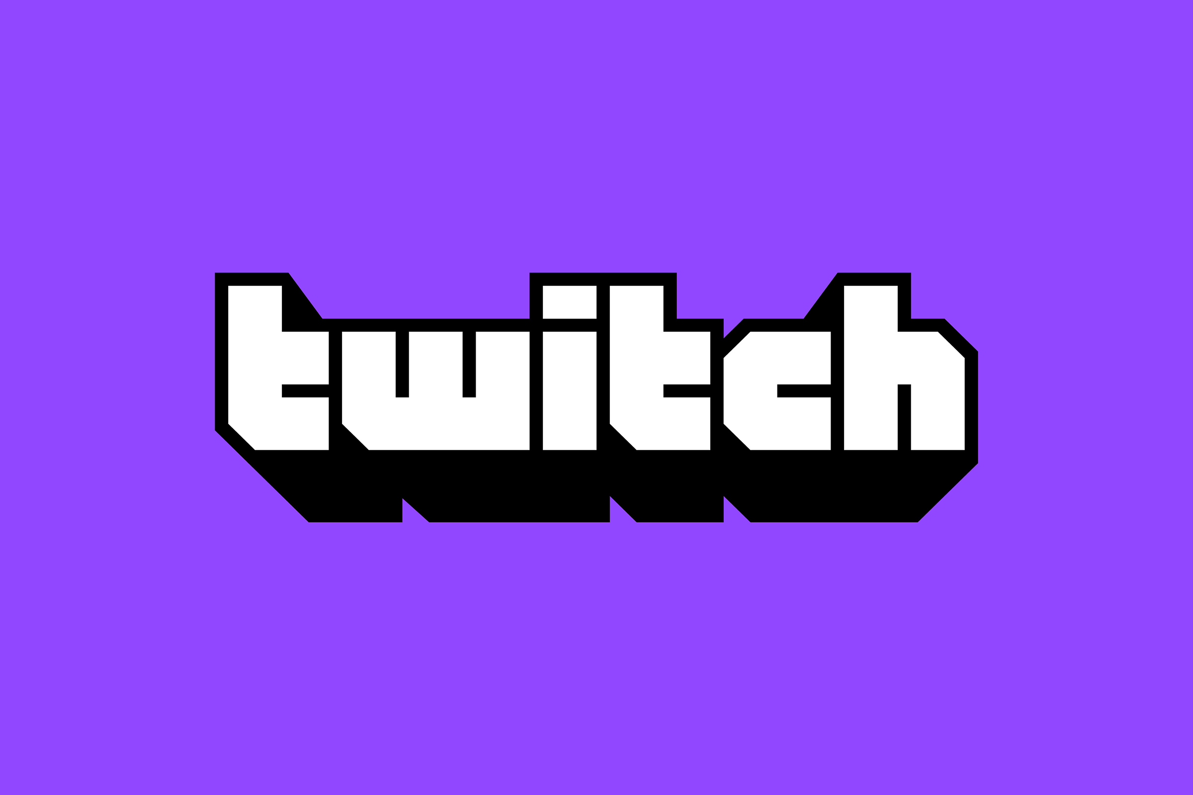
As for the updated wordmark, it's carried over the DNA of the old logo. The blocky letterforms are still there, but they've been straightened out and enhanced by retro arcade game aesthetics. Just look at those lurid gradients.

The Twitch icon, known as Glitch, has also been given a facelift. However the design team wisely decided to play it safe with this update.
Twitch added: "Any brand should worry about retaining some recognisability when updating, but, like, this is Glitch. It’s tattooed on people. We couldn’t change it too much."
It's not all change though, as Twitch's emotes remain the same. Given that its community gave these characters meaning, leaving them untouched is a good way to remind users that they're at the heart of the rebrand. Although Twitch says that it will be putting Emotes out into the world more often.
"We’re in a unique position because we have this deep, weird lore to pull from that others simply don’t, and it seemed nuts to try to make emotes less weird. So we didn't."

Given that Twitch continues to dominate the streaming landscape, with a recent report revealing that it far outstrips the likes of YouTube and Facebook Gaming, it makes sense for the platform to up its game (no pun intended) when it comes to its branding.
"We’re lucky to be able to support such a vibrant, passionate community of creators, viewers, and everyone in-between. These changes are all about putting you front and center and equipped to shine as you reinvent what entertainment is and can be. We can’t wait to see what you do with them."
And with more changes on the way, including new product experiences, it looks like Twitch has more treats in store for its users.
Related articles:

Thank you for reading 5 articles this month* Join now for unlimited access
Enjoy your first month for just £1 / $1 / €1
*Read 5 free articles per month without a subscription

Join now for unlimited access
Try first month for just £1 / $1 / €1

Dom Carter is a freelance writer who specialises in art and design. Formerly a staff writer for Creative Bloq, his work has also appeared on Creative Boom and in the pages of ImagineFX, Computer Arts, 3D World, and .net. He has been a D&AD New Blood judge, and has a particular interest in picture books.
