New Twisters poster is an unwelcome spin on the original
Fans are looking back in anger.

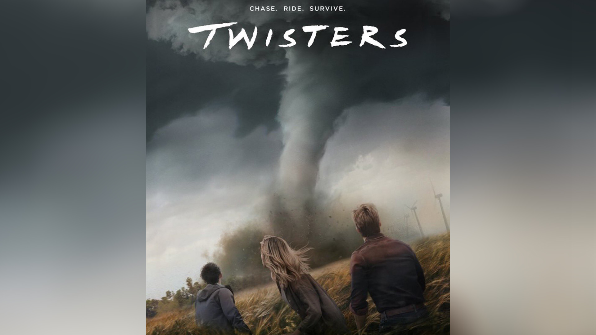
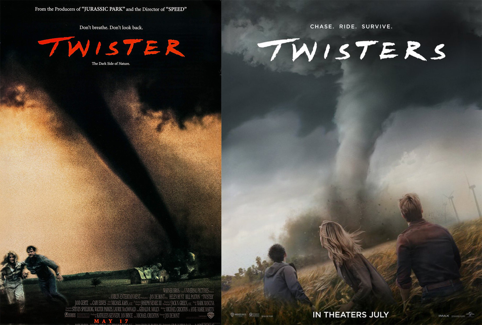
The 1996 storm-chasing action film Twister is getting an unexpected sequel, set to hit cinemas this July. The creatively titled reboot Twisters has a new poster but fans of the classic already have some strong opinions and are already finding flaws in the design.
While this year has already bought us some stunning film posters, Twisters' has received a somewhat underwhelming reaction from fans so far. As a cult classic, the original Twister will be hard to beat, but let's not judge a film by its poster (too much) just yet.

With its brooding colour palette and grainy design, the 1996 Twister poster expertly complements the thrilling storyline. The slanted twister appears to chase the protagonists, creating a sense of tension and threat. In comparison, the sleek, high-def imagery of the new poster feels too clean, lacking the depth and grit to top the original design. Even with a simple colour grading fix by X user XanHouck117, the new poster immediately feels more authentic to the original.
Aesthetics aside, the new poster contradicts the commanding tagline of the original – "Don't look back" (not to mention the poster's singular twister for a film that promises plural – give me more twisters, you cowards). One X user compared the Twisters logo to another 90s classic, tweeting "Is this a Friends remake" while another scathingly compared it to an uninspired "Marvel movie" design. Since its release, various X users have attempted to 'fix' the new design with some amusing results.
Fixed it pic.twitter.com/7QE4wvll4qFebruary 12, 2024
Fixed it https://t.co/AMBknJftAy pic.twitter.com/1VJ7S7pKKcFebruary 13, 2024
I made it better 😉 pic.twitter.com/tC4RjDEgTnFebruary 12, 2024
For more film poster design, take a look at the laughably 'edgy' posters for Netflix's new series The Gentlemen. If you're in need of a movie poster to restore your faith in design, take a look at the gorgeous Tenet rerelease poster that's even better than the original.
Get the Creative Bloq Newsletter
Daily design news, reviews, how-tos and more, as picked by the editors.

Thank you for reading 5 articles this month* Join now for unlimited access
Enjoy your first month for just £1 / $1 / €1
*Read 5 free articles per month without a subscription

Join now for unlimited access
Try first month for just £1 / $1 / €1

Natalie Fear is Creative Bloq's staff writer. With an eye for trending topics and a passion for internet culture, she brings you the latest in art and design news. Natalie also runs Creative Bloq’s Day in the Life series, spotlighting diverse talent across the creative industries. Outside of work, she loves all things literature and music (although she’s partial to a spot of TikTok brain rot).
