TrueCar rebrand fails to reinvent the wheel
New logo is an improvement, but is this a rare misstep from Pentagram?

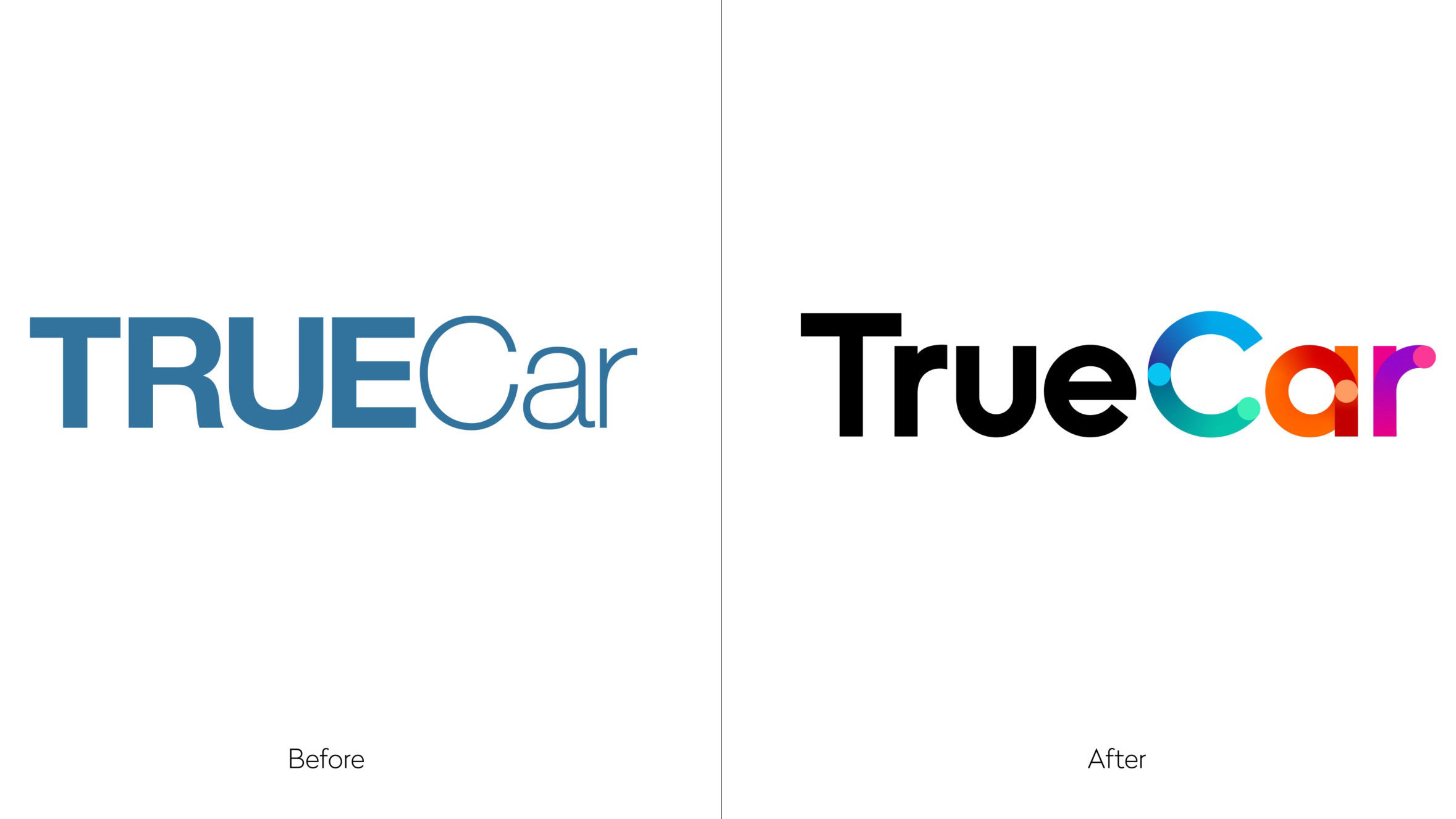
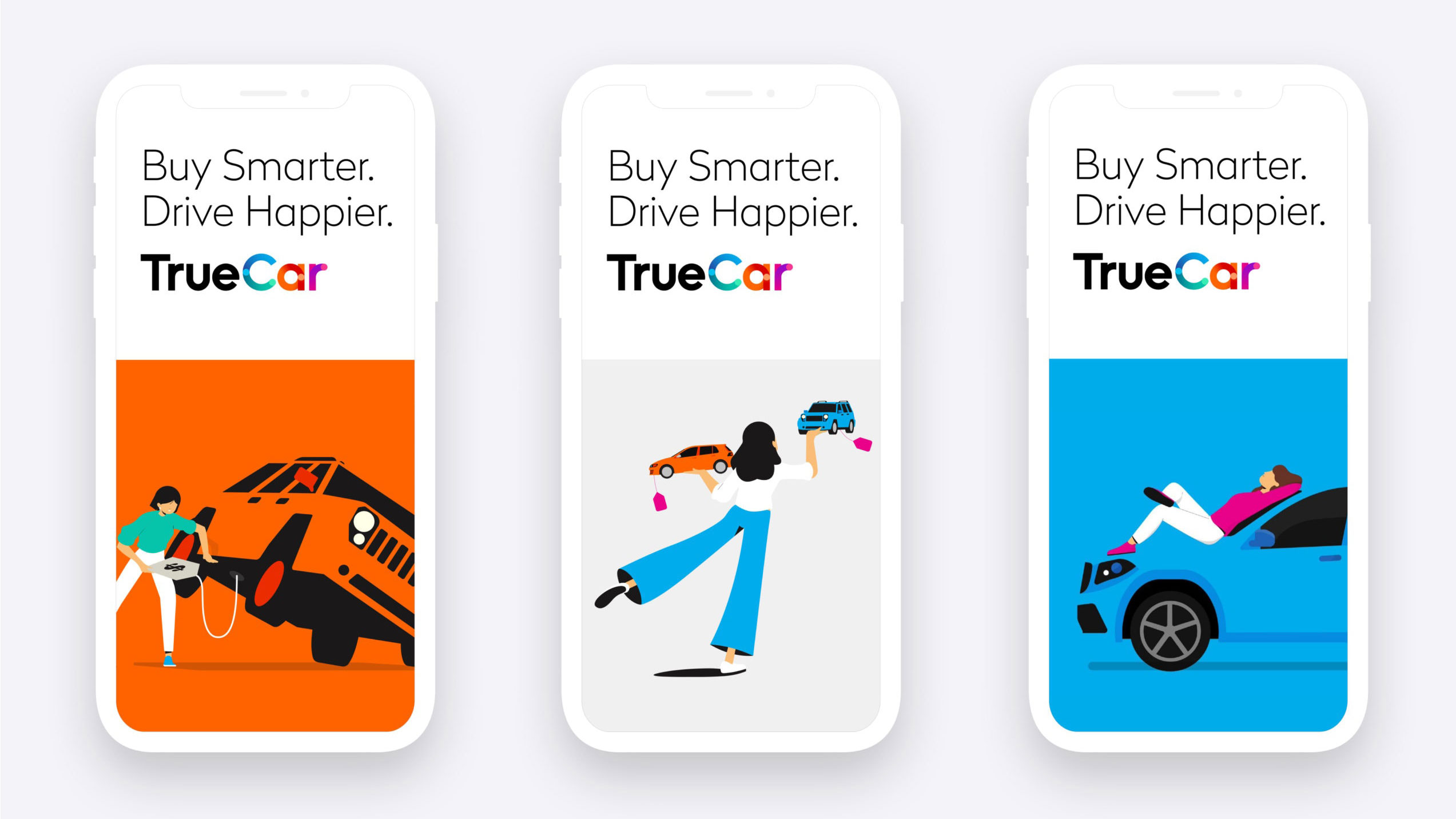
TrueCar is a website and app designed to help people buy new and used cars, and it's recently been rebranded by Pentagram, led by Michael Gericke. There's a new logo, a new tagline: 'Buy Smarter. Drive Happier.,' and a redesigned interface. Usually, we think think that anything Pentagram touches turns to gold, but here, we're not so sure.
It's hard to have much to say about the old logo, apart from that it was dull and unmemorable, and had a horrid mix of caps and lowercase letters. The new one – with the typeface, Radikal – is objectively better, but there's still something about it that doesn't sit quite right for us.
Is it the contrast between the black 'true' and the colourful 'car'? Is it the use of the gradient within the word 'car'? Might a solid colour have worked better? Or perhaps it's those little circles within the letters, which we assume are supposed to represent wheels. Or perhaps a magnifying glass. It's not totally clear. We don't think this one is going to make it to our list of the best logos ever made.
Pentagram says the new logo "evokes TrueCar’s many choices and options, and sets the brand apart from the blue typically used by its competitors". The move away from blue definitely seems like a good decision, and the new logo certainly feels less clinical and unobtrusive than the old one.
The aim of the rebrand was to "appeal to a wider audience as it personalises the car-buying journey for consumers". And as Lucas Donat, chief brand officer of TrueCar told Fast Company, it was also to resonate with women: "A main driver of our rebrand was to resonate with women, who make or influence 82 per cent of vehicle purchases in the US," he says. It's hard to say whether or not this rebrand will appeal to a whole gender, but its new look is perhaps less masculine than before.

There are also a lot of women in the illustrations and animations, created by NiceShit Studio and Hornet/Moth, respectively. The illustrations of faceless people feel pretty on trend right now (or at least they were last year), although whether they have true staying power remains to be seen.
The animations feel fun and fresh, although they do show people with their legs sticking out of cars and lying on top of cars, which doesn't feel like the most sensible of choices for a car selling site. We just hope people don't take them literally.
Get the Creative Bloq Newsletter
Daily design news, reviews, how-tos and more, as picked by the editors.

Overall, this rebrand has all the elements of a thought-through piece of work, yet for us, it doesn't quite hang together properly. And it's not often we say that about Pentagram. We raved about its DK rebrand, or recent refresh of Fisher-Price.
What do you think of the new look? Let us know on Twitter or Facebook.
Read more:

Thank you for reading 5 articles this month* Join now for unlimited access
Enjoy your first month for just £1 / $1 / €1
*Read 5 free articles per month without a subscription

Join now for unlimited access
Try first month for just £1 / $1 / €1

Rosie Hilder is Creative Bloq's Deputy Editor. After beginning her career in journalism in Argentina – where she worked as Deputy Editor of Time Out Buenos Aires – she moved back to the UK and joined Future Plc in 2016. Since then, she's worked as Operations Editor on magazines including Computer Arts, 3D World and Paint & Draw and Mac|Life. In 2018, she joined Creative Bloq, where she now assists with the daily management of the site, including growing the site's reach, getting involved in events, such as judging the Brand Impact Awards, and helping make sure our content serves the reader as best it can.
