Tour de France rebrands and drops the 'Le'
The cycling race gets a sunny new look.

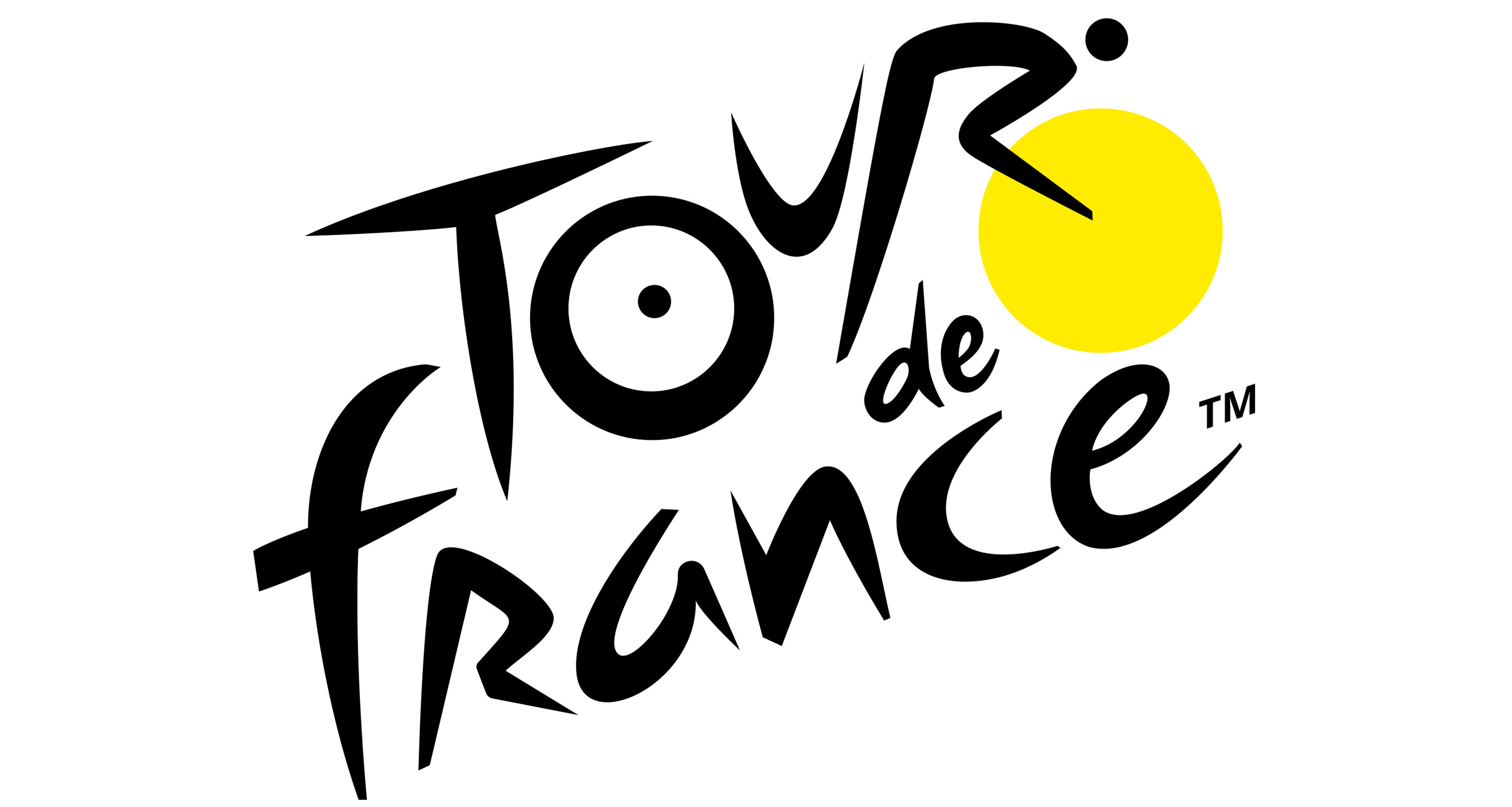
Le Tour de France is now just Tour de France, according to its new logo. A new bright yellow version of the cycling race's logo was used throughout this year's competition.
And yes, we know, we're a little late to the party. But in all fairness, the event itself unveiled the new logo and identity with little fanfare, and we were too busy watching Wimbledon/reading our guide to logo design to notice.
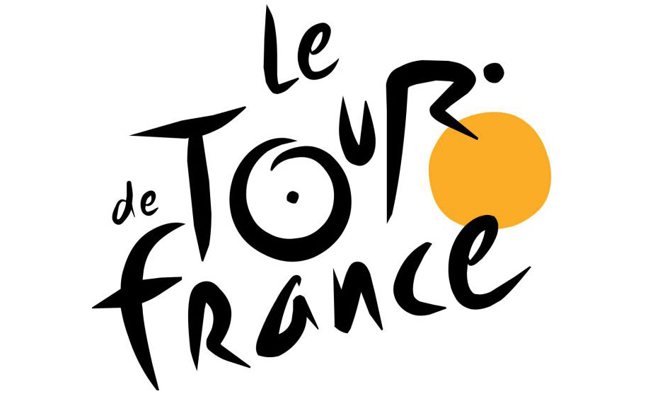
The new logo (designer unknown) sticks with the same scrawly handwriting font as before. However, there are lots of subtle differences to the previous logo, which was created by Joel Guenoun in 2002 and incorporates a hidden cyclist – one of our favourite logo easter eggs.
The 'o' is now a full circle – which makes sense as it looks more like a wheel than before, the 'u' is less squished in and therefore easier to read, the 'r', or cyclist, is now slightly easier to read too. There are also subtle changes to the letters in the word 'France', which improve legibility overall.

The 'de' in the logo has also moved, making the logo less likely to be read as 'Le de Tour France'. And of course, the 'le' has gone altogether. This is perhaps the most interesting move in terms of the letters, because the competition is still known as Le Tour, even on its own Twitter feed.
Was it because the organisers were fed up of people who don't speak French butchering the 'le'? Or was it simply to make the logo neater and easier to place? The designer has also added a 'TM' to the logo, which feels a little unnecessary.

You can see the new logo in action on @LeTour's Twitter feed, below.
Get the Creative Bloq Newsletter
Daily design news, reviews, how-tos and more, as picked by the editors.
🏆 Final sprint on the Champs-Elysées. It can be a very close one like in 2016 in Limoges between Marcel Kittel and Bryan Coquard. 🏆 Dernier sprint sur les Champs-Elysées. Victoire à un boyau avec @Continental_fr en perspective comme en 2016 à Limoges entre Kittel et Coquard ? pic.twitter.com/GntWIZvtXbJuly 28, 2019
The refreshed colour palette is also with a mention. The use of bright yellow, although a little garish, does make sense for Tour de France. The yellow jersey (maillot jaune) is worn by the leader of the race at each stage, and by the winner at the end. And while the previous logo was a sort of nod to this, its circle was more of an orangey hue. This logo matches the jersey much more closely.
See more about the yellow jersey in the video below.
The dazzling yellow as the wheel/sun of the logo, as well as across the identity in general also reflects the summery feel to the competition, and many will already associate the race with long, hot days.
And while those who weren't keen on the previous logo will have hoped the logo would change more significantly, we're just pleased that the 'hidden rider' is still present. The enlarged 'u' does break this design up a bit, but we think the rider is easier to see now. Although that's perhaps because we can't 'unsee' it.
Read more:

Thank you for reading 5 articles this month* Join now for unlimited access
Enjoy your first month for just £1 / $1 / €1
*Read 5 free articles per month without a subscription

Join now for unlimited access
Try first month for just £1 / $1 / €1

Rosie Hilder is Creative Bloq's Deputy Editor. After beginning her career in journalism in Argentina – where she worked as Deputy Editor of Time Out Buenos Aires – she moved back to the UK and joined Future Plc in 2016. Since then, she's worked as Operations Editor on magazines including Computer Arts, 3D World and Paint & Draw and Mac|Life. In 2018, she joined Creative Bloq, where she now assists with the daily management of the site, including growing the site's reach, getting involved in events, such as judging the Brand Impact Awards, and helping make sure our content serves the reader as best it can.
