These clever logo mashups are totally on-point
You'll never see these brands the same way again.
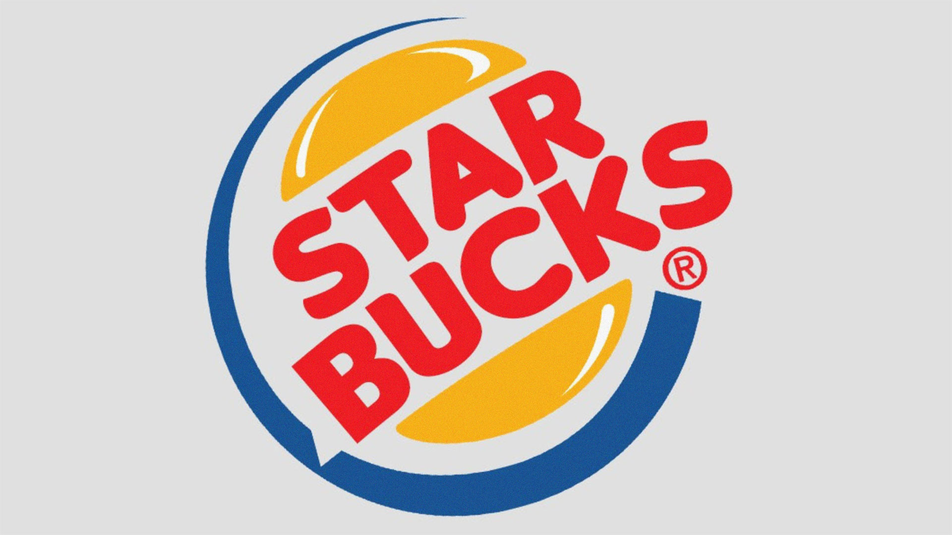
I love a good mashup, but at the same time I'm not particularly keen on the term, 'mashup'. It implies a certain lack of care, and while there are plenty of examples where that's definitely the case, the best work is assembled with precision, intelligence and humour that definitely makes it transcend the 'mashup' label.
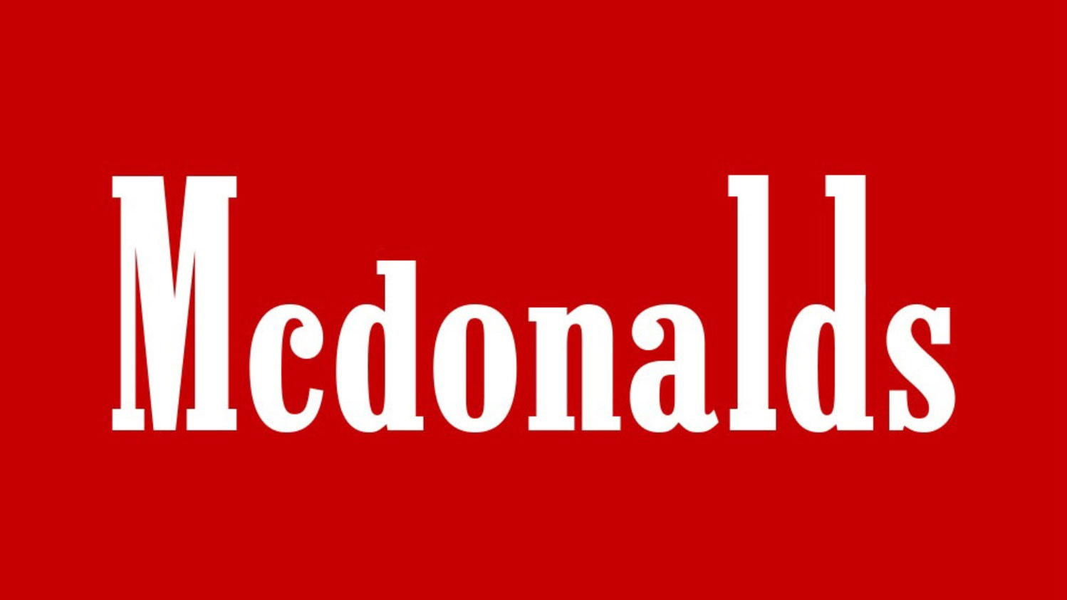
That's why my favourite listening right now is 'OV/ER/LO/AD', an eight-hour work by The Kleptones made from bits of way too many songs to count or keep track of, which very much has something to say about the state of the world right now. And I'm similarly enamoured of Logos Twisted, a set of logo collisions by Dubai-based designer Mostafa Azzam, which doesn't merely smash disparate brand identities together for the lols; like an earlier set of logo mashups we looked at a while back, there's a clear streak of humour running through this collection as well as a strong knowledge of how to design a logo, such as this expert blend of Mcdonald's and Marlboro.
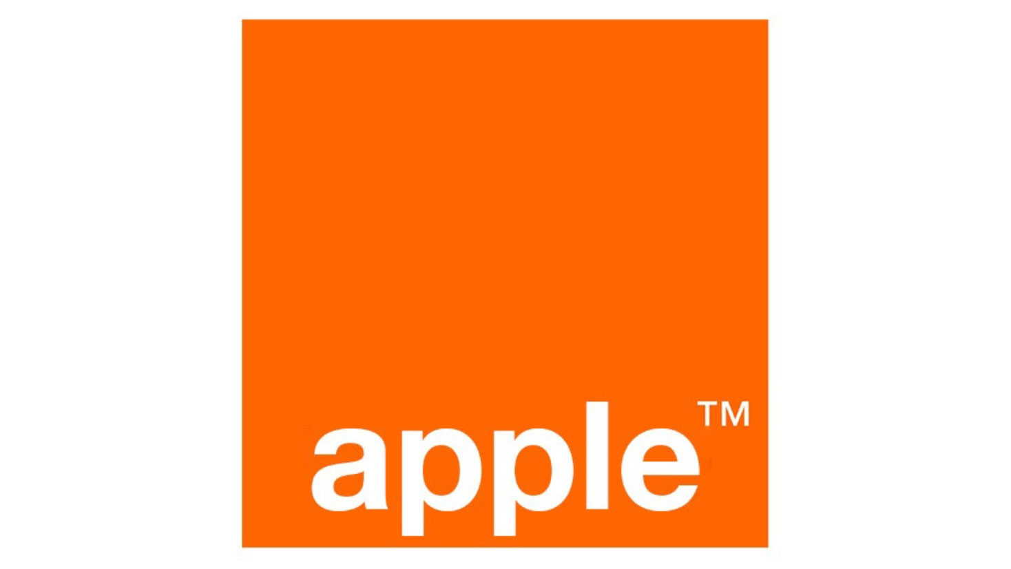
Similarly, take this glorious shoehorning of Apple into the stylings of the Orange logo. Apples and oranges! That's just the sort of silliness I needed on this far-too-hot afternoon.
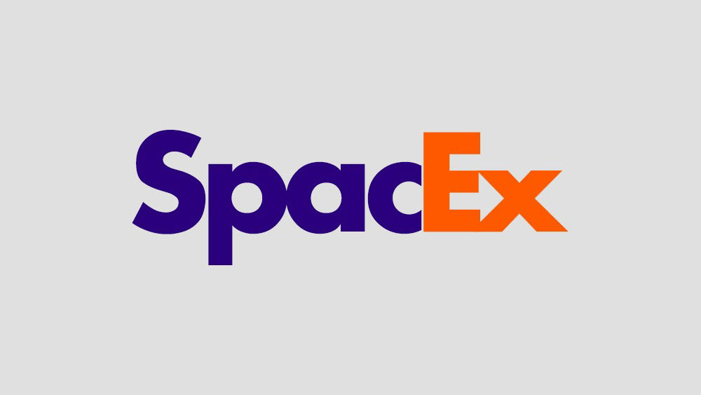
I also like the thinking behind this FedEx treatment of SpaceX. Not only does it fit really nicely (and you can also argue that there are fundamental similarities between both companies' missions, as they're both focused on getting stuff from one place to another), but it also retains that hidden arrow that we surely all know about by now.
Azzam's treatment of Mr Muscle, transferring it into the MasterCard branding, maybe doesn't make quite so much conceptual sense, but I really like it; those MasterCard circles could be interpreted as bulging biceps, which makes this one a really good fit.
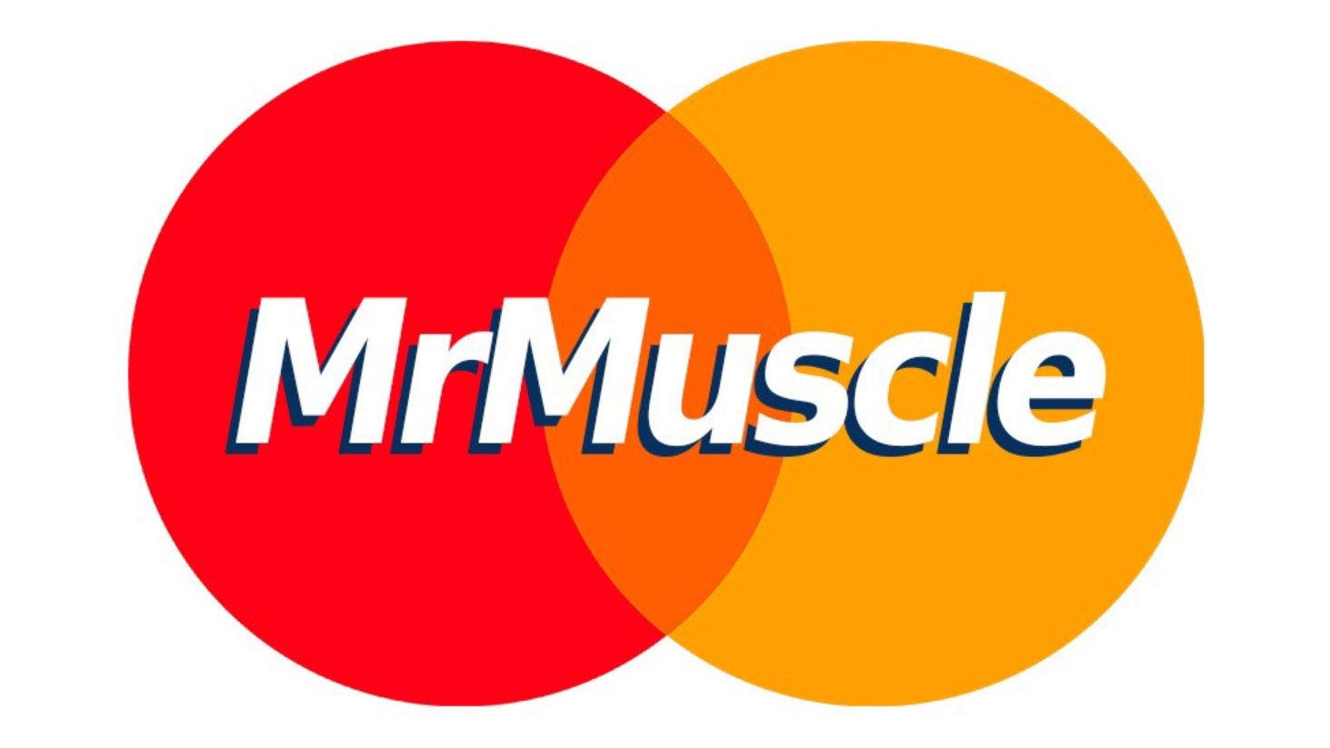
There are plenty to enjoy; here are some more of my favourites, some more successful than others.
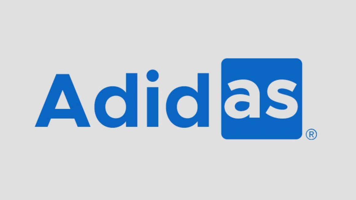
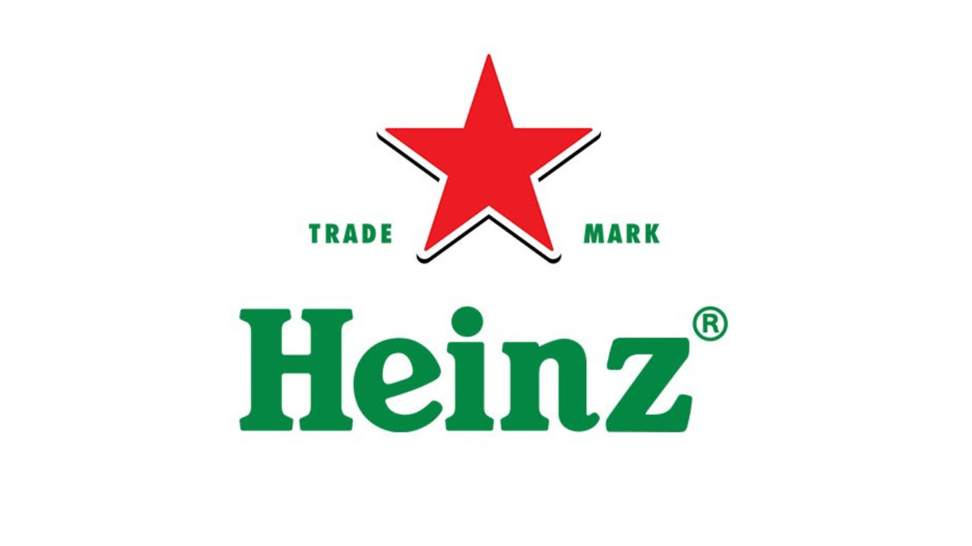
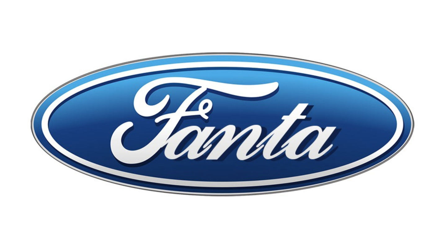
If you want to see the full set, head over to Behance where you can also enjoy an ongoing series of Azzam's nonsense designs: a mixed bag of creativity with some fantastically daft works to be found. And if you want to know more about Azzam and his work, this interview with Bored Panda is a great read.
Get the Creative Bloq Newsletter
Daily design news, reviews, how-tos and more, as picked by the editors.
Read more:
- The hottest logo design trends of 2022
- These logo design disputes are utterly ridiculous
- Discover the best logo designer

Thank you for reading 5 articles this month* Join now for unlimited access
Enjoy your first month for just £1 / $1 / €1
*Read 5 free articles per month without a subscription

Join now for unlimited access
Try first month for just £1 / $1 / €1
Jim McCauley is a writer, performer and cat-wrangler who started writing professionally way back in 1995 on PC Format magazine, and has been covering technology-related subjects ever since, whether it's hardware, software or videogames. A chance call in 2005 led to Jim taking charge of Computer Arts' website and developing an interest in the world of graphic design, and eventually led to a move over to the freshly-launched Creative Bloq in 2012. Jim now works as a freelance writer for sites including Creative Bloq, T3 and PetsRadar, specialising in design, technology, wellness and cats, while doing the occasional pantomime and street performance in Bath and designing posters for a local drama group on the side.
