New Titanic movie poster design is getting utterly roasted
Hello, Photoshop.

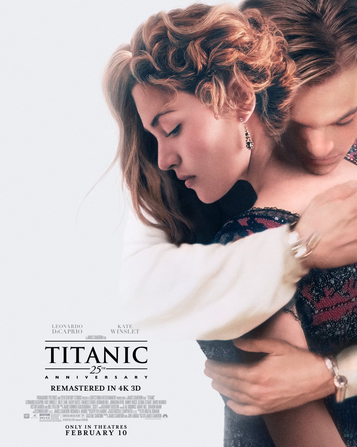
One of the greatest movies of all time (well I like it, anyway), James Cameron's 1997 epic Titanic has just been released in 4K 3D for its 25th anniversary. And as you'd expect for such a momentous occasion, the studio has commissioned a brand new poster. But what you might not have expected is for it to look like a bit of a rush job.
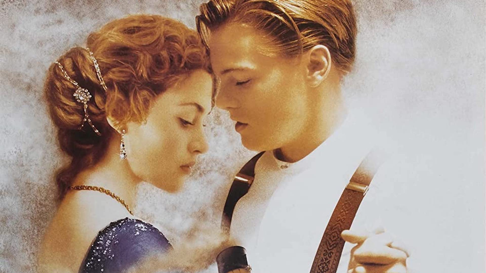
On the face of it, it seems like a pretty familiar shot of Jack, played by Leonardo DiCaprio, hugging Rose, portrayed by Kate Winslet. Compared with the original posters, there's a bit of motion blur in Leo's arm, adding a touch of dynamism and movement. Then in the bottom left corner the movie logo, tweaked for the 25th anniversary, and a stack of standard credits. And that's about it. As a composition, it's nicely balanced and on the face of it, does the job well (though it isn't a match for the best print ads ever).
But look a little closer at the image below – as bored people on social media are wont to do – and something odd pops up. Can you spot what we're talking about?
Titanic returns to the big screen in 4K 3D for a limited time on February 10. pic.twitter.com/cuhO6dMQc7January 10, 2023
Writer Hunter Harris sums up the problem succinctly, asking "Why does she have two different hairstyles?" Twitter user Federico is similarly troubled, writing: "This poster is… I mean her hair… it’s… I’ll watch the movie but… this poster. Jesus help me."
When you glance back at the image, you can see exactly what they mean: Kate Winslet's mane does seem to have a split personality. But what's not clear is why? Your initial thought is that someone's made an epic photo compositing error... but does that actually make sense? Surely this kind of hair collage would be something you'd have to spend a lot of effort creating, not something that could suddenly appear at the accidental press of a button.

One Twitter user has a theory which might explain all that. "The two different hairstyles on Rose represent the two different sides to Rose," she believes. "One side prim and proper how she was supposed to be as viewed by her Mom and upper society, and the other side, down, free, and flowing, as how she felt when she was with Jack."
It's an interesting idea, although it seems a little convoluted to us. The principle of Occam's razor – that the simplest explanation is likely to be the most correct one – would suggest that this is a mere cockup, and if so, it certainly wouldn't be the worst we've seen. Look at what happened with this poster for The Northman, for example.
Get the Creative Bloq Newsletter
Daily design news, reviews, how-tos and more, as picked by the editors.
Alternatively, maybe the studio themselves are trolling us, and they just wanted to get everyone talking. If so... hey, it worked! In fact, we're still staring at this poster and noticing yet more issues. For instance, are they handcuffs Leo's wearing? If so, it doesn't really fit the chronology of the film...
Meanwhile, to see how a movie poster should be done, read our guide to the best print ads of all time, and to improve your own skills, check our roundup of the best Photoshop tutorials.
Read more:

Thank you for reading 5 articles this month* Join now for unlimited access
Enjoy your first month for just £1 / $1 / €1
*Read 5 free articles per month without a subscription

Join now for unlimited access
Try first month for just £1 / $1 / €1

Tom May is an award-winning journalist and editor specialising in design, photography and technology. Author of the Amazon #1 bestseller Great TED Talks: Creativity, published by Pavilion Books, Tom was previously editor of Professional Photography magazine, associate editor at Creative Bloq, and deputy editor at net magazine. Today, he is a regular contributor to Creative Bloq and its sister sites Digital Camera World, T3.com and Tech Radar. He also writes for Creative Boom and works on content marketing projects.
- Daniel JohnDesign Editor
