Tinder's first global ad campaign is delightfully maximalist
We're swiping right on this one.

Ah, Tinder. Over the last decade, the brand has become synonymous with online dating – a world that's arguably as terrifying as it can be exciting. But in its first ever global marketing campaign, Tinder wants to move a way from the "one-night stand" perception and celebrate the many types of connection it believes are available on the app.
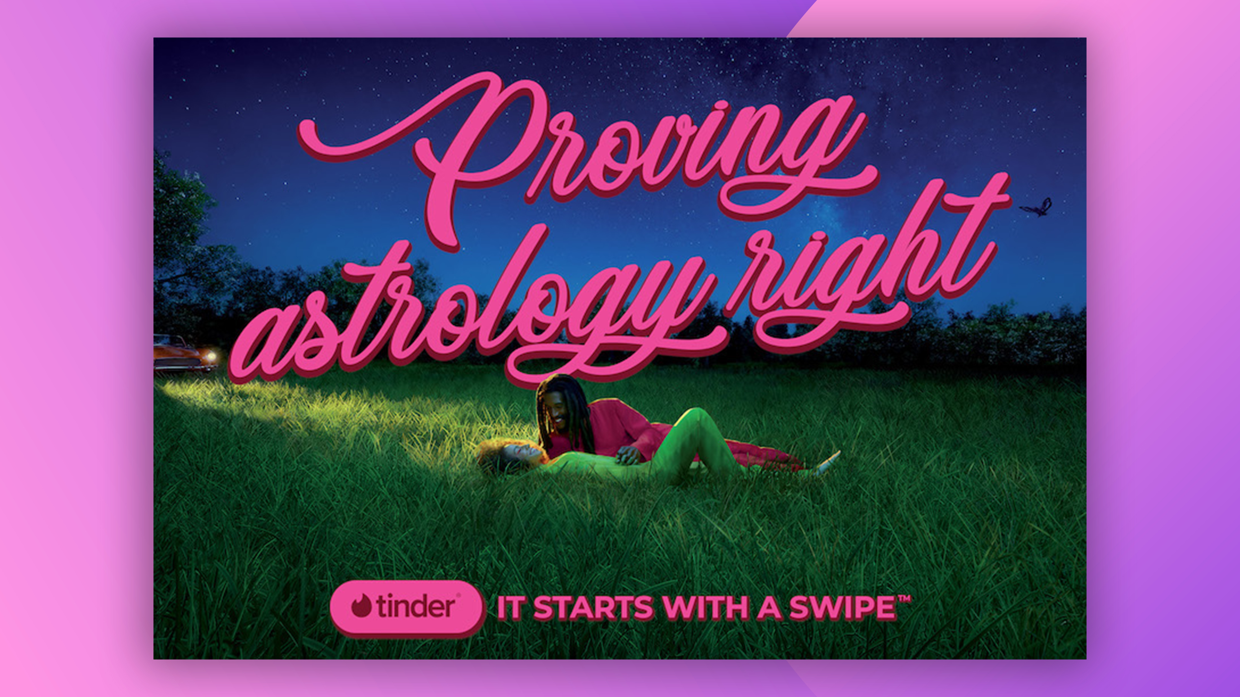
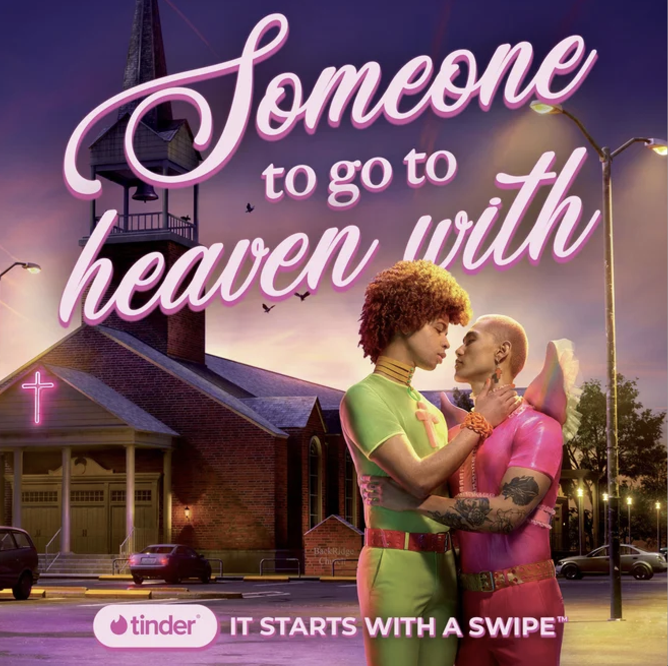
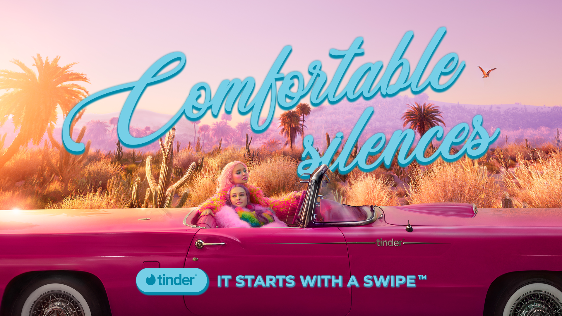
Created in partnership with US agency Mischief, the 'It starts with a swipe' campaign "illustrates all the possibilities that Tinder delivers - from yes, a modern-day hook up, to relationship milestones like meeting the friends." While it'll be interesting to see whether Tinder can really shake off its "hook-up" reputation, for now we can enjoy the delightfully retro, sunkissed visuals created for the campaign. (Looking for more inspiration? Check out the best print ads of all time.)

The campaign celebrates a diversity of dating possibilities, as well as genders, orientations and multiculturalism, all produced with a diverse cast and crew that "reflects the fluid and inclusive attitude that is so inherent to Tinder."
"Tinder's challenge to us was bigger than a change of brand perception—it was a change of dating perception," says Mischief in a blog post on Tinder's website. "Today, there’s a new generation of people who aren’t jaded by dating, nor do they define dating the same way. The opportunity for Tinder is to communicate the infinite possibilities that exist on Tinder that lead to a one-time vibe or a long term relationship."

The 80s-style visually lead with delightfully 'extra' typography celebrating various aspects of relationships, from meeting new friends to leaving a toothbrush at someone's place. Photo-digital artist Pol Kuruz shot the campaign, and describes the aesthetic as "a cocktail of unusual chromatic combinations, vibrant colours, contrast and pop aesthetics," which sums it up pretty much perfectly.
Indeed, in a world of minimalism and flat design (looking at you, Nokia), it's always fun to see a brand embrace maximalism and fun. Like Netflix's new illustrations, Tinder's first global campaign feels like a celebration, and we're here for it.
Read more
Get the Creative Bloq Newsletter
Daily design news, reviews, how-tos and more, as picked by the editors.

Thank you for reading 5 articles this month* Join now for unlimited access
Enjoy your first month for just £1 / $1 / €1
*Read 5 free articles per month without a subscription

Join now for unlimited access
Try first month for just £1 / $1 / €1

Daniel John is Design Editor at Creative Bloq. He reports on the worlds of design, branding and lifestyle tech, and has covered several industry events including Milan Design Week, OFFF Barcelona and Adobe Max in Los Angeles.
