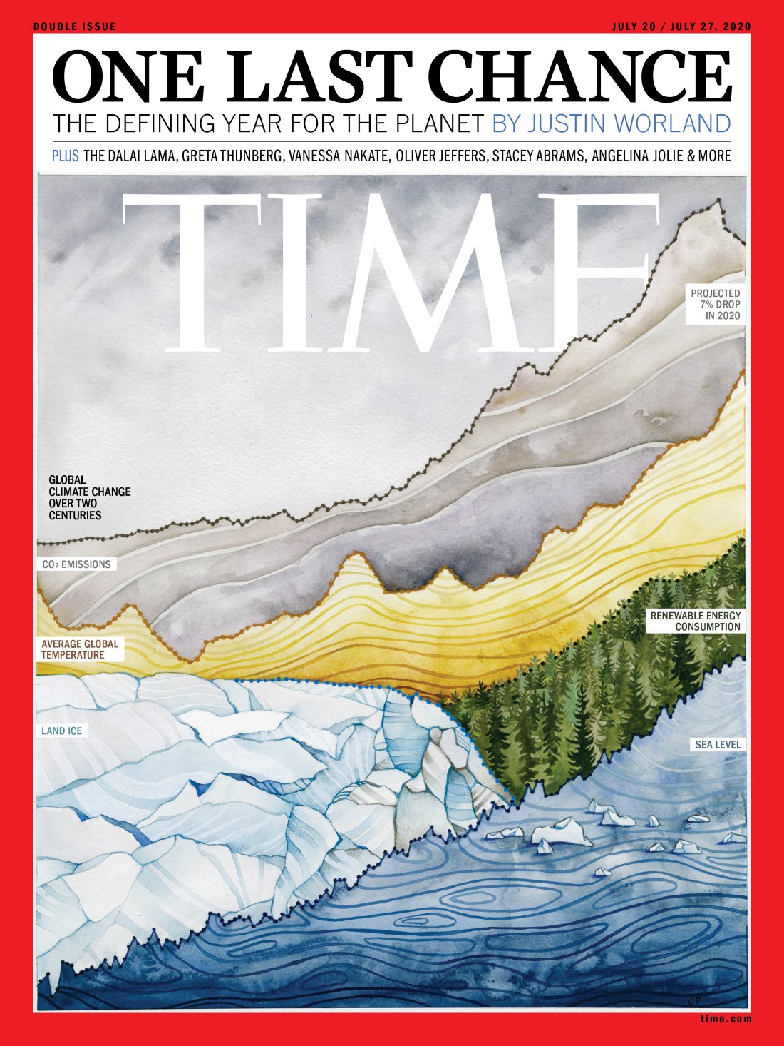
Time Magazine’s new cover is both beautiful and terrifying
"One last chance."
Sign up to Creative Bloq's daily newsletter, which brings you the latest news and inspiration from the worlds of art, design and technology.
You are now subscribed
Your newsletter sign-up was successful
Want to add more newsletters?
At first glance, it looks like a beautiful, vibrant landscape complete with ice, forest and mountains. But look a little closer, and Time Magazine's latest cover illustration becomes a lot more complicated – and terrifying.
This week's cover (below) features a watercolour painting titled Currents, depicting a landscape made out of global climate change indicators. These graphs create the outline of mountains, trees and more, serving to illustrate "the benefits and costs of human impacts on this planet". Like many of the best print ads of all time, it's a surprising and multi-layered design.

The cover was painted by artist and scientist Jill Pelto, who often incorporates scientific research and data into her watercolour paintings. “It has been a tumultuous year, but underlying currents of positive action are surfacing rapidly,” says Pelto on the magazine's website. "The reality of this data may be frightening, but there are messages for hope within."
Article continues belowIndeed, not every upward gradient in the painting is designed to be horrifying. While sea level and global temperature are shown to be rising, so too is renewable energy consumption. And C02 emissions even see a sharp decline in 2020, reflecting the "projected 7% drop in 2020" as a result of the coronavirus pandemic. Above the painting are the words "One last chance: the defining year for the planet".
I created a new watercolor painting features on TIME July climate issue!! It depicts a critical grouping of climate data dictating our present and future action. I'll share the data sources on my website asap (https://t.co/bVClwGfzCR) https://t.co/pymu4G7ao2July 9, 2020
Pelto's cover has proved a hit online. "Excellent use of data and mixed media," one Reddit user comments, while another adds, "Illustration is great, but the message is so saddening." Of Time's cover designs in general, one user remarks, "They really don't miss".
We're seriously impressed by Pelto's combination of art and science to convey both beauty and horror. Like many of the most controversial magazine covers, the message is shocking – but here, it's also tinged with hope.
Read more:
Sign up to Creative Bloq's daily newsletter, which brings you the latest news and inspiration from the worlds of art, design and technology.

Daniel John is Design Editor at Creative Bloq. He reports on the worlds of design, branding and lifestyle tech, and has covered several industry events including Milan Design Week, OFFF Barcelona and Adobe Max in Los Angeles. He has interviewed leaders and designers at brands including Apple, Microsoft and Adobe. Daniel's debut book of short stories and poems was published in 2018, and his comedy newsletter is a Substack Bestseller.
