That terrible new McDonald's logo, explained
Is the TikTok trend getting tiresome?

Over the past few weeks, you might have noticed various brands changing their logos to some frankly terrible designs on social media. It's all thanks to TikTok, with one user's comedy designs taking the internet by storm. The latest to jump on the brandwagon is none other than McDonald's. But is the joke already getting old?
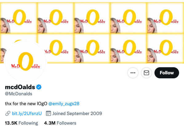
Emily Zugay's design crimes include crude reimaginings of some of the best logos of all time, and the clip art-esque abominations have to be seen to be believed. From Adobe to Amazon, some of today's most recognisable brands have fallen victim to Zugay's, er, talents. And some, including McDonald's, have even embraced the new designs by changing their profile images. Because brands can have a sense of humour too!

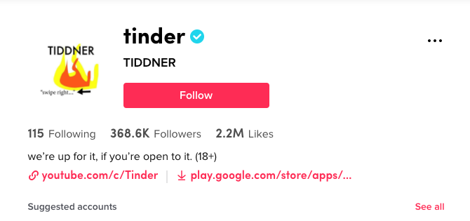
The garish designs, complete with misspelled names (McDoalds, anyone?) and horrendous typography have clearly struck a chord, with Zugay's videos receiving millions of likes. And perhaps spotting a golden PR opportunity, several of the corporate victims have got in on the joke, with The Washington Post, Tinder, Nascar, Tampax, the Detroit Lions and even TikTok itself all changing their profile photos to Zugay's redesigns along with McDonald's.
@emilyzugay ♬ original sound - Emily’sTikTok.edu
Of course, to call these design fails is somewhat missing the point – Zugay's delightfully dreadful designs are clearly a joke, and they're up there with last year's terrible logo project when it comes to comedy logos. Indeed, we're loving her hilarious videos and hope there are plenty more to come.
But the companies themselves are starting to look a little desperate. The rules of the internet state than when a brand joins in with a meme, the meme is dead – and this particular horse is being well and truly flogged. Like Microsoft's attempt to join in the lols about the Xbox Series X name, it all feels a little "How do you do, fellow kids?"

Zugay's brilliantly awful logos are worlds apart from those supposedly 'premium' logo designs that went viral on TikTok in August. But one thing's for sure – TikTok is proving itself to be quite the destination for designers. It's great to see creativity being championed on new platforms, even for comedy purposes. If you're still not up to speed on how it all works, check out our guide to how to edit a video on TikTok.
Read more:
Get the Creative Bloq Newsletter
Daily design news, reviews, how-tos and more, as picked by the editors.

Thank you for reading 5 articles this month* Join now for unlimited access
Enjoy your first month for just £1 / $1 / €1
*Read 5 free articles per month without a subscription

Join now for unlimited access
Try first month for just £1 / $1 / €1

Daniel John is Design Editor at Creative Bloq. He reports on the worlds of design, branding and lifestyle tech, and has covered several industry events including Milan Design Week, OFFF Barcelona and Adobe Max in Los Angeles. He has interviewed leaders and designers at brands including Apple, Microsoft and Adobe. Daniel's debut book of short stories and poems was published in 2018, and his comedy newsletter is a Substack Bestseller.
