Is this hilarious new Meta logo actually an improvement?
Comedy TikTok designer strikes again.

Remember back in September when McDonald's changed its logo to that seriously appalling design? Well, that was all down to TikToker Emily Zugay, who went viral for badly redesigning famous logos. Now the 'artist' has struck again with some more hilarious rebrands.
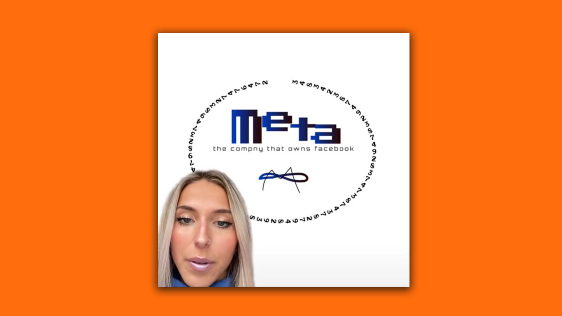
The last time we checked in on Zugay's account, she had redesigned the logos for the likes of Tinder, Nascar and The Washington Post, but now even more brands have had the Zugay makeover. One that stood out to us in particular was her redesign for Meta (see below). The design features a new wordmark, slogan and logo, and it's absolutely hilarious. Worried your logos look a little too similar to Emily's designs? Make sure you check out our 15 golden rules of logo design.
@emilyzugay ♬ original sound - Emily’sTikTok.edu
The TikToker claims that the Meta logo looks like a soft pretzel (which we can't argue with) and that the shade of blue is not the colour of the future. After criticising the design, Zugay reveals her version of the logo. Her design features a clunky 8-bit font, a badly drawn M overlapping an infinity circle and a brand new slogan that reads "The company that owns Facebook". And hey, while it's a hilariously confusing design, we're not exactly sure what the actual Meta logo is supposed to represent either.

Zugay has racked up over 65,900,000 likes on her TikTok account already and has attracted the attention of some huge brands. Both Uno and GymShark are the latest companies to swap out their profile pictures for the TikToker's awful designs. We particularly like the Gym Shark's new logo (or 'Jim Shark' according to Zugay), as it's now a shark wearing sunglasses.
We're not sure if we'd love to see how the artist would redesign our own logo or dread it – either way, we're happy laughing from afar for now. If you think you have what it takes to go viral on TikTok, then make sure you check out our roundup of the best TikTok trends for creatives.
Read More:
- Are these new Lord of the Rings posters genius – or just frustrating?
- These custom Apple AirTags are causing serious alarm
- Turns out the Walmart logo isn't what you think it is
Get the Creative Bloq Newsletter
Daily design news, reviews, how-tos and more, as picked by the editors.

Thank you for reading 5 articles this month* Join now for unlimited access
Enjoy your first month for just £1 / $1 / €1
*Read 5 free articles per month without a subscription

Join now for unlimited access
Try first month for just £1 / $1 / €1

Amelia previously worked as Creative Bloq’s Staff Writer. After completing a degree in Popular Music and a Master’s in Song Writing, Amelia began designing posters, logos, album covers and websites for musicians. She covered a range of topics on Creative Bloq, including posters, optical illusions, logos (she's a particular fan of logo Easter eggs), gaming and illustration. In her free time, she relishes in the likes of art (especially the Pre-Raphaelites), photography and literature. Amelia prides herself on her unorthodox creative methods, her Animal Crossing island and her extensive music library.
