England's Three Lions logo gets a controversial makeover (but there's a big misunderstanding)
Voices are roaring online.
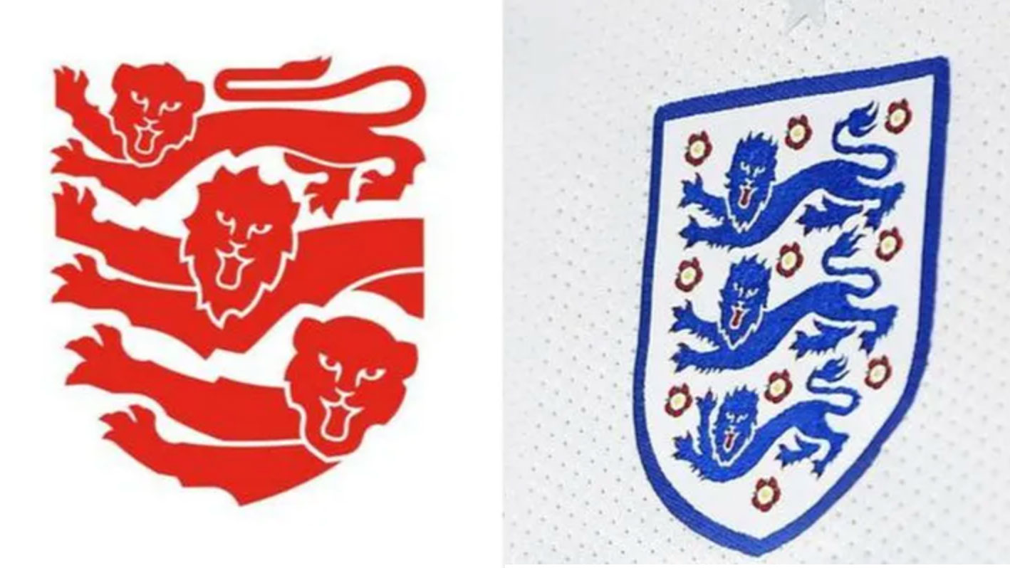
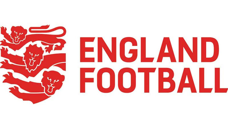
The FA's iconic Three Lions badge has been redesigned, as part of a new brand platform for the FA, called England Football. The new design has angered fans by removing most of the iconography and replacing the three male lions with a family of lions – a cub, lioness and lion.
But the incensed fans needn't worry too much (it may be too late for that), as this badge isn't intended to replace its predecessor (which could be considered one of the best logos of all time). Crucially, the blue Three Lions crest will remain on the shirt, with this new badge standing separately as part of a new brand, created for the grassroots sector of football. Every design alteration plays a part in the brand's message, which is one of inclusivity and unity.

The new England Football badge, which is the culmination of an 18-month project by design studio Matta, represents every part of the football industry. The lion, lioness and cub stand for men's, women's and children's football (you can guess which is which). And the removal of the iconic shield and roses play a part too.
Matt Swan, creative director of Matta, told Design Week that the lack of shield around the lions allow the lions to create their own shield – they are tilted at a 45-degree angle, forming their own boundaries. Swan said it's a "visual way to show how football can break boundaries". And the 10 roses have been omitted to show that football is for everyone (and apparently there was no real reason why they were there in the first place).

Many commenters are outraged by the redesign, calling it 'woke' and 'uncalled for'. These voices, though, seem to think this badge is a replacement for the much-loved blue crest, and are objecting to a perceived move forward from the heritage of the FA's symbol.
It’s shameful.May 7, 2021
Interestingly, the new design is actually much more reminiscent of the medieval royal crest the FA's badges are based on (see it above). Here, the lions are clearly three different sizes (as with the new badge), and the red background is echoed, too. The shapes of the tails are also more closely represented in the new design, so the design is actually touching on the past as much as it is providing a new design for a new ethos.
England Football's new badge ties together the past and the present of the game, using design elements to cleverly project how the FA wants the game to be seen – united and inclusive. The new brand comes with a digital-first strategy, so anyone can access information to grassroots football online and get involved – and don't worry, the blue lions will remain untouched (for now at least – they have, after all, been subject to their own redesigns over the years).
Get the Creative Bloq Newsletter
Daily design news, reviews, how-tos and more, as picked by the editors.
All the fuss may be one of the biggest design misunderstandings we've seen in recent times, with people putting it in the same context as the most controversial rebrands of recent times. You can explore those right here.
Read more:

Thank you for reading 5 articles this month* Join now for unlimited access
Enjoy your first month for just £1 / $1 / €1
*Read 5 free articles per month without a subscription

Join now for unlimited access
Try first month for just £1 / $1 / €1

Georgia has worked on Creative Bloq since 2018, and has been the site's Editor since 2022. With a specialism in branding and design, Georgia is also Programme Director of CB's award scheme – the Brand Impact Awards. As well as immersing herself with the industry through attending events like Adobe Max and the D&AD Awards and steering the site's content streams, Georgia has an eye on new commercial opportunities and ensuring they reflect the needs and interests of creatives.
