This 'agency' has rebranded branding and it's hilarious
The #thoughtleader of (made-up?) agency DRB Brands has given branding the rebrand it has always needed.
Have you ever thought that branding itself is due a rebrand? You're not alone. David Barnes, managing editor at Packt and "founder, creative director, and #thoughtleader of DRB Brands" has felt the need to shake up the branding industry's branding, as revealed in a recent post on Medium.
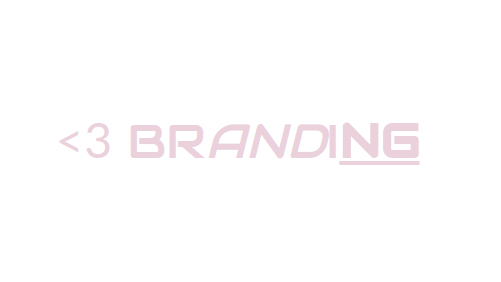
We won't spoil the surprise too much – the process he outlines is a brilliantly tongue-in-cheek reflection of the design industry – but here is the outcome of DRB's rebranding of branding.

Barnes explains: "The <3 signifies love (the heart emoticon used by millennials) as well as the '<' signifying that rebranded branding is 'greater than' what has gone before.
"The font is bold and futuristic while the soft pink colour inspires feelings of love.
"The NG is bold and underlined to signify energy and implying that – while the new brand for branding is bold and new, it still rests on solid and strong foundations. The italicized AND also shows that branding lets you have more and more!"
Read DRB's post on Medium to find out more.
Read more:
Get the Creative Bloq Newsletter
Daily design news, reviews, how-tos and more, as picked by the editors.

Thank you for reading 5 articles this month* Join now for unlimited access
Enjoy your first month for just £1 / $1 / €1
*Read 5 free articles per month without a subscription

Join now for unlimited access
Try first month for just £1 / $1 / €1

Craig Stewart is a writer, SEO strategist and content marketer, and is a former editor of Creative Bloq. Craig has written about design, typography, tech and football for publications including Creative Bloq, T3, FourFourTwo and DSG, and he has written a book on motoring for Haynes. When he's not writing, you'll usually find Craig under his old car learning about DIY repairs the hard way.
