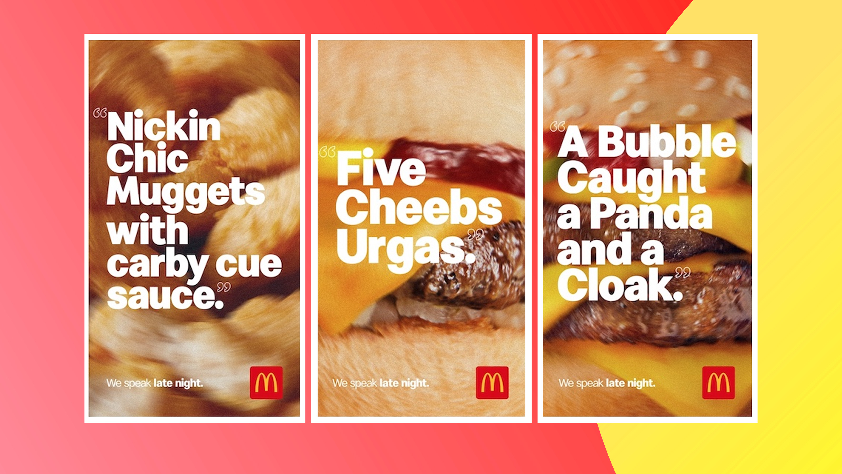
These drunken McDonald's ads are golden
I'm glad someone speaks "late night".

We've all been there – it's the end of a long night, everything hurts and you have no idea what time it is when suddenly you see those familiar golden arches and suddenly everything feels okay again. In its latest branding, McDonald's New Zealand has made light of late-night drunken customers in these brilliantly funny billboards.
We've seen some similarly entertaining marketing in our pick of the very best print adverts of all time. Designed by branding agency DDB Aotearoa, the ads depict some of the brand's most popular products doubled with hilarious mispronunciations commonly overheard by those poor late night workers.
A post shared by DDB Group Aotearoa NZ (@ddbgroupaotearoanz)
A photo posted by on
The billboards depict the names of various menu items with a drunken twist. The Fillet-o-Fish with extra tartar sauce becomes a "ferret oh frish extra tata", where as the Big Mac combo is now lovingly known as the "mig back congo". A rather entertaining detail in each poster is that the background image is slightly blurred to further replicate the feel of drunken dining. Tagged with the catchphrase "we speak late night", the billboards certainly give insight into what the night shift in one of their restaurants both look and sound like. I'm glad someone understands the intoxicated lingo, as it took an embarrassingly long time to decipher what "a bubble caught a panda" is meant to translate to.
It's quite interesting to see a brand lean into its various audiences through advertising: a recent UK campaign titled "raise your arches" depicted a large group of office workers as a main demographic for the brand, which is certainly a departure from the tipsy customers Aotearoa is referencing. The fast food giant is also no stranger to unique marketing aimed at a younger audience. Remember that iconic McDonald's swing set that was mainly aimed at kids? I wonder what we'll see next.
READ MORE:
- This McDonald's marketing stunt is total genius
- How to design a logo: 15 pro tips
- These ingenious minimal McDonald's billboards are driving Reddit wild
Get the Creative Bloq Newsletter
Daily design news, reviews, how-tos and more, as picked by the editors.

Thank you for reading 5 articles this month* Join now for unlimited access
Enjoy your first month for just £1 / $1 / €1
*Read 5 free articles per month without a subscription

Join now for unlimited access
Try first month for just £1 / $1 / €1

Abi Le Guilcher previously worked as Creative Bloq’s former ecommerce writer. With a Bachelor of Arts in Creative Design for Game and Film, Abi enjoys almost anything creative and will either be found crafting or gaming in her spare time. Her previous experience as a retail assistant at CeX means she has a wide range of knowledge in both technology and media and loves to keep up to date with the latest tech. Abi is an avid cosplayer and has most recently worked with PlayStation and Santa Monica Studio on a promotional campaign for the release of God of War Ragnarök.
