Interactive Witcher map is truly a thing of beauty
The Witcher's companion website creates the perfect storytelling experience.

If you're loving Netflix fantasy drama the series The Witcher, but can't quite get your head around what seems like a constantly jumping timeline, we have a solution. You need to check out the beautifully crafted 'Map of the Continent', the official companion website to the series.
The site is packed with snippets of extra information that enhance the characters' back stories and draw you further into the world of the Witcher. However, what makes the site so enticing is the visual presentation. The site is a treasure trove of beautiful design elements, smart and engaging interactivity and CSS animation, all of which come together to provide a storytelling experience of the highest order.

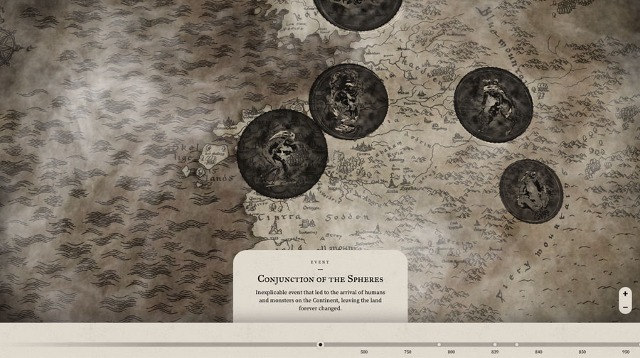
The timeline is split into four tracks dedicated to different story elements: users can follow leading characters, Geralt, Yennefer or Ciri, or explore the general history of the magical world. All four tracks converge when the timeline is dragged to 1250, the birth of Ciri. Key points along the timeline animate to inform the user there is something to read: a pop-up window slides up to reveal an event, and more usefully for Witcher-lovers, what episode and what year a key plotline occurs in.
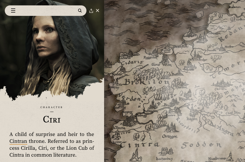
Enhancing the timeline and embellishing the whole storytelling experience is a dynamic map that uses animation to add atmosphere by reflecting the weather. The map might boast a familiar feel as its underlying code is very much part of the Google Maps experience. Zoom in, zoom out and drag to wherever you want to go on the map.

Google's influence doesn't stop here. A well-timed, animated slide-out side panel reveals a search omnibox giving fans quick access to Witcher information when they want it. Completing the picture is the classic hamburger menu icon to reveal the essential company information.
The Witcher's 'Map of the Continent' website is a perfect example of how to bring different media together to create a complete and compelling storytelling experience. The site uses subtle and smart UI animations to engage users, and give users the information they want. It borrows from well-known everyday elements (like Google Maps) to ensure an intuitive and vastly enjoyable experience. Visit the Witcher interactive map to explore for yourself.

Join us in April 2020 with our lineup of JavaScript superstars at GenerateJS – the conference helping you build better JavaScript. Book now at generateconf.com
Get the Creative Bloq Newsletter
Daily design news, reviews, how-tos and more, as picked by the editors.
Read more:

Thank you for reading 5 articles this month* Join now for unlimited access
Enjoy your first month for just £1 / $1 / €1
*Read 5 free articles per month without a subscription

Join now for unlimited access
Try first month for just £1 / $1 / €1
Steven Jenkins is a freelance content creator who has worked in the creative industries for over 20 years. The web and design are in his blood. He started out as a web designer before becoming the editor of Web Designer magazine and later net magazine. Loud guitars, AFC Bournemouth, Photoshop, CSS, and trying to save the world take up the rest of this time.
