Why The Traitors UK's visual identity is so brilliant
But I'll happily banish the US and Australian versions.

Everyone's talking about The Traitors at the moment. Both the UK and US versions of the murder mystery game have their season two finales tomorrow (Friday 26 January) and here at Creative Bloq, we're all absolutely hooked on the UK version.
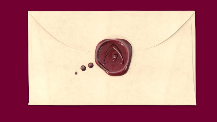
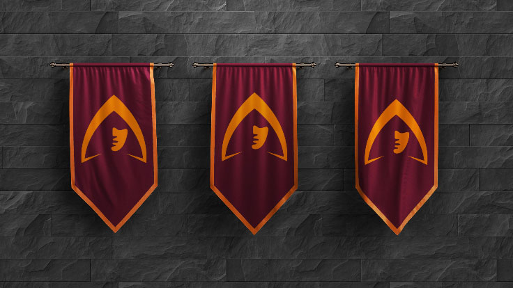
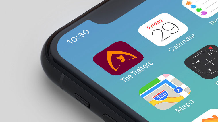
Aside from gleefully watching all the backstabbing, part of the enjoyment of the show is its visual feel. The UK version has a strong, cohesive visual identity. There's a gothic feel to it, with the creepy owl, the dark cloaks and the Scottish castle, and there's also a clear visual language that runs from everything from the simple yet effective logo with its extended stems and hooded figure (is it just me who thinks it's Claudia Winkleman?), to the app icon (Claudia?) to the design of the letters, and seal on the envelopes they're sent in. All this adds to the chilling feeling of high stakes drama, and, I'd argue, helps keep the audience interested.
The Traitors UK's visual identity was created by Turquoise Branding, who have created identities for UEFA Europe League, reality TV show The Circle and more. They took visual cues from the original Dutch series of The Traitors (De Verraders) – like the design of the round table, for example – and they ran with it to create something stylish, chic and effective. Hats (or hoods) off to them.
Now, let's compare The Traitors UK's visual identity to that of The Traitors Australia and The Traitors US (full disclosure, I've yet to watch the US version). While watching the Aussie version, I felt that this same stylish, modern gothic feel was lost. Perhaps that's because it wasn't set in a castle, and it wasn't aiming for that feel, but I felt like the logo and visual identity wasn't as effective. To me, it felt quite garish and – dare I say it – cheap looking.
Take the logo (the top image, below). It's got an almost '90s feel to it, with its drop shadow and shine. It reminds me of the Gladiators logo. The show was also missing some of the other more stylish aspects of the UK one, like the hooded figure icon and the dark cloaks (the Aussie traitors wear red velvet cloaks and gold masks).
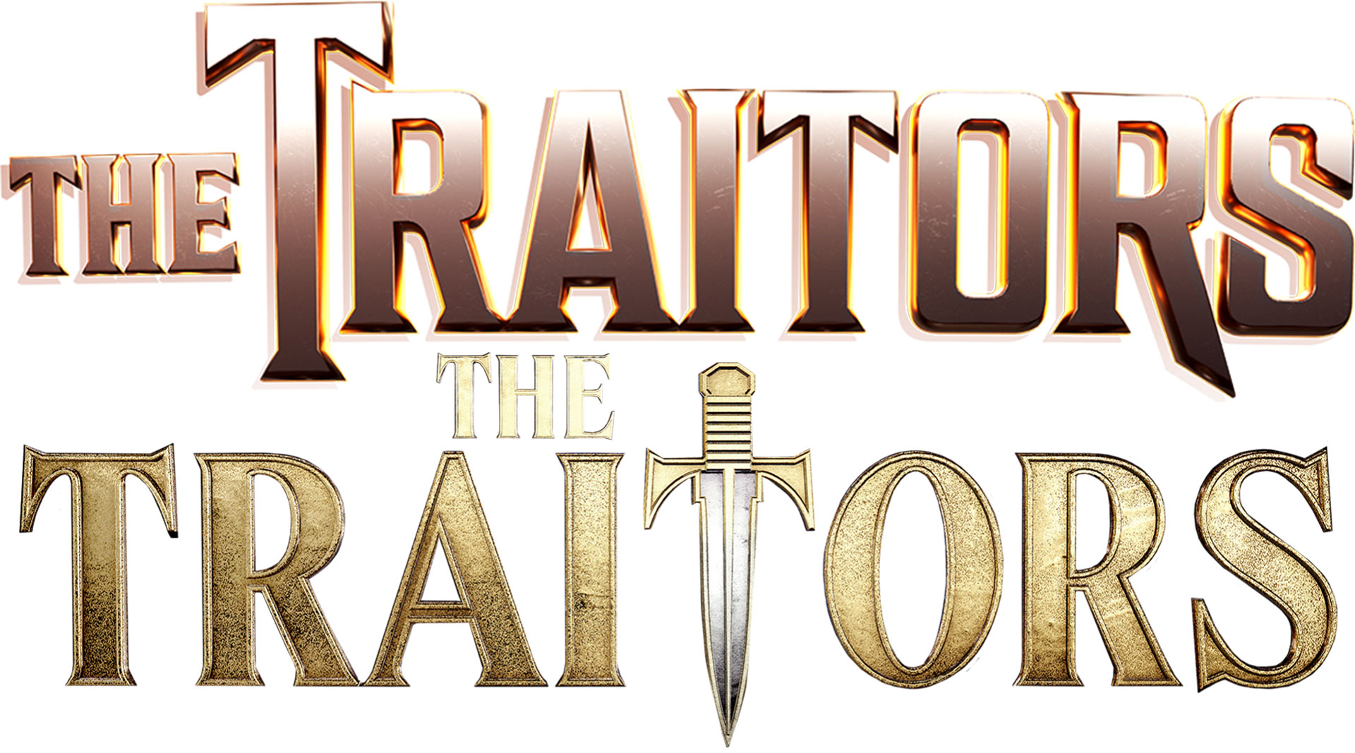
The Traitors US logo also doesn't feel especially chic, to me at least. Although perhaps it isn't supposed to. The gold lettering and use of the dagger as a 'T' feels a little in your face to me, a little 'this is what this show is about!', but perhaps this is more appropriate in the US market.
Either way, I'll happily watch more series of The Traitors from around the world, but The Traitors UK branding is something I won't be banishing anytime soon.
Get the Creative Bloq Newsletter
Daily design news, reviews, how-tos and more, as picked by the editors.

Thank you for reading 5 articles this month* Join now for unlimited access
Enjoy your first month for just £1 / $1 / €1
*Read 5 free articles per month without a subscription

Join now for unlimited access
Try first month for just £1 / $1 / €1

Rosie Hilder is Creative Bloq's Deputy Editor. After beginning her career in journalism in Argentina – where she worked as Deputy Editor of Time Out Buenos Aires – she moved back to the UK and joined Future Plc in 2016. Since then, she's worked as Operations Editor on magazines including Computer Arts, 3D World and Paint & Draw and Mac|Life. In 2018, she joined Creative Bloq, where she now assists with the daily management of the site, including growing the site's reach, getting involved in events, such as judging the Brand Impact Awards, and helping make sure our content serves the reader as best it can.
